This week, I was tagged in a tweet by Akil Bello, asking about capacity in higher education in the US. My first response was that there was no way to measure capacity; no one asks this in federal reporting, and any way to attempt to measure it was fraught with problems. Remember this point as I attempt to do just that.
At the same time, I've been hearing more about the decreases in college enrollment nationwide, and I've wanted to respond to them and supply some context. So, I think I might be able to accomplish both with one post and one visualization.
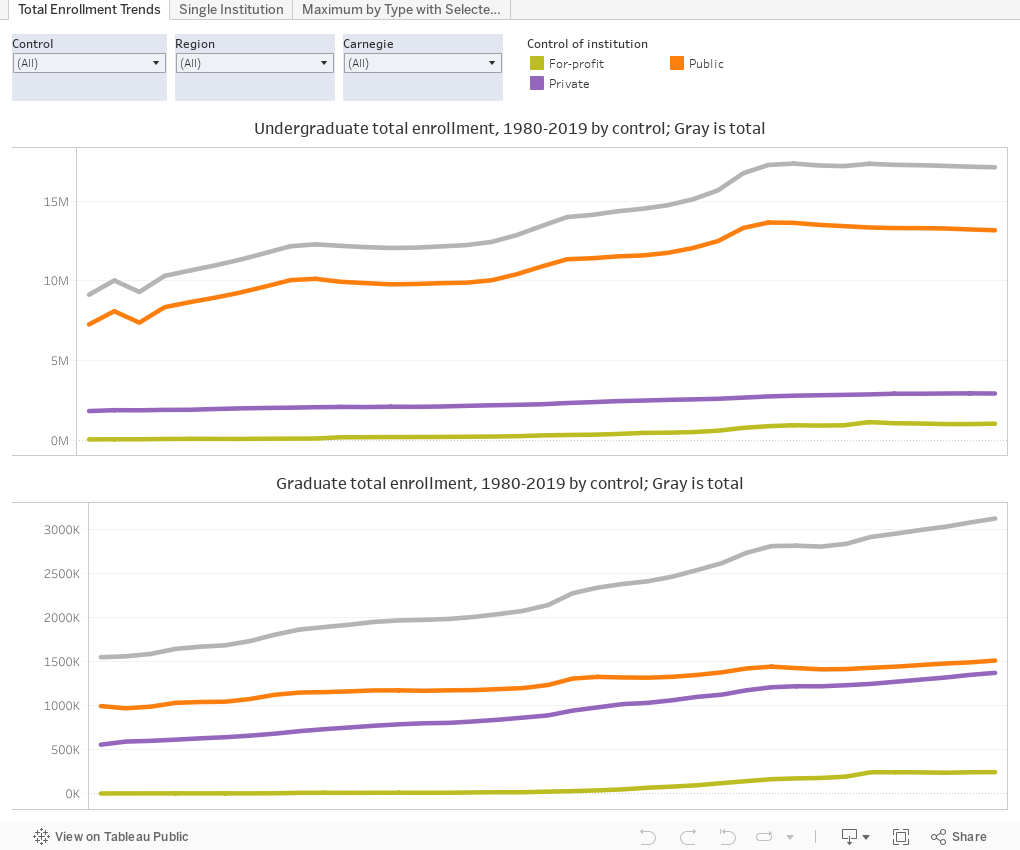
On the latter point, you want to take a look at the first tab (across the top) Total Enrollment Trends. You can see that we have experienced some drop-off in total enrollment (gray line for totals and colored lines by segments). Hover over the lines to see how much they've changed from 1980 and from the prior year. Measured against the dramatic increase over a longer period of time, the drop-off might be viewed as a blip, or as stock market watchers might call it, a "correction." Context is important, and, of course, the Fall 2019 enrollments don't take COVID-19 into account. You can get more specific if you take out for-profits, for instance, or only look at a particular region (the differences are quite noticeable, and tend to follow population patterns) using the filters across the top.
If you want to see trends at a single institution, you can go to the tab cleverly titled Single Institution. Oregon State is listed first, but use the dropdown at the top to look at any institution of interest. Hint: to keep from scrolling, type any part of the name, like "Prince" or "Stan" or "Iowa" to reduce the list before making a selection. Look at the trend over time, and then look at the red line to see what year their maximum enrollment was or is.
Finally, the question from the esteemed Mr. Bello: There is, as I indicated, no way to measure capacity, but if you make a few assumptions, you might be able to get close. Assume that no college has decreased capacity over the last 40 years; that they can go back to their peak enrollment. Then, take a look at what their peak enrollment was, and assume that it's not a zero-sum game: That all institutions could, in fact, independently enroll that many regardless of what their competitors do. Assume they want to, or would get back to that number if they could. Assume (because my skills are not great in writing code) that every college showing enrollment data in any year is still open (which of course is wrong, but I think we can also assume that smaller institutions are the ones that have closed, and thus the numbers won't throw everything out of whack). That's what I did.
Look at the tab Maximum by Type with Selected Years: Akil's question was about capacity and the ability to expand at the most selective institutions (and, presumably, for undergraduates). You can use the filters in any combination to look at Carnegie Types, Region, or Selectivity Bands. This suggests that if every college returned to its historic peak capacity, we could enroll about 21.6 million undergrads and 3.9 million graduates.
New: This is the time when I normally ask people to let me know what they see. Today I'm trying something different: If (and only if) you use this blog (or any of my blogs) in your business or personal education or betterment, you can help defray the cost of web hosting by buying me a beer. (Public high school counselors should always consider this a free resource and read without any guilt, by the way!) Just click here to do so.
Comments
Post a Comment