First things first: Let's define what IPEDS calls Net Price: You can read all the details here, or just realize it's the cost that students and parents are expected to pay after all grant aid is awarded. The average is only calculated for those who receive aid. If you have questions beyond what is found on the link above, you'll have to ask someone else to explain it.
Some limitations: This data is for Fall, 2018, and it's by income bands that have been around a long time: Under $30,000, and then in increments up to anyone over $110,000. That top threshold is clearly too low, with some college budgets exceeding $70,000 annually.
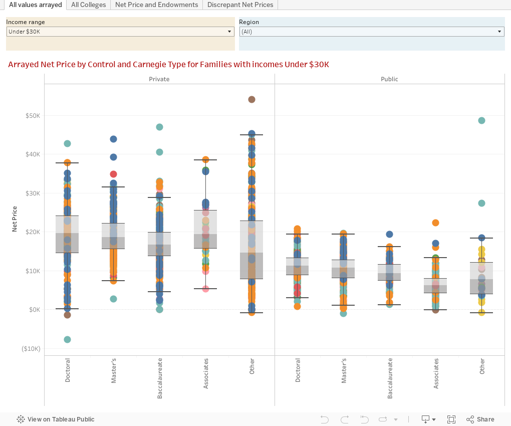
There are four views here that go from very high-level overviews to more granular, and ends with 45 private, selective colleges who have a unique quirk in their pricing, or so it might seem.
View 1: All Values Arrayed shows the entire landscape in a box and whiskers plot. The gray boxes show were the middle 50% of the (unweighted) distribution is. It would be fun to weight by enrollment, but I'm not that good at coding this stuff. Choose the income range, and if you want, filter to a region.
View 2: All Colleges displays the five different net prices for each college on one horizontal bar. Hover for details. Make the population of colleges you're looking at smaller by filtering Pell Grant percentages, Carnegie type, switching from private to public, choosing a region, or filtering by institutional wealth, if you'd like.
View 3: Net Price and Endowments shows the relationship between the two. Use the filters as you wish to make the display more legible, and use the parameter at the bottom to change what family income band you're looking at, and note a couple of things: Public universities (default view) are all funded differently, and endowment per FTE can be very misleading, based on external foundations who hold some or all of the endowment funds. Also, notice the labels on the x-axis when you switch from public to private institutions.
View 4: Discrepant Net Prices. This is an interesting one, and I found it by accident. There are about 45 private, selective colleges who have lower net prices for families with incomes between $30,000 and $48,000 than they do for families with incomes under $30,000. To the uneducated or unsophisticated viewer, this looks nefarious. I don't think it is, for reasons I outlined in this Twitter thread.
What do you find? Do these numbers make sense? Let me know, as always.
Comments
Post a Comment