
Public and Private Schools and AP Exams, 2020

 A few weeks ago, I saw this Twitter thread by James Murphy, and it reminded me of something.  If you don't want to read the thread, it has to do with the seemingly enormous advantage private school students have in the admissions process at the highly rejective colleges (hat tip to Akil Bello for that term.)

What it reminded me of was the data that College Board publishes annually on AP results. It's good of them to do so, but when data is published in massive spreadsheets, the conspiracy theorist in me starts to wonder if there isn't an attempt to claim transparency while attempting obfuscate the patterns.  Even if you manage to download the data, the tables are formatted for printing, not analysis, and it's sliced and diced in ways that make it impossible to do a lot of the detailed analysis you'd might like.

But what we have is what we got.  And what I chose to look at today were the tabs that broke out performance on AP exams by test and ethnicity and school type (that is, public or private).  Sort of.  College Board provides a tab for "all students" and a tab for "public school students" so if you want to figure out the private school data, it takes a bit of time (and my assumption is that there are only two types of schools, and if you're not in a public, you are in a private, which includes home-schooled students, I suspect).  Time I just happened to have this week in the late evenings.

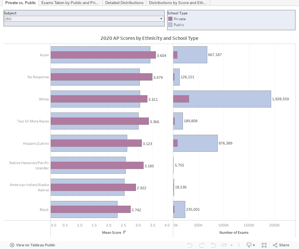
There are four views here: The first shows mean AP scores for test takers by ethnicity, broken out by public school (blue) and private school (purple) students.  On the right is the number of exams taken.  If you want to look at a specific score (for instance, US History) you can use the control at the top to filter to just those results.

The second shows the public/private percentage break downs for each exam. What's up with Latin?  Surprising/not surprising.  If  you want to look at just a cluster of exams (math and computer science, for instance), or a range of scores, you can use the filters to get those views.  Go ahead and interact; you won't break anything.

The averages from the first view are interesting, of course.  But distributions are more compelling, I think, so I visualized those on the third view. The come broken out by ethnicity, and you can filter to AP score, subject, or school type.  Watch the patterns change as you click.

Finally, the fourth view shows 100% rows by score, broken out by ethnicity.  For instance, of all the students who got a score of 3, 52.38% were White, and 19.06% were Hispanic/Latino.  If you want to look at just one subject, or either school type, the filters are your friends.  The row at the very bottom shows all the results for all of the scores selected.

As always, I'm eager to hear what you see or notice here. Drop me a note if something jumps out at you.


Comments

Popular posts from this blog

Changes in AP Scores, 2022 to 2024

Used to be, with a little work, you could download very detailed data on AP results from the College Board website: For every state, and for every course, you could see performance by ethnicity.  And, if you wanted to dig really deep, you could break out details by private and public schools, and by grade level.  I used to publish the data every couple of years. Those days are gone.  The transparency The College Board touts as a value seems to have its limits, and I understand this to some extent: Racists loved to twist the data using single-factor analysis, and that's not good for a company who is trying to make business inroads with under-represented communities as they cloak their pursuit of revenue as an altruistic push toward access. They still publish data, but as I wrote about in my last post , it's far less detailed; what's more, what is easily accessible is fairly sterile, and what's more detailed seems to be structured in a way that suggests the company doesn...

The Highly Rejective Colleges

If you're not following Akil Bello on Twitter, you should be.  His timeline is filled with great insights about standardized testing, and he takes great effort to point out racism (both subtle and not-so-subtle) in higher education, all while throwing in references to the Knicks and his daughter Enid, making the experience interesting, compelling, and sometimes, fun. Recently, he created the term " highly rejective colleges " as a more apt description for what are otherwise called "highly selective colleges."  As I've said before, a college that admits 15% of applicants really has a rejections office, not an admissions office.  The term appears to have taken off on Twitter, and I hope it will stick. So I took a look at the highly rejectives (really, that's all I'm going to call them from now on) and found some interesting patterns in the data. Take a look:  The 1,132 four-year, private colleges and universities with admissions data in IPEDS are incl...

Changes in SAT Scores after Test-optional

One of the intended consequences of test-optional admission policies at some institutions prior to the COVID-19 pandemic was to raise test scores reported to US News and World Report.  It's rare that you would see a proponent of test-optional admission like me admit that, but to deny it would be foolish. Because I worked at DePaul, which was an early adopter of the approach (at least among large universities), I fielded a lot of calls from colleagues who were considering it, some of whom were explicit in their reasons for doing so.  One person I spoke to came right out at the start of the call: She was only calling, she said, because her provost wanted to know how much they could raise scores if they went test-optional. If I sensed or heard that motivation, I advised people against it.  In those days, the vast majority of students took standardized admission tests like the SAT or ACT, but the percentage of students applying without tests was still relatively small; the ne...