
Another look at enrollment and ethnicity, 2019

 Let's take a look at undergraduate enrollment by ethnicity.  You'd be surprised how hard it is to keep this to seven views, as the topic is complex and nuanced.  But I did.

The topic should be self-explanatory: Who goes to college where?  And there are six views, using the tabs across the top:

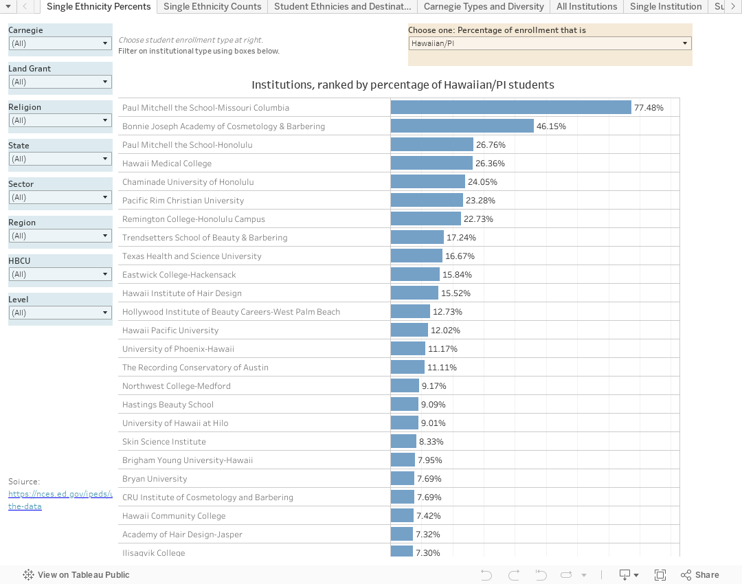
Single Ethnicity Percents allows you to see which institutions have the largest percentage of students of the selected ethnicity.  The view starts with Hawaiian Natives and Other Pacific Islanders, but you can choose any of nine different groups using the filter on the top right.  If you want to limit the universe of colleges, use the filters down the left-hand side.  Maybe you want to look at Asian students but only at HBCUs, for instance.

Single Ethnicity Counts is identical, but it uses counts instead of percentages. Filters work the same way.

The next two views are static:

Student Ethnicities and Destinations is easy to read once you understand it.  Hover over any segment for an explanation of what you're seeing.

Carnegie Types and Diversity is similar, but the dependent and independent variables are switched.  Again, hover to get some insight into what you're seeing.

All Institutions starts with the whole universe of 5,748 institutions, sorted by total undergraduate enrollment, broken out by ethnicity percentages.  Look at and combination of subsets by using the filters, and hover for details.

Single Institution shows just that: Breakouts of all undergraduates by percentages.  The view starts with Tulane, but you can choose any institution you'd like using the filter.  Just start typing some of the name, and hit "enter" then make your selection.

Finally, Summaries by State shows how diverse enrollment in each state is.  If you want to do a subset of institutions in each state, go ahead.  You won't break anything.

This was fun; the visualization is open for downloading if you want to do something with this yourself. As always, let me know what you see.

Comments

Popular posts from this blog

Changes in AP Scores, 2022 to 2024

Used to be, with a little work, you could download very detailed data on AP results from the College Board website: For every state, and for every course, you could see performance by ethnicity.  And, if you wanted to dig really deep, you could break out details by private and public schools, and by grade level.  I used to publish the data every couple of years. Those days are gone.  The transparency The College Board touts as a value seems to have its limits, and I understand this to some extent: Racists loved to twist the data using single-factor analysis, and that's not good for a company who is trying to make business inroads with under-represented communities as they cloak their pursuit of revenue as an altruistic push toward access. They still publish data, but as I wrote about in my last post , it's far less detailed; what's more, what is easily accessible is fairly sterile, and what's more detailed seems to be structured in a way that suggests the company doesn...

Educational Attainment and the Presidential Elections

I've been fascinated for a while by the connection between political leanings and education: The correlation is so strong that I once suggested that perhaps Republicans were so anti-education because, in general, places with a higher percentage of bachelor's degree recipients were more likely to vote for Democrats. The 2024 presidential election puzzled a lot of us in higher education, and perhaps these charts will show you why: We work and probably hang around mostly people with college degrees (or higher).  Our perception is limited. With the 2024 election data just out , I thought I'd take a look at the last three elections and see if the pattern I noticed in 2016 and 2020 held.  Spoiler: It did, mostly. Before you dive into this, a couple of tips: Alaska's data is always reported in a funky way, so just ignore it here.  It's a small state (in population, that is) and it's very red.  It doesn't change the overall trends even if I could figure out how to c...

Changes in SAT Scores after Test-optional

One of the intended consequences of test-optional admission policies at some institutions prior to the COVID-19 pandemic was to raise test scores reported to US News and World Report.  It's rare that you would see a proponent of test-optional admission like me admit that, but to deny it would be foolish. Because I worked at DePaul, which was an early adopter of the approach (at least among large universities), I fielded a lot of calls from colleagues who were considering it, some of whom were explicit in their reasons for doing so.  One person I spoke to came right out at the start of the call: She was only calling, she said, because her provost wanted to know how much they could raise scores if they went test-optional. If I sensed or heard that motivation, I advised people against it.  In those days, the vast majority of students took standardized admission tests like the SAT or ACT, but the percentage of students applying without tests was still relatively small; the ne...