
Let's talk about library books

This post had two inspirations: First, I was scrolling around the IPEDS data center one night, looking for something to visualize that I hadn't before that I thought would be interesting. I scrolled through all the variables, and found the Academic Libraries section.  I was certain that I had never even looked at the data, so put it in the back of my mind.

The second thing that led me to this data was thinking about my discussions with high school counselors after they come back from campus tours: Just how often they've heard the same things from tour guides who are quite convinced the counselors have never heard it before (the blue safety lights comes to mind, along with the perfunctory mention of the number of books in the library.)

The latter is not an unimportant statistic, of course, as the library has long been at the heart of the intellectual life of an institution dedicated to intellectual pursuits.  But what do those numbers mean?  Are comparisons between institutions different?  And, as I've been asked more than once, "How many books can you read in four years?'

So, this.

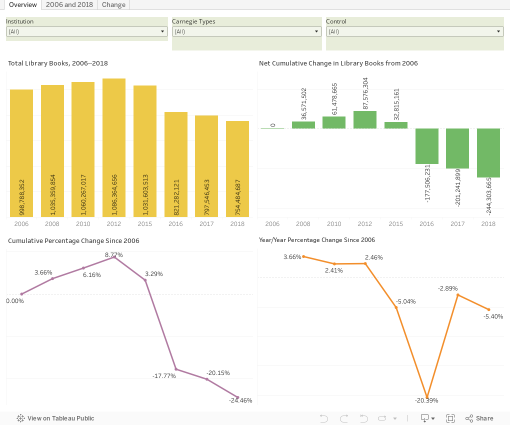
There are three views here, all interactive and accessible via the tabs across the top.  The first shows library volumes from 2006 to 2018 (not every year has data for "physical books" as IPEDS calls them), along with three measures of change over time. Look at it by single institution, Carnegie Types, or Control to see what's happened since 2006.  As you can see, overall the number of volumes has fallen by almost 25%; but America's colleges and universities collectively still own about two books for every person in the US.

The second view shows every institution in the US and its number of books in 2006 (gray bar) and 2018 (purple bar).  Hover over the bar to see the values and the change over time.

And the third view, while the simplest, is the most intriguing to me, as it may go to institutional strategy.  Note that UCLA has added just under 5 million volumes in 12 years, which works out to just over 1,100 volumes every day over twelve years, including weekends and holidays. At the other end of the spectrum, look at the University of Illinois at Urbana-Champaign: It's gone in the exact opposite direction and has reduced its collection by almost that same amount.

There are probably stories there, or maybe reminders about anchoring fallacies, or bad assumptions that the two libraries were both appropriately sized in 2006.  Or it could be a definitional one, although IPEDS makes it pretty clear what a "book" is.  It may be a shift to electronic media; or it could be that they're acquiring the same number of books, but UIUC is disposing of older books more rapidly.

What I don't know about running a library would fill a library.  So, as always, don't make any rash decisions about your university based on what you see here.  Higher Ed Data Stories is for fun and entertainment only.

Dig in, click around, and enjoy.  And as always, let me know what you come up with.


Comments

Popular posts from this blog

First-year student (freshman) migration, 2022

A new approach to freshman migration, which is always a popular post on Higher Ed Data Stories. If you're a regular reader, you can go right to the visualization and start interacting with it.  And I can't stress enough: You need to use the controls and click away to get the most from these visualizations. If you're new, this post focuses on one of the most interesting data elements in IPEDS: The geographic origins of first-year (freshman) students over time.  My data set includes institutions in the 50 states and DC.  It includes four-year public and four-year, private not-for-profits that participate in Title IV programs; and it includes traditional institutions using the Carnegie classification (Doctoral, Masters, Baccalaureate, and Special Focus Schools in business, engineering, and art/design. Data from other institutions is noisy and often unreliable, or (in the case of colleges in Puerto Rico, American Samoa, and other territories, often shows close to 100% of enro...

Educational Attainment and the Presidential Elections

I've been fascinated for a while by the connection between political leanings and education: The correlation is so strong that I once suggested that perhaps Republicans were so anti-education because, in general, places with a higher percentage of bachelor's degree recipients were more likely to vote for Democrats. The 2024 presidential election puzzled a lot of us in higher education, and perhaps these charts will show you why: We work and probably hang around mostly people with college degrees (or higher).  Our perception is limited. With the 2024 election data just out , I thought I'd take a look at the last three elections and see if the pattern I noticed in 2016 and 2020 held.  Spoiler: It did, mostly. Before you dive into this, a couple of tips: Alaska's data is always reported in a funky way, so just ignore it here.  It's a small state (in population, that is) and it's very red.  It doesn't change the overall trends even if I could figure out how to c...

Education Levels in the US, by State and Attainment

Attainment has always been an interesting topic for me, every since I first got stunned into disbelief when I looked at the data over time.  Even looking at shorter periods can lead to some revelations that many don't make sense at first. Here is the latest data from NCES, published in the Digest of Education Statistics . Please note that this is for informational purposes only, and I've not even attempted to visualize the standard errors in this data, which vary from state-to-state.  There are four views year, all looking at educational attainment by state in 2012 and 2022.   The first shows data on a map: Choose the year, and choose the level of attainment.  Note that the top three categories can be confusing: BA means a Bachelor's degree only; Grad degree means at least a Master's (or higher, of course); and BA or more presumably combines those two.  Again, standard errors might mean the numbers don't always add up perfectly. The second shows the data o...