
Fresh WICHE data: Projections of High School Graduates

The good folks at WICHE just released some fresh data on high school graduates, past, present, and future, and as always, it's interesting.  Their website has some excellent summaries, and some interactive dashboards, but I like to download the data and create my own views, some of which I'm sharing here.

If you've looked at this before, you know all the disclaimers about the accuracy of the data; it seems to be pretty good, but data this big is complicated and hard to work with, and it's never perfect.  In fact, the staff there said that prior year's estimates were a little short due to an unanticipated bump in high school graduation rates.  Good news.

The point is this: This data gives you a good place to put your feet down and get a glimpse--but not a perfect view--of the future.  It may and probably should help you with your planning efforts, and especially to talk to people at your institution about current and future realities.  Of course, it's not just numbers, but breakouts of numbers that are important, so I've looked at this a lot of ways.  And that's still not sufficient.  No one could have anticipated a pandemic, for instance, and that event will make future numbers less precise.  Additionally, there are many things not contained in this data that you might want to dig into, using Census Bureau or Ipums data: More granular geography, income, parental attainment, to name a few.

There are six views here, using the tabs across the top.  Most allow you to filter to specific states or regions; some allow you to limit the years, using the filters.

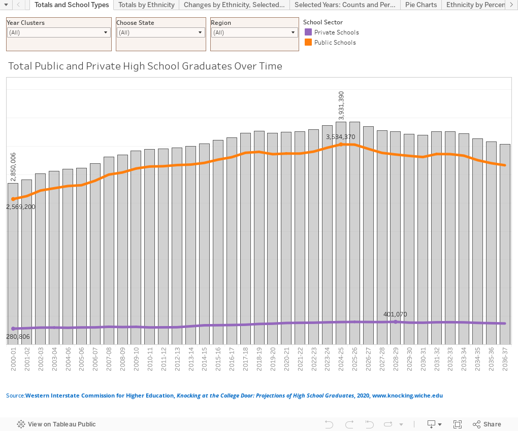
Totals and School Types shows high school graduates out to 2037.  I doubt I'll be worrying about this then.  It shows totals and breakouts by public and private.

Totals by Ethnicity shows the same data (but just for public schools), but the colored lines show breakouts by race and ethnicity.

Changes by Ethnicity, Selected Years shows how the number of high school graduates has and will change over a long stretch, from 2014 to 2037.  Numbers on top; percent change on bottom.  Note that some early years had Asian and Asian/Pacific Islander categories as one; in other years they are separate.

Selected years: Counts and Percentages shows size, numbers, and percentages by ethnicity over time.

Pie Charts is essentially the same view, but displayed as pies for fans of that format.

And Ethnicity by percent shows how the composition of our graduating high school classes has changed over a long period.  It's especially interesting to use a state or region filter here to see how different states have very different class compositions.

Even if you don't work in EM, I think you'll find the insight compelling and interesting.  As always, let me know if you find anything interesting.


Comments

Popular posts from this blog

Freshman Migration, 1986 to 2020

(Note: I discovered that in IPEDS, Penn State Main Campus now reports with "The Pennsylvania State University" as one system.  So when you'd look at things over time, Penn State would have data until 2018, and then The Penn....etc would show up in 2020.  I found out Penn State main campus still reports its own data on the website, so I went there, and edited the IPEDS data by hand.  So if you noticed that error, it should be corrected now, but I'm not sure what I'll do in years going forward.) Freshman migration to and from the states is always a favorite visualization of mine, both because I find it a compelling and interesting topic, and because I had a few breakthroughs with calculated variables the first time I tried to do it. If you're a loyal reader, you know what this shows: The number of freshman and their movement between the states.  And if you're a loyal viewer and you use this for your work in your business, please consider supporting the costs

Changes in AP Scores, 2022 to 2024

Used to be, with a little work, you could download very detailed data on AP results from the College Board website: For every state, and for every course, you could see performance by ethnicity.  And, if you wanted to dig really deep, you could break out details by private and public schools, and by grade level.  I used to publish the data every couple of years. Those days are gone.  The transparency The College Board touts as a value seems to have its limits, and I understand this to some extent: Racists loved to twist the data using single-factor analysis, and that's not good for a company who is trying to make business inroads with under-represented communities as they cloak their pursuit of revenue as an altruistic push toward access. They still publish data, but as I wrote about in my last post , it's far less detailed; what's more, what is easily accessible is fairly sterile, and what's more detailed seems to be structured in a way that suggests the company doesn&

The Highly Rejective Colleges

If you're not following Akil Bello on Twitter, you should be.  His timeline is filled with great insights about standardized testing, and he takes great effort to point out racism (both subtle and not-so-subtle) in higher education, all while throwing in references to the Knicks and his daughter Enid, making the experience interesting, compelling, and sometimes, fun. Recently, he created the term " highly rejective colleges " as a more apt description for what are otherwise called "highly selective colleges."  As I've said before, a college that admits 15% of applicants really has a rejections office, not an admissions office.  The term appears to have taken off on Twitter, and I hope it will stick. So I took a look at the highly rejectives (really, that's all I'm going to call them from now on) and found some interesting patterns in the data. Take a look:  The 1,132 four-year, private colleges and universities with admissions data in IPEDS are incl