
State Flagship Tuitions over time

This should be a pretty easy one.  Every year, the College Board puts out data on college tuition and financial aid.  It's a great service, but of course it's all spreadsheets.  Not fun to work with.  But you can interact with the data below.

Four views for you to look at:

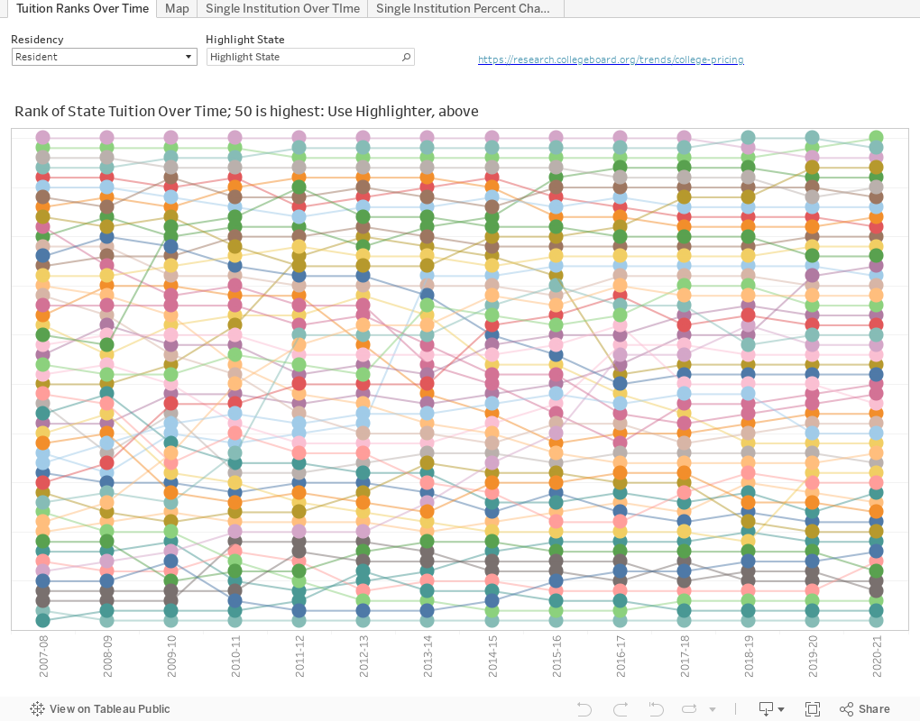
View one is just ranks: Where does your state flagship rank on tuition and fees for residents and non-residents?  Just pick which type of tuition you want to see, then use the highlighter to call out your state's flagship.  On this chart, 50 (at the top) is the highest rate; 1 (at the bottom) is the lowest.

View two is a map to see relative values: Here, purple is low, and orange is high.  Choose a year, then choose a value to display: Resident tuition, non-resident tuition; non-resident premium (how much more a non-resident pays), and non-resident percent (that premium as a function of the resident rate.)

View three is a single institution over time, showing your choice of inflation-adjusted dollars to 2020, or nominal (unadjusted) dollars.

And view four also shows a single institution, but percentage change.

Enjoy, and as always, let me know what you find that's interesting.


Comments

Popular posts from this blog

The Highly Rejective Colleges

If you're not following Akil Bello on Twitter, you should be.  His timeline is filled with great insights about standardized testing, and he takes great effort to point out racism (both subtle and not-so-subtle) in higher education, all while throwing in references to the Knicks and his daughter Enid, making the experience interesting, compelling, and sometimes, fun. Recently, he created the term " highly rejective colleges " as a more apt description for what are otherwise called "highly selective colleges."  As I've said before, a college that admits 15% of applicants really has a rejections office, not an admissions office.  The term appears to have taken off on Twitter, and I hope it will stick. So I took a look at the highly rejectives (really, that's all I'm going to call them from now on) and found some interesting patterns in the data. Take a look:  The 1,132 four-year, private colleges and universities with admissions data in IPEDS are incl

Freshman Migration, 1986 to 2020

(Note: I discovered that in IPEDS, Penn State Main Campus now reports with "The Pennsylvania State University" as one system.  So when you'd look at things over time, Penn State would have data until 2018, and then The Penn....etc would show up in 2020.  I found out Penn State main campus still reports its own data on the website, so I went there, and edited the IPEDS data by hand.  So if you noticed that error, it should be corrected now, but I'm not sure what I'll do in years going forward.) Freshman migration to and from the states is always a favorite visualization of mine, both because I find it a compelling and interesting topic, and because I had a few breakthroughs with calculated variables the first time I tried to do it. If you're a loyal reader, you know what this shows: The number of freshman and their movement between the states.  And if you're a loyal viewer and you use this for your work in your business, please consider supporting the costs

Doctoral recipients by bachelor's degree-granting institution, 2016-2020

Each time I publish this visualization I get a lot of traffic on the site, and I can see why. It shows all doctoral recipients (in 2016-2020) broken out by where they received their bachelor's degrees.  So, for instance, the top level view shows that UC Berkeley is the alma mater of more doctoral recipients than any other institution, followed by The University of Michigan and Cornell University. That would be interesting, but of course, these are large institutions, and it's natural to think lots of graduates will lead to lots of doctoral degrees.  No surprise there. So the visualization allows you to look at the types of colleges you or your students might want: Select a state, select public or private, select by Carnegie type if you wish.  You can also look at HBCUs if you'd like.  Most important, you can filter by doctoral degree, so if you want to see which institution sends the most students to doctorates in chemistry, you can do so. To head off the questions I get ev