I bought another camera, so I had hoped to spend the weekend out and about doing some photography, but this weekend is one of those rare ones in the Pacific Northwest where the temperature is cracking 100° F. So I decided to stay inside, for the most part, and take a look at a data set I had downloaded for some others at the university.
My original intent in doing this was to refresh the visualization I had done on Simpson's Diversity Index. It's the way an ecologist looks at the diversity of an eco-system, and it puts the question in a new light: If you select two students from the population, what are the chances they'll be different along a specified dimension, in this case, ethnicity? The first time I did it, I calculated the index at the institution level in Excel, then imported the data into Tableau. That works, but you can't look at the data in any way other than by institution. So, if I wanted to look at states, or regions, or public or private universities in aggregate, I'd have to write the formulae in Tableau.
I failed miserably. The formula is pretty straightforward, but coding it is not so simple.
So I thought the better of it, and started looking at it in ways that were more traditional. What we have is the visualization, below.
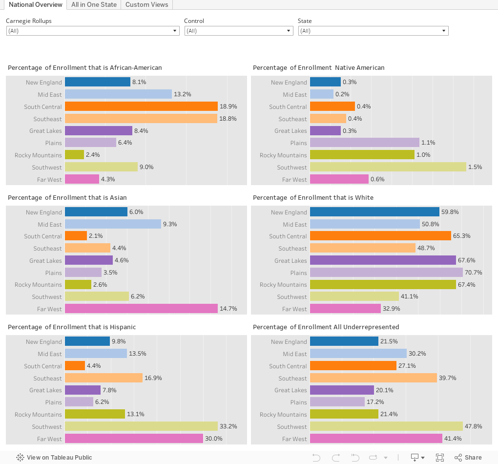
There are three views of the data. The first is a simple series of bar charts, showing percent of total enrollment in the group six ways: By five ethnicities individually, and by total under-represented students. You can filter on Carnegie type or control, or limit the views by certain states. The bars are colored by regions.
The second view looks at institutions by state, and how diverse their undergraduate enrollment is. Choose a state (it starts with Colorado.) Then decide how many of the top x institutions by undergraduate enrollment) you want to see. Maybe you want the top 10, or the bottom 15, or the middle 20. It's up to you. Use the slider to your heart's content. The bars are 100% bars.
At the bottom of this view is a stacked bar chart of the residents aged 17-25 of that state by ethnicity. You can see what percentage fall into the five large census categories (which are not identical to college reporting categories) for reference. College reporting includes three categories (the gray sections) not reported in census data: Non-resident aliens (international students), students reporting two or more races (this data is available in the census, but not in a single table), and "unknown." You can eliminate them from the view if you wish by clicking the boxes in the filter. Note that if you do eliminate them from the view, the new percents of total only apply to those who are in the set.
Finally, the last view allows you to find schools by combining the enrollment profiles for each specific ethnicity (of the four largest). So, if you want to find the colleges that are at least 10% African-American (n = 745) , you can do that. If you want to find the ones that are at least 40% Hispanic (92), just pull the sliders.
They also work in combination. So, if you want to find institutions that are at least 15% Asian and 35% white, you can do that, too (there are 46, by the way). When using the filters, I find it easier to just type in the box. Enter the numbers as decimals (for instance, 12% is .12).
What do you see? What surprised you? I'd love to hear.
Comments
Post a Comment