It's been quite a while since I looked at application fees, so I thought I'd review them again.
I've never understood the idea of application fees; I suppose you can say they're not unreasonable, given that the college is offering a service to people who are not (yet) students. On the other hand, acquisition costs are a part of any business cost, and if you're into crass comparisons, imagine if you had to pay a fee of some sort before you could even try to buy a car.
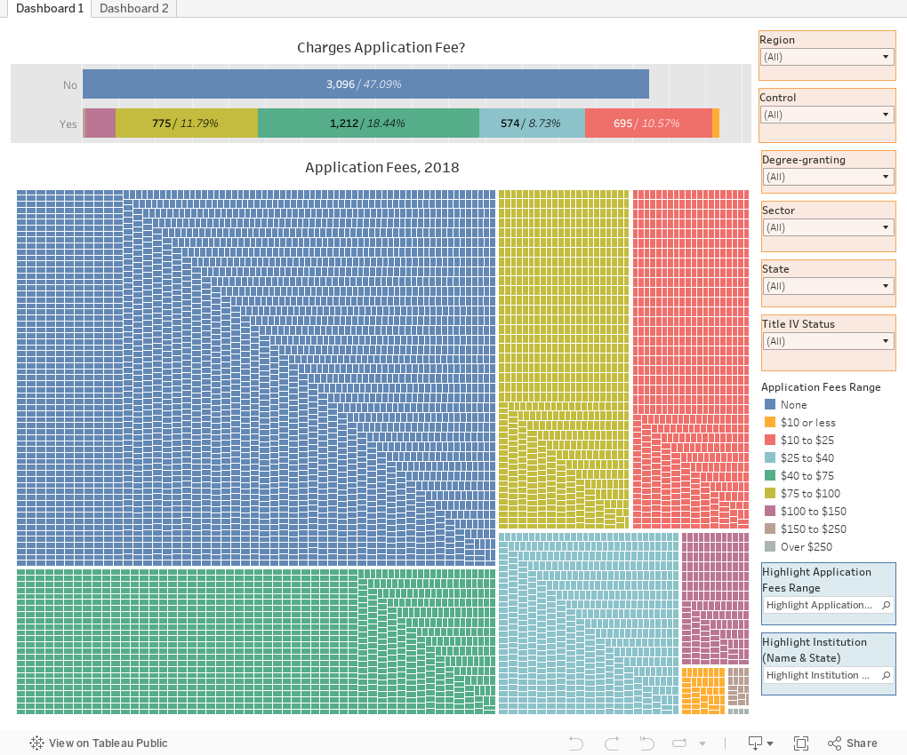
Anyway, this is pretty simple and shows you two views: The first view (using the tabs across the top) shows an array of college app fees, based on how much they charge. I've broken them into groups ($10 or under, over over $250, for instance.) The top bar charts aggregate the data, and the bottom chart breaks the data into individual colleges. Hover over a dot for details.
If you work in admissions and want to compare your app fees to competitors or any group of colleges, use the filters at right: You can look at colleges by control, region, or other variables in any combination. Both charts will update when you do. You can also use the highlighters at lower right to highlight a group or an individual college. Just type part of the name of the college and select from the ones that pop up.
The second view looks at total maximum application fees from freshmen in 2018. It's just app fee x the number of apps from freshmen (not transfers) and represents a theoretical maximum. Institutions give a lot of fee waivers, so the actual amount at every university is almost certainly less.
Take a look and let me know what strikes you.
I've never understood the idea of application fees; I suppose you can say they're not unreasonable, given that the college is offering a service to people who are not (yet) students. On the other hand, acquisition costs are a part of any business cost, and if you're into crass comparisons, imagine if you had to pay a fee of some sort before you could even try to buy a car.
Anyway, this is pretty simple and shows you two views: The first view (using the tabs across the top) shows an array of college app fees, based on how much they charge. I've broken them into groups ($10 or under, over over $250, for instance.) The top bar charts aggregate the data, and the bottom chart breaks the data into individual colleges. Hover over a dot for details.
If you work in admissions and want to compare your app fees to competitors or any group of colleges, use the filters at right: You can look at colleges by control, region, or other variables in any combination. Both charts will update when you do. You can also use the highlighters at lower right to highlight a group or an individual college. Just type part of the name of the college and select from the ones that pop up.
The second view looks at total maximum application fees from freshmen in 2018. It's just app fee x the number of apps from freshmen (not transfers) and represents a theoretical maximum. Institutions give a lot of fee waivers, so the actual amount at every university is almost certainly less.
Take a look and let me know what strikes you.
Comments
Post a Comment