
Yes, your yield rate is still falling


In 2015, I wrote this post on falling yield rates.  It was pretty obvious to many of us in the profession that this trend was widespread, and largely driven by a dramatic increase in applications against a more modest increase in actual students who could or would enroll.

It apparently wasn't so obvious to everyone.  Response was much stronger than I thought it would be, and I never had seen so many requests from people who wanted to share it with their trustees (btw, this is public; you never have to ask permission to share).

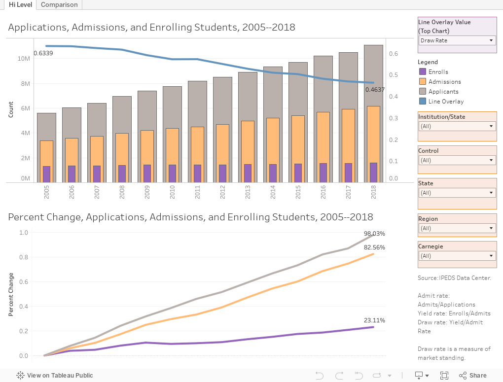
So I redid it, using trend data from 2005 to 2018.  First a couple of definitions:


  • Admit rate is the percentage of applicants who were offered admission (admits/applicants).
  • Yield rate is the percentage of admitted students who enroll (enrollers/admits).
  • Draw rate is not commonly known, and I wish I remember who first mentioned it to me in the 1980's.  It stuck with me and is a valuable metric, I think, as we attempt to measure market position.  It's Yield Rate/Admit Rate, and it sorts out the super-selective places even within the category.  For example, The Average Draw Rate is about .46; Stanford's is 18, and Dartmouth's is about 7.  It's intended to punish institutions who artificially inflate application numbers to appear to be more selective, as yield usually drops when you do that.  Of course, now many colleges manipulate this (even if they don't know it) by using ED, ED2, EA, etc. to drive yield higher.
  • The universe is about 2,000 four-year public and private, not-for-profit institutions that report admissions data to IPEDS.  Open admissions institutions are not required to do so.
There are just two views on this.  The first shows two charts.  On the top, you see the total applications, admits, and enrolling students over time.  Use the control at top right (purple box) to change the value on the blue line to show admit, yield, or draw, as you like.  The bottom chart shows the percentage increase since 2005 of those same numbers.

If you don't want to look at the whole universe, use the filters (orange boxes).  You can choose any subset of institutions you wish: Public institutions in the Southeast, for instance; or Doctoral institutions; or even a single institution if that's what you want.

The second tab (across the top) is for Enrollment people or anyone who wants to compare one institution to another.  Choose your focus institution on the top chart (Boston University is the starting value, but you can choose any institution); then create a comparison group on the bottom chart.  For instance, Michigan State might want to compare itself to Land Grant Universities in the Great Lakes Region.  Three clicks is all it takes.  Highlight the year to, well, highlight a specific year.

Let me know what you think, and, of course feel free to share with others at your institution.  This may answer a lot of "what" questions, and maybe a few "why" questions, but the answers don't always provide insight.

That's what they pay you for.


Comments

Popular posts from this blog

First-year student (freshman) migration, 2022

A new approach to freshman migration, which is always a popular post on Higher Ed Data Stories. If you're a regular reader, you can go right to the visualization and start interacting with it.  And I can't stress enough: You need to use the controls and click away to get the most from these visualizations. If you're new, this post focuses on one of the most interesting data elements in IPEDS: The geographic origins of first-year (freshman) students over time.  My data set includes institutions in the 50 states and DC.  It includes four-year public and four-year, private not-for-profits that participate in Title IV programs; and it includes traditional institutions using the Carnegie classification (Doctoral, Masters, Baccalaureate, and Special Focus Schools in business, engineering, and art/design. Data from other institutions is noisy and often unreliable, or (in the case of colleges in Puerto Rico, American Samoa, and other territories, often shows close to 100% of enro...

Educational Attainment and the Presidential Elections

I've been fascinated for a while by the connection between political leanings and education: The correlation is so strong that I once suggested that perhaps Republicans were so anti-education because, in general, places with a higher percentage of bachelor's degree recipients were more likely to vote for Democrats. The 2024 presidential election puzzled a lot of us in higher education, and perhaps these charts will show you why: We work and probably hang around mostly people with college degrees (or higher).  Our perception is limited. With the 2024 election data just out , I thought I'd take a look at the last three elections and see if the pattern I noticed in 2016 and 2020 held.  Spoiler: It did, mostly. Before you dive into this, a couple of tips: Alaska's data is always reported in a funky way, so just ignore it here.  It's a small state (in population, that is) and it's very red.  It doesn't change the overall trends even if I could figure out how to c...

Education Levels in the US, by State and Attainment

Attainment has always been an interesting topic for me, every since I first got stunned into disbelief when I looked at the data over time.  Even looking at shorter periods can lead to some revelations that many don't make sense at first. Here is the latest data from NCES, published in the Digest of Education Statistics . Please note that this is for informational purposes only, and I've not even attempted to visualize the standard errors in this data, which vary from state-to-state.  There are four views year, all looking at educational attainment by state in 2012 and 2022.   The first shows data on a map: Choose the year, and choose the level of attainment.  Note that the top three categories can be confusing: BA means a Bachelor's degree only; Grad degree means at least a Master's (or higher, of course); and BA or more presumably combines those two.  Again, standard errors might mean the numbers don't always add up perfectly. The second shows the data o...