It's always good to get some perspective. And thus, every so often, I download fresh data and do this visualization, with a few variations on a theme.
We love to focus our collective attention and wonder on a handful of high profile, well known, well resourced, and highly selective institutions. Is that amount of attention warranted? You decide.
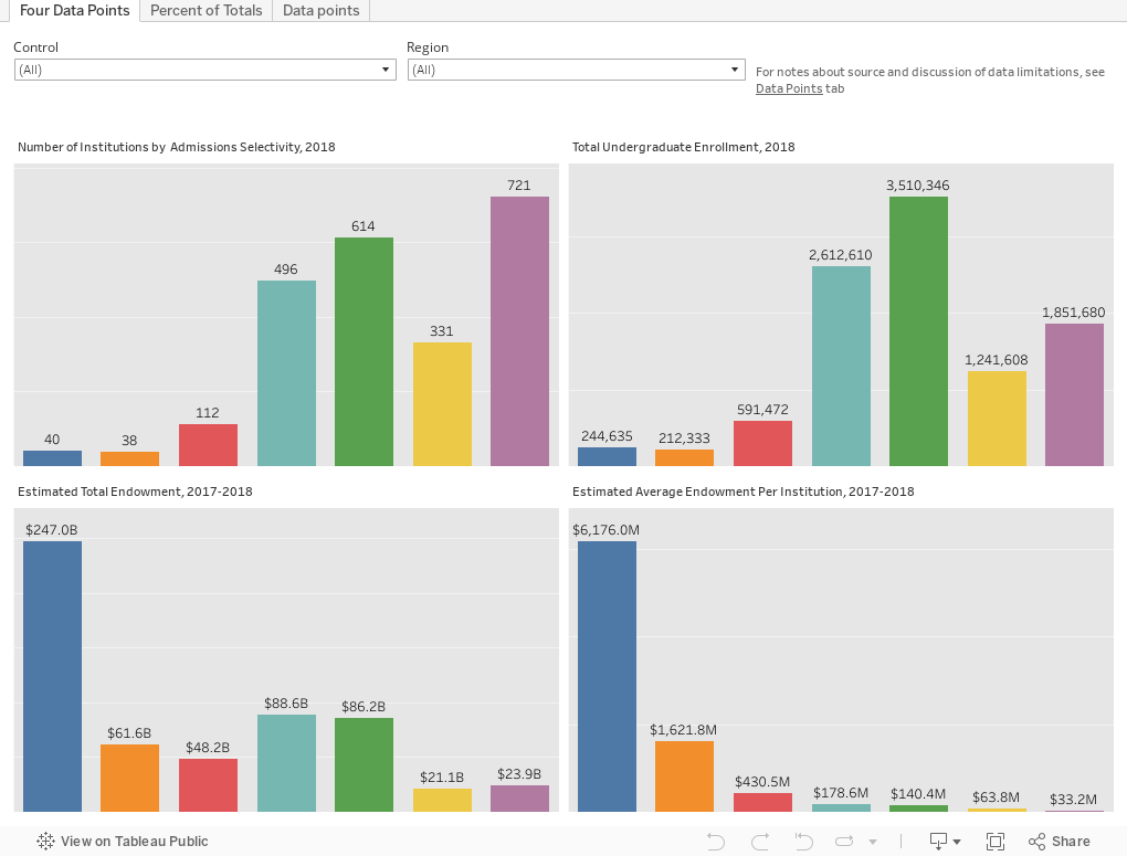
This shows just under 2,400 four-year public and private, not-for-profit institutions. I've broken these institutions into selectivity bands, based on 2018 freshman admissions data. You can see how many there are, how many students they enroll, how much of endowment they collectively control, and and what their average endowments are on the first tab. The second tab looks at variables by percentage of totals: Thus, not how much, but what percentage? Be sure to read the Data Notes tab for a few minor caveats.
This is not precise, but the patterns would hold for the most part. Of course, you can also see what percentage of college students in the US go to non-selective, or moderately selective colleges. And, I hope you'd compare them to the blue bloods--I'm sorry, the blue bars-- to compare.
And the next time you hear a news story about one of them, try to remember what percentage of the market attends these institutions.
Comments
Post a Comment