This is always a popular post, it seems, and I've had a couple of people already ask when it was going to be out. Wait no more.
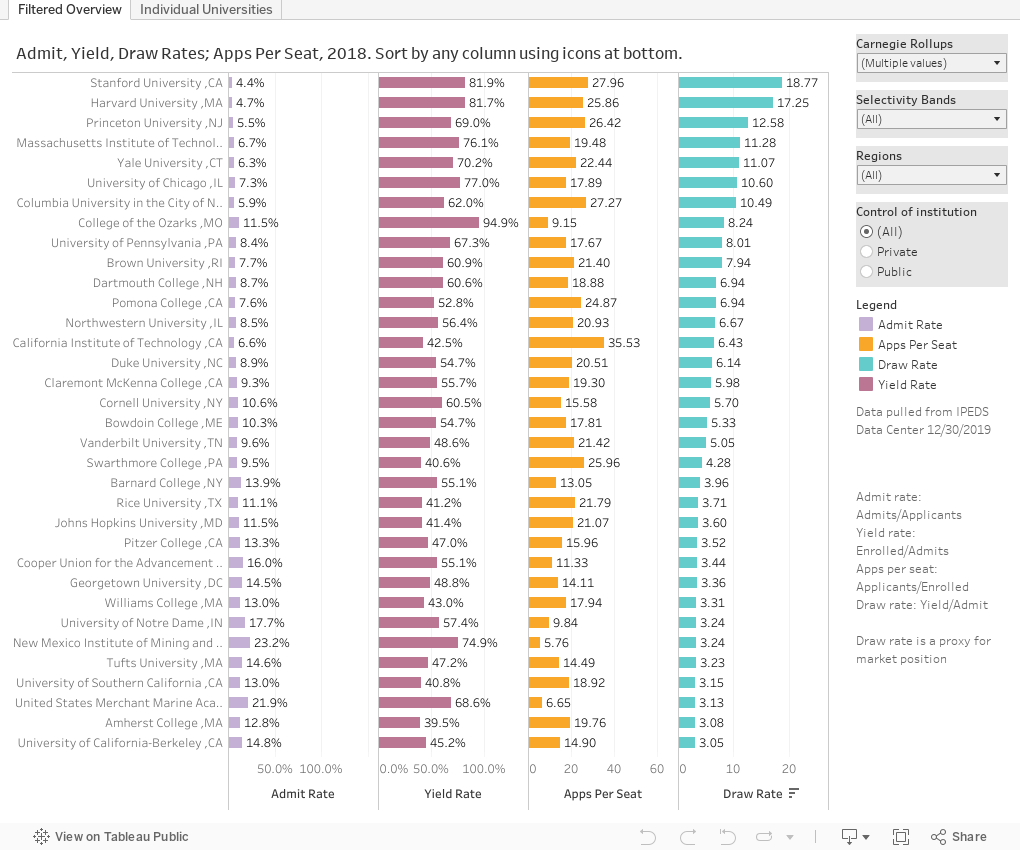
This is IPEDS 2018 admissions data, visualized for you in two different ways. You can switch using the tabs across the top.
The first view is the universe of colleges and universities that report data; not every college is required to, and a few leave data out, and test optional colleges are not supposed to report test scores. But IPEDS is not perfect, so if you find any problems, contact the college.
On the first view, you'll see 1,359 four-year private and public, not-for-profit institutions displayed. In order to make this as clean as possible, I've taken out some specialty schools (nursing, business, engineering, etc.) as many of those don't have complete data. But you can put them back in using the filter at top right.
Hover over any bar, and a little chart pops up showing undergraduate enrollment by ethnicity.
You can also choose to look at selected institutions by selectivity, or region, or control, using any of the filters at right. The four data displays are:
- Admit rate (percentage of applicants offered admission)
- Yield rate (percentage of those offered who enrolled)
- Applications per seat (applicants/enrolling)
- Draw rate (yield rate divided by admit rate), which is a good measure of market power. Cornell and Harvard are both in the Ivy League and both highly selective, but Harvards' draw is three times that of Cornell. It allows you to take similar institutions and sort them out. Draw, of course, is affected by the two variables that go into it, and thus things like percentage of class taken early can help manipulate it.
You can sort the colleges you've selected by any of the columns: Just look for the little icon near the label at the bottom and click on it.
The second view allows you to see the details of an individual college or university. Select it using the box at the very top to see:
- Applications, admits, and enrolls
- Undergraduate enrollment by ethnicity
- Admit rate for men and women and overall, and the difference between men and women, expressed as men's advantage. Positive numbers favor men; negative numbers favor women.
- SAT and ACT scores at the 25th and 75th percentile.
I hope this is helpful. Let me know if you notice anything in the comments, below.
Comments
Post a Comment