This will probably be the final post in Higher Ed Data Stories for a while. As you may already know, I'm leaving DePaul for the "best coast" to take the position of Vice Provost of Enrollment at Oregon State University, effective July 1. Thus, I'll be in personal and professional transition for a while, and once I arrive, I'll be busy learning a new institution and working on new challenges that should keep me occupied for a while. (Additionally, I'm not sure what my Tableau situation will be like...)
As you may already know, HEDS got its start when I decided to revise and share work I was already doing in my job at DePaul. Much of it, I presumed, would be of interest to university colleagues and high school and independent counselors. But I had no idea how many people craved information like this.
So, for now, here is information about bachelor's degrees earned in 2011, 2014, and 2017, the most recent available in the IPEDS data center. It's presented three different ways so you can find the information you're curious about.
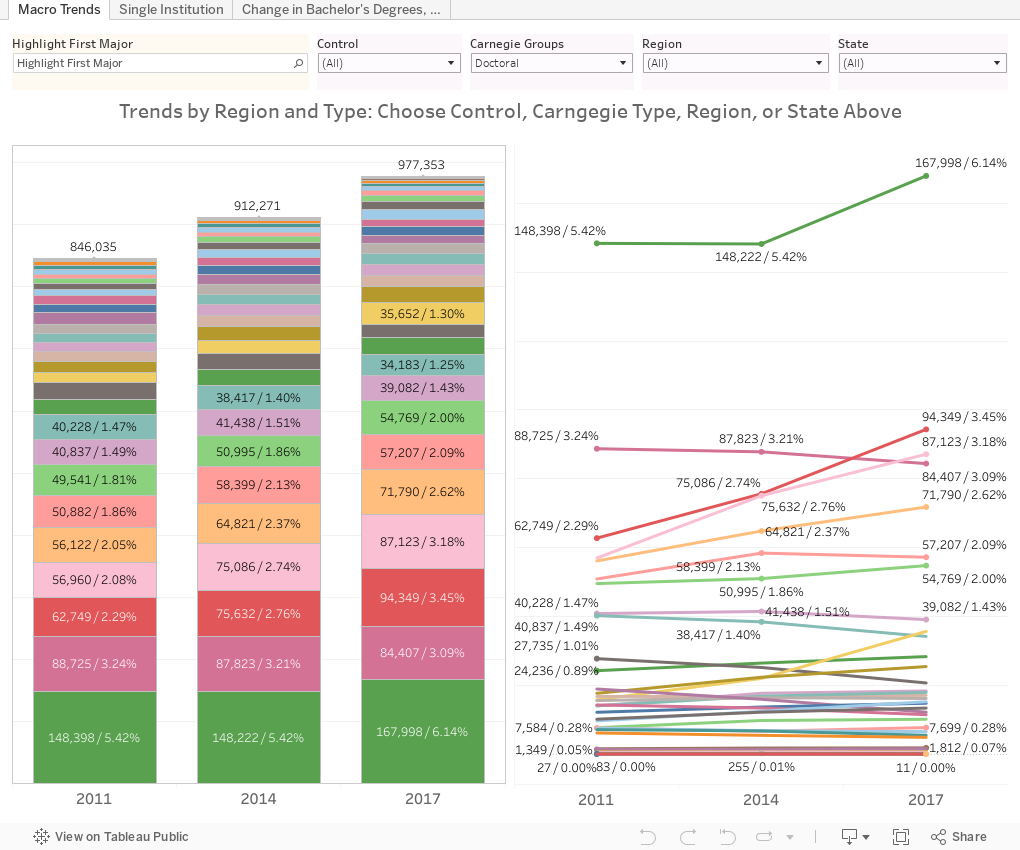
First Tab: Macro Trends shows bachelor's degrees awarded by US four-year, public and private, not-for-profit institutions in three years (2011, 2014, and 2017). Use the highlight control at top to call out a specific area, and use the filters to limit the universe, for instance, to look at just private colleges in New England, or Doctoral Institutions in the Southeast. This will give you an overall perspective on the market, which is much bigger, much more powerful, and far more independent than we'd like to admit. Hover over data points for details via the popup.
Second Tab: Single Institution allows you to select a single college or university to compare over time. You generally won't see a lot of change over any three-year period, but the overall upward trends are interesting. The slices are labeled by total number and percent of total for ease of comparison.
Third Tab: Changes in Bachelor's Degrees breaks out the data by discipline. It starts with Education majors, but you can use the control to change it to any academic area. Again, if you don't want to see the whole universe of institutions, use the filters to change the included universities.
One note about this: Some institutions have meteoric increases due to small base numbers in 2011. For instance, going from 2 to 16 is a 700% increase, which is interesting but not compelling. To make the data more meaningful, I set the filter (at lower right) to include only those institutions with at least 50 degrees awarded in the discipline in 2011. You might want to change this, to 15 for Philosophy, for instance, or 100 for Engineering. As always, you can't break this; just use the reset icon at lower right.
And as always, let me know what you see that's interesting.
As you may already know, HEDS got its start when I decided to revise and share work I was already doing in my job at DePaul. Much of it, I presumed, would be of interest to university colleagues and high school and independent counselors. But I had no idea how many people craved information like this.
So, for now, here is information about bachelor's degrees earned in 2011, 2014, and 2017, the most recent available in the IPEDS data center. It's presented three different ways so you can find the information you're curious about.
First Tab: Macro Trends shows bachelor's degrees awarded by US four-year, public and private, not-for-profit institutions in three years (2011, 2014, and 2017). Use the highlight control at top to call out a specific area, and use the filters to limit the universe, for instance, to look at just private colleges in New England, or Doctoral Institutions in the Southeast. This will give you an overall perspective on the market, which is much bigger, much more powerful, and far more independent than we'd like to admit. Hover over data points for details via the popup.
Second Tab: Single Institution allows you to select a single college or university to compare over time. You generally won't see a lot of change over any three-year period, but the overall upward trends are interesting. The slices are labeled by total number and percent of total for ease of comparison.
Third Tab: Changes in Bachelor's Degrees breaks out the data by discipline. It starts with Education majors, but you can use the control to change it to any academic area. Again, if you don't want to see the whole universe of institutions, use the filters to change the included universities.
One note about this: Some institutions have meteoric increases due to small base numbers in 2011. For instance, going from 2 to 16 is a 700% increase, which is interesting but not compelling. To make the data more meaningful, I set the filter (at lower right) to include only those institutions with at least 50 degrees awarded in the discipline in 2011. You might want to change this, to 15 for Philosophy, for instance, or 100 for Engineering. As always, you can't break this; just use the reset icon at lower right.
And as always, let me know what you see that's interesting.
Comments
Post a Comment