If you are at all interested in college admissions, you are perhaps already sick of the coverage of the Varsity Blues Scandal, in which some parents allegedly conspired to break the law to get unfair advantages for their children in the admissions process.
Almost no one thinks this behavior is appropriate. Almost no one.
There have been calls for reform in college admissions, and it's clear that this scandal has exposed some weak spots in the process.
At some institutions. OK, a handful of institutions. If you had your thumb removed.
And even then, it's a coach or two at those institutions who gave into greed and decided to take the money in exchange for a greased path to admission and a fake spot on the team for these students, some of whom apparently had no idea about the machinations behind the scenes on their behalf.
Admittedly, as we get deeper into discovery on this, we may find that the cheating on the SAT and ACT scandal goes far deeper than we would have anticipated; this will create many more problems for probably many more universities. But interestingly, the most zealous users of the SAT and ACT are the very institutions everyone is fascinated with, and this is what they get for putting faith in a test a) originally designed to keep Jews out of the Ivy League that is b) now produced by private companies accountable to no one, and that c) measures wealth and ethnicity better than academic potential. (The Institutional Research Office at Yale knew this as early as the mid-60's and fortunately for all of us, put it on paper and sent it to the archives.)
However, in this instance, I have to be uncharacteristically charitable to College Board and ACT, as their good faith efforts to make reasonable accommodations to students with diagnosed learning differences was--and still can be, apparently--exploited by a handful of parents with money and access to willing psychologists and psychiatrists, who should also be punished.
Those of us who work in higher education have long since given up trying to corral the media fascination with this handful of institutions and their quirky ways. But the calls for reform suggest that admission to college in the US is extraordinary competitive, so seeing the scope and context from a high level is still important, I think.
So, this:
Four views of admissions data from 2001--2017, all interactive and filterable to your heart's content. Dive right in, or if you've never interacted with Tableau software before, take a few minutes to learn how to interact.
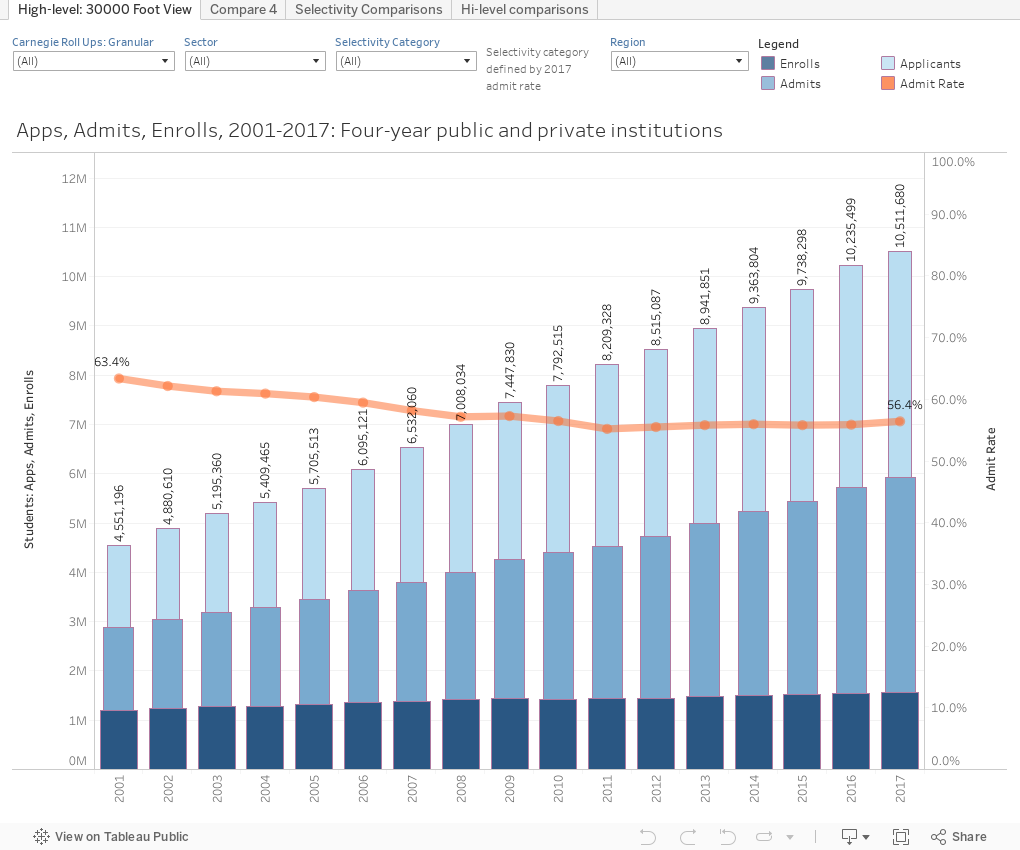
1st Tab: (tabs are across the top): The three bars represent freshman applications, admissions, and enrollments at all four-year, public and private not-for profit institutions in America, from 2001--2017 that are not open enrollment. The number of institutions varies a tiny bit over time, but nothing that makes this analysis any different, fundamentally.
The orange line represents the aggregate admissions rate (percentage of applicants admitted). If you want to look at a subset of these institutions, use one of the controls at the top: Look at just public universities, or just colleges in New England, for instance, or use the filters in any combination.
2nd Tab: Compare any four institutions to each other. The view starts with four highly regarded Big 10 institutions, but you can use the drop down boxes to choose any four institutions you wish, from Abilene Christian to Youngstown State.
3rd Tab: This shows the universe broken into groups of colleges by selectivity. Use the controls to see how many applications, admissions, or enrolls at each band of colleges (Most Selective is a 2017 Admit Rate of 10% or less, for instance; Extremely includes all colleges with admit rates between 10% and 25% in that year. And so on.)
The top chart shows raw numbers; the middle chart shows percent of total, and the bottom shows how many colleges in each category. Hint: Dark blue is the most selective group of colleges--the ones everyone talks about. And remember, this data doesn't even include Community Colleges (who do not report admissions data to IPEDS).
4th Tab: This shows four key metrics for all colleges, and can be broken out (that is the lines separated and colored) by several different categories using the control at top right, and can be filtered to show only certain types of colleges, using the controls in the middle of the right-hand column.
Draw rate (the bottom chart) is especially important, because it's a measure of market power, calculated by the yield rate/admit rate. If I might make a suggestion: Notice national averages or draw rates, and then look at it by the selectivity categories. While almost every college strives to raise this rate, note who has: The ones everyone talks about. Chicken, meet egg. You two fight it out.
As always, you can't break anything. The little reset arrow in the lower right is your friend, so use it if you get stuck.
And let me know what you think.
Almost no one thinks this behavior is appropriate. Almost no one.
There have been calls for reform in college admissions, and it's clear that this scandal has exposed some weak spots in the process.
At some institutions. OK, a handful of institutions. If you had your thumb removed.
And even then, it's a coach or two at those institutions who gave into greed and decided to take the money in exchange for a greased path to admission and a fake spot on the team for these students, some of whom apparently had no idea about the machinations behind the scenes on their behalf.
Admittedly, as we get deeper into discovery on this, we may find that the cheating on the SAT and ACT scandal goes far deeper than we would have anticipated; this will create many more problems for probably many more universities. But interestingly, the most zealous users of the SAT and ACT are the very institutions everyone is fascinated with, and this is what they get for putting faith in a test a) originally designed to keep Jews out of the Ivy League that is b) now produced by private companies accountable to no one, and that c) measures wealth and ethnicity better than academic potential. (The Institutional Research Office at Yale knew this as early as the mid-60's and fortunately for all of us, put it on paper and sent it to the archives.)
However, in this instance, I have to be uncharacteristically charitable to College Board and ACT, as their good faith efforts to make reasonable accommodations to students with diagnosed learning differences was--and still can be, apparently--exploited by a handful of parents with money and access to willing psychologists and psychiatrists, who should also be punished.
Those of us who work in higher education have long since given up trying to corral the media fascination with this handful of institutions and their quirky ways. But the calls for reform suggest that admission to college in the US is extraordinary competitive, so seeing the scope and context from a high level is still important, I think.
So, this:
Four views of admissions data from 2001--2017, all interactive and filterable to your heart's content. Dive right in, or if you've never interacted with Tableau software before, take a few minutes to learn how to interact.
1st Tab: (tabs are across the top): The three bars represent freshman applications, admissions, and enrollments at all four-year, public and private not-for profit institutions in America, from 2001--2017 that are not open enrollment. The number of institutions varies a tiny bit over time, but nothing that makes this analysis any different, fundamentally.
The orange line represents the aggregate admissions rate (percentage of applicants admitted). If you want to look at a subset of these institutions, use one of the controls at the top: Look at just public universities, or just colleges in New England, for instance, or use the filters in any combination.
2nd Tab: Compare any four institutions to each other. The view starts with four highly regarded Big 10 institutions, but you can use the drop down boxes to choose any four institutions you wish, from Abilene Christian to Youngstown State.
3rd Tab: This shows the universe broken into groups of colleges by selectivity. Use the controls to see how many applications, admissions, or enrolls at each band of colleges (Most Selective is a 2017 Admit Rate of 10% or less, for instance; Extremely includes all colleges with admit rates between 10% and 25% in that year. And so on.)
The top chart shows raw numbers; the middle chart shows percent of total, and the bottom shows how many colleges in each category. Hint: Dark blue is the most selective group of colleges--the ones everyone talks about. And remember, this data doesn't even include Community Colleges (who do not report admissions data to IPEDS).
4th Tab: This shows four key metrics for all colleges, and can be broken out (that is the lines separated and colored) by several different categories using the control at top right, and can be filtered to show only certain types of colleges, using the controls in the middle of the right-hand column.
Draw rate (the bottom chart) is especially important, because it's a measure of market power, calculated by the yield rate/admit rate. If I might make a suggestion: Notice national averages or draw rates, and then look at it by the selectivity categories. While almost every college strives to raise this rate, note who has: The ones everyone talks about. Chicken, meet egg. You two fight it out.
As always, you can't break anything. The little reset arrow in the lower right is your friend, so use it if you get stuck.
And let me know what you think.
As I write, I'm going through the madness of college admissions with my high school senior. She scored 35 out of 36 on the ACT, 1540 out of 1600 on the SAT, has nothing but As in Honors and AP courses, was co-captain of the varsity soccer team, and had a long list of extracurriculars and leadership positions. Applying to engineering programs, we thought she'd have her choice of schools, but this week she was rejected from Northwestern and Rice and wait-listed at Vanderbilt. Today she hears from Dartmouth and Duke, but I'm not expecting good news based on the previous decisions. She got in to Villanova (where I work) and Northeastern. It just makes you wonder what it takes to get into these elite schools. Very disheartening for kids who work so hard to make it to the top.
ReplyDeleteCan you make these observations from the data? Since 2001, there has been an increase of 34% in students entering private and public universities. Cumulative applications have risen by 131%, because the average number of applications-to-enrollments has increased from 3.8 to 6.7. And is there any evidence that acceptance rates have gone down because of 1) the higher number of applications colleges are receiving for limited spots in the incoming class (at least for some schools, which then control how many they can admit) and/or 2) candidates increasingly applying to "stretch" schools as they increase the number of applications they submit? Would adding trend lines for these percentage changes add to your story? Trust all is well, Jon. Great work!
ReplyDelete