Several years ago, The College Board produced a study of "discrepant performance," after studying about 150,000 students and their freshman-year grades in college. If you want to see the study, you can get a pdf of it here. The title, of course, is interesting. (And before we get too deep, it's important to note that these are old SAT scores, in case you think the new test is better and want to argue that point, nice tight concordance between the old and the new notwithstanding.)
Discrepant performance is defined as standardized test scores that are inconsistent with a student's academic performance in high school. The distributions of scores and grades were normalized, and then each student's z-score on tests was compared to their z-score on grades. Just under two-thirds of students had scores and grades that were consistent, and we don't need to talk too much more about them.
The most interesting thing is the other one third of students: Those whose grades were higher than their tests (High GPA) and those whose tests were higher than their grades (High SAT). Each group was about one-sixth (17.5%) of the sample.
Back to The College Board presentation for a moment. It suggests that high testers with low grades are a better risk than low testers with high grades, but it also says grades are a better predictor by themselves than tests. That's not statistically impossible, of course, but it does seem curious. And it does fly in the face of both my experience and conventional wisdom regarding the best way to make admissions decisions; I think most admissions officers believe high tests/low grades are the weaker bet of the two extremes.
But let's go with that for a minute. And let's ask why it might be true. But first, let's argue with what little methodology is presented here in this study. A lot of the conceptual problem in predicting human performance, of course, comes from our own arrogance: In this case, the belief that a limited number of pre-college factors represent the sum total of factors affecting freshman grades. How limited, in this case? Two.
If you really wanted to get a good model to predict freshman performance, you'd look at a lot of factors: Family income, parental attainment, ethnicity of the student vis-à-vis the student body and vis-à-vis the high school they came from, just to name a few. All of those factors are important, and what we find is that students from lower-income families whose parents didn't go to college, and who feel out of place in the college they've enrolled have some struggles. I don't see any of these factors controlled for in this analysis (if I'm wrong I'll be happy to correct it.)
You can see the table of how discrepant performance breaks out, but you can you really see it? Let me draw you a picture. On this chart, (which shows only the students with discrepant performance), the light blue bar on the left chart shows the number of students with high tests and lower GPA (High SAT); the orange bar on the left chart show the number of students with low tests and high GPA (High GPA). Hover over the bars to see how many there are. One the right chart, the mauve colored bar shows what percentage of each group had high SAT. (The ones The College Board says you should give the breaks to).
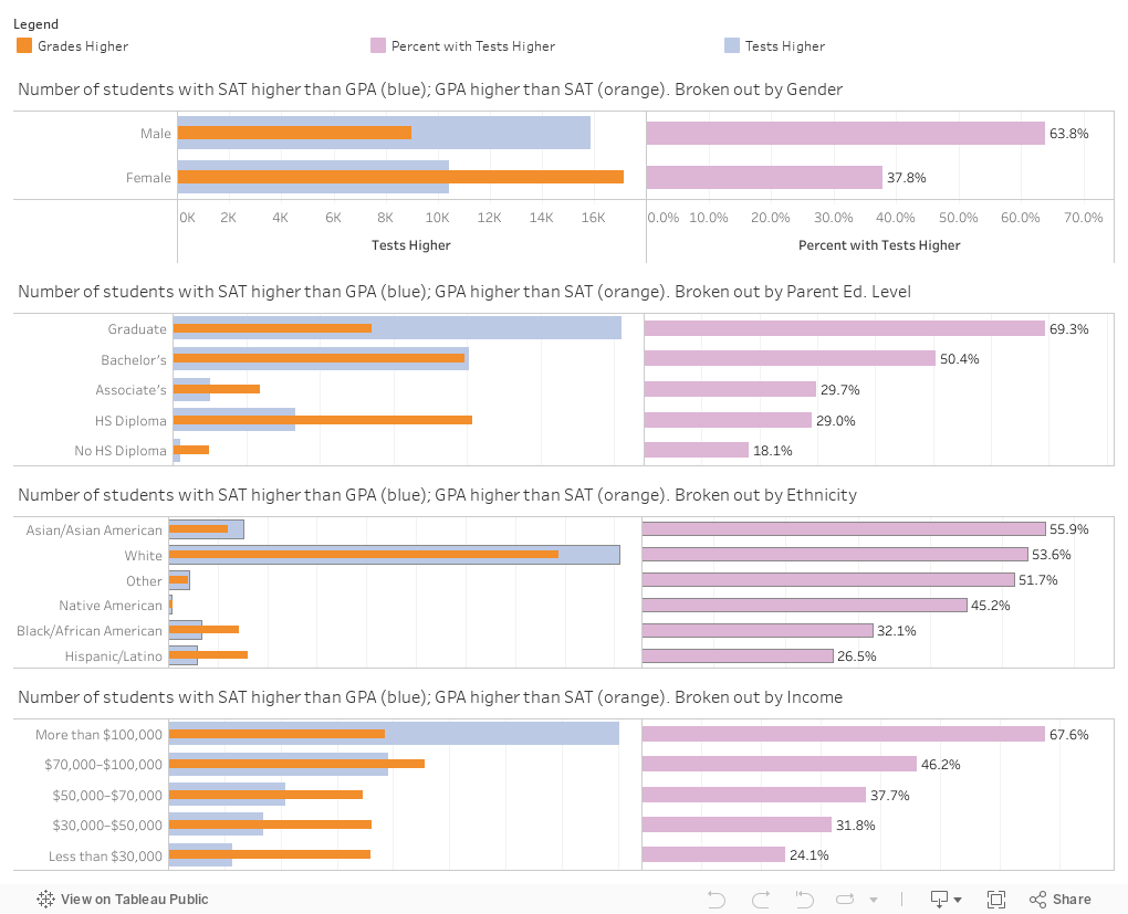
Surprise: Guess who tends to have higher grades and lower scores? Women (who get better grades at every level of education than men, by the way); poorer students; students from underrepresented ethnic groups, and students whose parents have less education. This narrative plays smoothly into the prevailing wisdom of 1930, which suggested they just were not suited for higher education, and which some people still seem to believe.
Who has higher scores and lower grades? Men, white and Asian students, wealthier students, and children of well educated parents. And The College Board statistics tell you these are the students you should give a break to in the admissions process because they did better on a three-hour test. You see, in the simple approach, only SAT scores and GPA determine your college performance, and it's not at all affected by how much you have to work, or worry about money, or spend time figuring out how college operates, or whether you belong there. So keep giving the white guys the break.
Two final points: If I took the labels off the bars, and told you "This is the gender chart," or "This is the income chart" you could probably put the labels on in correct order pretty easily. Second (and this could be a whole other blog post all together) even the poorest students (a B- average) with the lowest test scores ended the first year with an average GPA of 2.0, and the differences between and among the groups are exaggerated by a truncated y-axis on the chart in the presentation.
As always, let me know what you think.
Discrepant performance is defined as standardized test scores that are inconsistent with a student's academic performance in high school. The distributions of scores and grades were normalized, and then each student's z-score on tests was compared to their z-score on grades. Just under two-thirds of students had scores and grades that were consistent, and we don't need to talk too much more about them.
The most interesting thing is the other one third of students: Those whose grades were higher than their tests (High GPA) and those whose tests were higher than their grades (High SAT). Each group was about one-sixth (17.5%) of the sample.
Back to The College Board presentation for a moment. It suggests that high testers with low grades are a better risk than low testers with high grades, but it also says grades are a better predictor by themselves than tests. That's not statistically impossible, of course, but it does seem curious. And it does fly in the face of both my experience and conventional wisdom regarding the best way to make admissions decisions; I think most admissions officers believe high tests/low grades are the weaker bet of the two extremes.
But let's go with that for a minute. And let's ask why it might be true. But first, let's argue with what little methodology is presented here in this study. A lot of the conceptual problem in predicting human performance, of course, comes from our own arrogance: In this case, the belief that a limited number of pre-college factors represent the sum total of factors affecting freshman grades. How limited, in this case? Two.
If you really wanted to get a good model to predict freshman performance, you'd look at a lot of factors: Family income, parental attainment, ethnicity of the student vis-à-vis the student body and vis-à-vis the high school they came from, just to name a few. All of those factors are important, and what we find is that students from lower-income families whose parents didn't go to college, and who feel out of place in the college they've enrolled have some struggles. I don't see any of these factors controlled for in this analysis (if I'm wrong I'll be happy to correct it.)
You can see the table of how discrepant performance breaks out, but you can you really see it? Let me draw you a picture. On this chart, (which shows only the students with discrepant performance), the light blue bar on the left chart shows the number of students with high tests and lower GPA (High SAT); the orange bar on the left chart show the number of students with low tests and high GPA (High GPA). Hover over the bars to see how many there are. One the right chart, the mauve colored bar shows what percentage of each group had high SAT. (The ones The College Board says you should give the breaks to).
Surprise: Guess who tends to have higher grades and lower scores? Women (who get better grades at every level of education than men, by the way); poorer students; students from underrepresented ethnic groups, and students whose parents have less education. This narrative plays smoothly into the prevailing wisdom of 1930, which suggested they just were not suited for higher education, and which some people still seem to believe.
Who has higher scores and lower grades? Men, white and Asian students, wealthier students, and children of well educated parents. And The College Board statistics tell you these are the students you should give a break to in the admissions process because they did better on a three-hour test. You see, in the simple approach, only SAT scores and GPA determine your college performance, and it's not at all affected by how much you have to work, or worry about money, or spend time figuring out how college operates, or whether you belong there. So keep giving the white guys the break.
Two final points: If I took the labels off the bars, and told you "This is the gender chart," or "This is the income chart" you could probably put the labels on in correct order pretty easily. Second (and this could be a whole other blog post all together) even the poorest students (a B- average) with the lowest test scores ended the first year with an average GPA of 2.0, and the differences between and among the groups are exaggerated by a truncated y-axis on the chart in the presentation.
As always, let me know what you think.
Reminder: I appreciate support for webhosting and other costs associated with creating Higher Ed Data Stories. You can support these efforts here.
I have intuitively sensed this, but it is good to see the data. Somehow your blog fell of my radar. Good to come back to it. Keep it up. Thanks, Carey
ReplyDelete