If you want to strike fear into the hearts of enrollment managers everywhere, just say, "The trustees want to talk about the discount rate."
If you don't know, the discount rate is a simple calculation: Institutional financial aid as a percentage of tuition (or tuition and fees) revenue. If your university billed $100 million in tuition and fees, and awarded $45 million in aid, your discount is 45%. In that instance, you'd have $55 million in hard cash to run the organization.
Discount used to be a reporting function, something you would look at when the year was over to see where you stood. Now, it's become a management target. And that's a problem. If you want to know why, read this quick little explanation of Campbell's Law. The short explanation is this: If you want to lower discount--if that's really the thing you are after--you can do it very easily. Just shrink your enrollment. Or lower your quality, as measured by things like GPA and test scores. Easy.
Of course, this is generally not what people mean when they say they want to decrease the discount rate. They usually mean "decrease the discount and keep everything else the same, or better yet, improve those measures." That's not so easy. The simple reason is that decreasing your discount means you're raising price. And we all know what happens when you raise price, unless you turn your college into a Giffen good which you can't do, of course.
What people really want is more net revenue: that $55 million in the example above. You'd probably like to have it be $57 million, which would mean you lower your discount rate to 43%. That happens because you either charge students more, or enroll more students who bring external aid, like Pell or state grants. You don't care, really. Cash is cash.
The absurdity of discount was demonstrated to me by a finance professor friend, who said back in the late 90's, "If we generate $12,000 in average net revenue on an $18,000 tuition (a 33% discount), let's propose raising tuition to $100,000 and the discount to 80%." Yes, believe it or not, the denominator is important when calculating percentages, which is why it's hard to compare discounts in a meaningful way for competitors who charge more.)
If you're interested, here's a little presentation I did on why colleges have tended to increase discount and net revenue at the same time. This exercise is probably close to the breaking point, however.
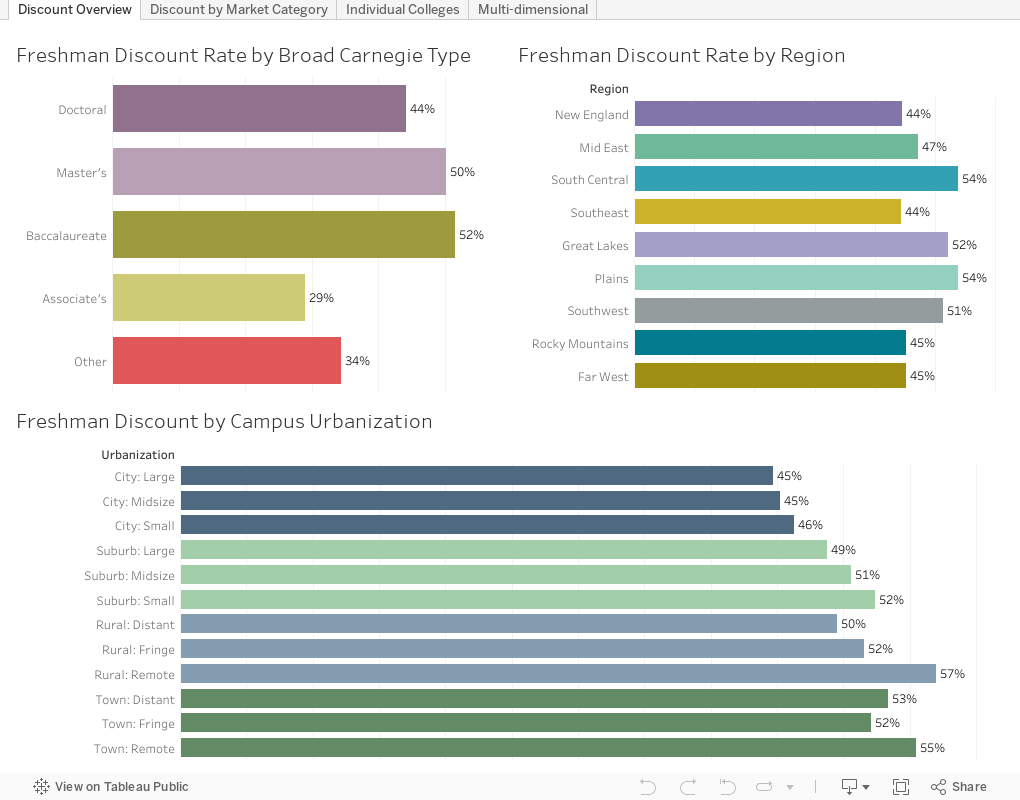
Now that you understand a little more about discount, on to the data. This is from the IPEDS data for Fall, 2016, the most recent available showing both aid and admissions data. There are four views, using the tabs across the top.
View 1: Discount overview
No interactivity: Just average discount rates by Carnegie type, Region, and Urbanicity. I think the bottom one is the most fascinating discovery I've come across yet. Just by playing with the data.
View 2: Discount by Market Category
This one combines the three categories above: Carnegie, Region, and Urbanicity into a single category to see how discounts play out. In order to be included in this, there had to be at least ten colleges in the category. You can see that the highest discount, on average, is Baccalaureate institutions in distant towns in the South Central region of the US. You can color this by any of the three individual categories using the little control at the top right.
View 3: Individual Colleges
This lists all the private colleges for which I could calculate a freshman discount rate and net revenue per freshman. The controls at the top allow you to look at schools like yours, if you want. Note the slider at top right: I started showing freshman classes of at least 200, as some small college data gets a bit funky. You can expand or narrow that by pulling the sliders to your heart's content.
Sort by any column by hovering over the little icon in the x-axis label. If you get in trouble, you can always reset using the arrow control at lower right.
View 4: Multidimensional
Each college in this view is a bubble, arrayed on the chart in two dimensions: Freshman Discount and Average net revenue per freshman. The size of the bubble shows freshman selectivity (bigger is more selective). The color of the bubble shows the percentage of freshmen with institutional aid. Note that the highest net revenue institutions are also the most selective, suggesting people will pay for prestige (or prestige and wealth pave the way to admissions). And the lowest net revenue institutions are dark blue, showing almost everyone getting institutional aid (either "merit" or "need-based" although those distinctions are silly.)
Use the filters to limit the colleges on the view, and use the highlight function (just start typing) to highlight the institution of your choice. Note especially what happens when you limit the view to colleges with higher tuition. Go ahead. You won't break anything.
As always, let me know what you see.
If you don't know, the discount rate is a simple calculation: Institutional financial aid as a percentage of tuition (or tuition and fees) revenue. If your university billed $100 million in tuition and fees, and awarded $45 million in aid, your discount is 45%. In that instance, you'd have $55 million in hard cash to run the organization.
Discount used to be a reporting function, something you would look at when the year was over to see where you stood. Now, it's become a management target. And that's a problem. If you want to know why, read this quick little explanation of Campbell's Law. The short explanation is this: If you want to lower discount--if that's really the thing you are after--you can do it very easily. Just shrink your enrollment. Or lower your quality, as measured by things like GPA and test scores. Easy.
Of course, this is generally not what people mean when they say they want to decrease the discount rate. They usually mean "decrease the discount and keep everything else the same, or better yet, improve those measures." That's not so easy. The simple reason is that decreasing your discount means you're raising price. And we all know what happens when you raise price, unless you turn your college into a Giffen good which you can't do, of course.
What people really want is more net revenue: that $55 million in the example above. You'd probably like to have it be $57 million, which would mean you lower your discount rate to 43%. That happens because you either charge students more, or enroll more students who bring external aid, like Pell or state grants. You don't care, really. Cash is cash.
The absurdity of discount was demonstrated to me by a finance professor friend, who said back in the late 90's, "If we generate $12,000 in average net revenue on an $18,000 tuition (a 33% discount), let's propose raising tuition to $100,000 and the discount to 80%." Yes, believe it or not, the denominator is important when calculating percentages, which is why it's hard to compare discounts in a meaningful way for competitors who charge more.)
Now that you understand a little more about discount, on to the data. This is from the IPEDS data for Fall, 2016, the most recent available showing both aid and admissions data. There are four views, using the tabs across the top.
View 1: Discount overview
No interactivity: Just average discount rates by Carnegie type, Region, and Urbanicity. I think the bottom one is the most fascinating discovery I've come across yet. Just by playing with the data.
View 2: Discount by Market Category
This one combines the three categories above: Carnegie, Region, and Urbanicity into a single category to see how discounts play out. In order to be included in this, there had to be at least ten colleges in the category. You can see that the highest discount, on average, is Baccalaureate institutions in distant towns in the South Central region of the US. You can color this by any of the three individual categories using the little control at the top right.
View 3: Individual Colleges
This lists all the private colleges for which I could calculate a freshman discount rate and net revenue per freshman. The controls at the top allow you to look at schools like yours, if you want. Note the slider at top right: I started showing freshman classes of at least 200, as some small college data gets a bit funky. You can expand or narrow that by pulling the sliders to your heart's content.
Sort by any column by hovering over the little icon in the x-axis label. If you get in trouble, you can always reset using the arrow control at lower right.
View 4: Multidimensional
Each college in this view is a bubble, arrayed on the chart in two dimensions: Freshman Discount and Average net revenue per freshman. The size of the bubble shows freshman selectivity (bigger is more selective). The color of the bubble shows the percentage of freshmen with institutional aid. Note that the highest net revenue institutions are also the most selective, suggesting people will pay for prestige (or prestige and wealth pave the way to admissions). And the lowest net revenue institutions are dark blue, showing almost everyone getting institutional aid (either "merit" or "need-based" although those distinctions are silly.)
Use the filters to limit the colleges on the view, and use the highlight function (just start typing) to highlight the institution of your choice. Note especially what happens when you limit the view to colleges with higher tuition. Go ahead. You won't break anything.
As always, let me know what you see.
Jon - this is great. I can't get the download for some reason. Shows up it crazy unreadable format.
ReplyDelete