Much has been made recently of the attempts by colleges to increase the enrollment of Pell-eligible students. For those who don't know, the Pell Grant is the federal grant awarded to students with the highest financial need. In fact, the pressure may be backfiring, in a classic case of Campbell's law.
Regardless, given the state of federal reporting requirements (why can't the FISAP be in IPEDS??), this blunt tool is still the best one we have widely available to help take stock of the economic diversity of enrolling students.
So this is where we are.
This morning, Robert Kelchen sent this tweet about the data he uses to measure grad rate gaps between Pell and Non-Pell recipients. I asked him for it, and he graciously shared it right away. I spent 30 minutes to visualize it (for our own internal use, mostly), and made it better for others who might want to take a look.
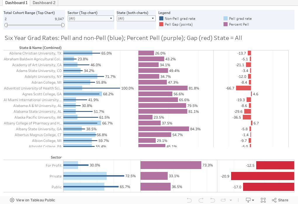
On the first view, four data points are displayed: The college's grad rate for Pell (light blue) and Non-Pell (dark blue) on the left; the percentage in the measured freshman cohort in purple in the center; and the gap, in percentage points. The identical chart at the bottom breaks it out by sector.
I recommend you use the filters at the top to limit the top chart by a) the size of the cohort (for instance, between 500 and 5,000), and then by sector. For these two filters, the bottom chart will not change. However, if you want to look at a specific state, using that filter will affect both the top and bottom.
If you want to sort the data by either the red or purple bars, hover over the top of the column, and click on the small icon that appears. Sort descending, ascending, or alphabetical on consecutive clicks.
On the second chart is a mostly a nothing burger: I was curious to see if the percentage of Pell students in the cohort had an effect on the gap. As you can see, it doesn't. On this chart, type and select any institution to see it highlighted.
And, as always, let me know what you see.
Regardless, given the state of federal reporting requirements (why can't the FISAP be in IPEDS??), this blunt tool is still the best one we have widely available to help take stock of the economic diversity of enrolling students.
So this is where we are.
This morning, Robert Kelchen sent this tweet about the data he uses to measure grad rate gaps between Pell and Non-Pell recipients. I asked him for it, and he graciously shared it right away. I spent 30 minutes to visualize it (for our own internal use, mostly), and made it better for others who might want to take a look.
On the first view, four data points are displayed: The college's grad rate for Pell (light blue) and Non-Pell (dark blue) on the left; the percentage in the measured freshman cohort in purple in the center; and the gap, in percentage points. The identical chart at the bottom breaks it out by sector.
I recommend you use the filters at the top to limit the top chart by a) the size of the cohort (for instance, between 500 and 5,000), and then by sector. For these two filters, the bottom chart will not change. However, if you want to look at a specific state, using that filter will affect both the top and bottom.
If you want to sort the data by either the red or purple bars, hover over the top of the column, and click on the small icon that appears. Sort descending, ascending, or alphabetical on consecutive clicks.
On the second chart is a mostly a nothing burger: I was curious to see if the percentage of Pell students in the cohort had an effect on the gap. As you can see, it doesn't. On this chart, type and select any institution to see it highlighted.
And, as always, let me know what you see.
Comments
Post a Comment