This data has long been of interest to high school counselors, and of course, I decided to update it at the worst possible time: During the recent shutdown of the federal government. I found the NSF website shuttered.
Fortunately, the Polar Vortex gave almost everyone in Chicago a two-day break shorty after the government re-opened, and there was not much to do with the windchill approaching -60° F; but the government had re-opened, and the data were available. So here you go.
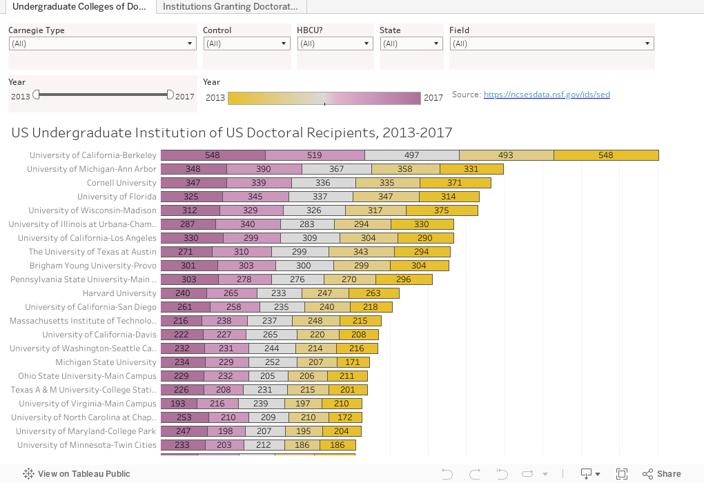
There are two simple views of doctoral education here: The first is the undergraduate institution of doctoral recipients from 2013 to 2017. You can use the controls at the top to limit your view to public or private; Carnegie type; State, or HBCU status. If you want to, you can also focus on a single year or range of years using the sliders.
For instance, if you wanted to look at how many graduates of Baccalaureate institutions in California received a doctorate in chemistry in 2014, just play around until you get there. (The top college may surprise you!)
The second view is similar, but shows the universities awarding the doctorate. The filters work the same way.
Let me know what you find interesting here.
Fortunately, the Polar Vortex gave almost everyone in Chicago a two-day break shorty after the government re-opened, and there was not much to do with the windchill approaching -60° F; but the government had re-opened, and the data were available. So here you go.
There are two simple views of doctoral education here: The first is the undergraduate institution of doctoral recipients from 2013 to 2017. You can use the controls at the top to limit your view to public or private; Carnegie type; State, or HBCU status. If you want to, you can also focus on a single year or range of years using the sliders.
For instance, if you wanted to look at how many graduates of Baccalaureate institutions in California received a doctorate in chemistry in 2014, just play around until you get there. (The top college may surprise you!)
The second view is similar, but shows the universities awarding the doctorate. The filters work the same way.
Let me know what you find interesting here.
Comments
Post a Comment