When designing a data visualization, the first thing to ask is, "What does the viewer want to see, or need to know?" If you're designing a dashboard for a CFO or a CEO or a VP for Marketing, those things are pretty straight forward: You're designing for one person and you have a pretty good idea what that person wants.
But in higher education, we want to look at segments of the industry, and trends that are specific to our sector. And there are thousands of you (if this blog post is average, that is). So I can't know.
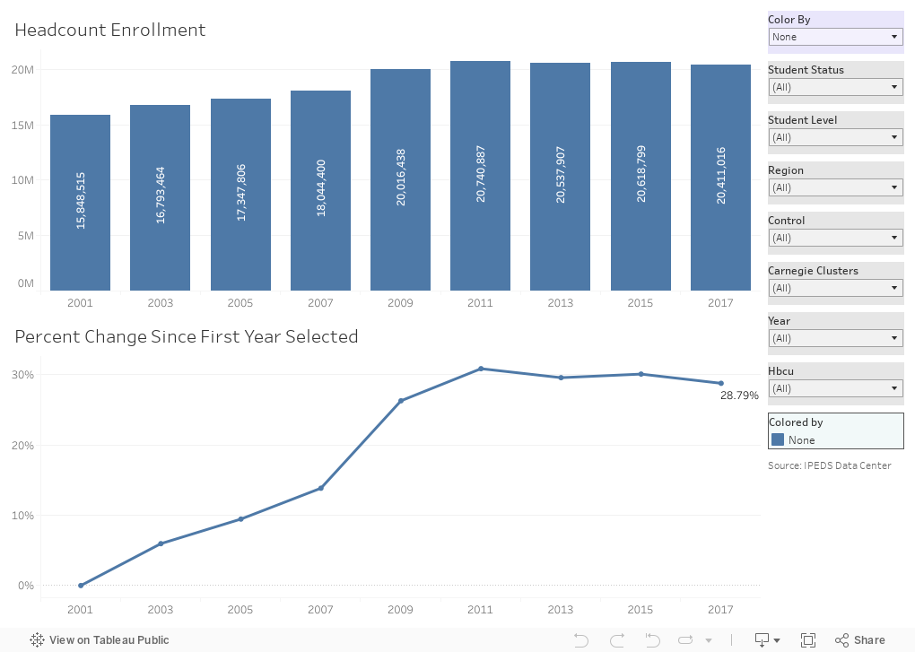
This visualization of enrollment data measures only one thing: Enrollment. But it measures several different types of enrollment (full-time, part-time, graduate, and undergraduate, in combination) at many different types of institutions (doctoral, baccalaureate, public, private, etc.) And the best thing is that you can make it yours with a few clicks.
The top chart shows total headcount, and the bottom shows percentage change since the first year selected. If you want to change the years, or change the types of enrollment, or the universe of the colleges selected, use the gray boxes at the right. At any time, use the lavender box at top right to change the breakouts of the charts: To color by region, or grad/undergrad, or any other variable listed.
There are lots of interesting trends here, some of which will help you realize that while enrollment may be declining, it's not declining everywhere, or for every type of institution.
See something interesting? Post in the comments below.
But in higher education, we want to look at segments of the industry, and trends that are specific to our sector. And there are thousands of you (if this blog post is average, that is). So I can't know.
This visualization of enrollment data measures only one thing: Enrollment. But it measures several different types of enrollment (full-time, part-time, graduate, and undergraduate, in combination) at many different types of institutions (doctoral, baccalaureate, public, private, etc.) And the best thing is that you can make it yours with a few clicks.
The top chart shows total headcount, and the bottom shows percentage change since the first year selected. If you want to change the years, or change the types of enrollment, or the universe of the colleges selected, use the gray boxes at the right. At any time, use the lavender box at top right to change the breakouts of the charts: To color by region, or grad/undergrad, or any other variable listed.
There are lots of interesting trends here, some of which will help you realize that while enrollment may be declining, it's not declining everywhere, or for every type of institution.
See something interesting? Post in the comments below.
Comments
Post a Comment