This is pretty interesting, I think, mostly for the patterns you don't see.
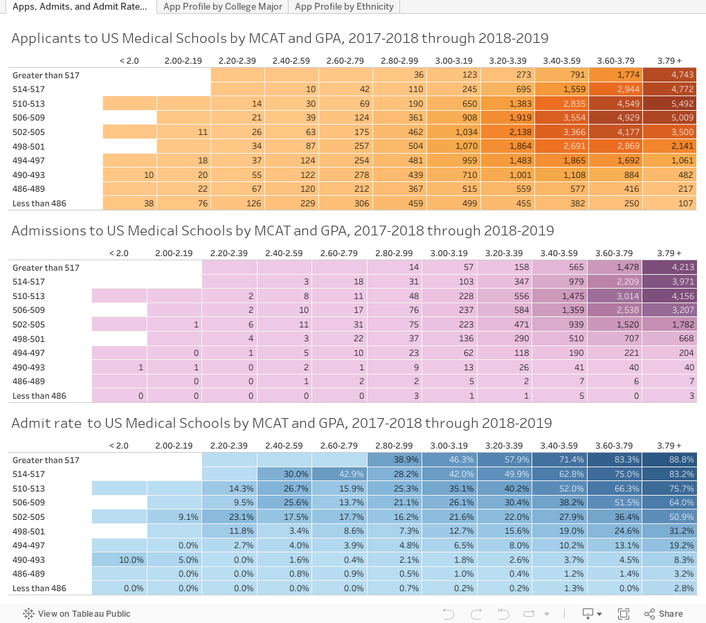
This is data on medical school admission in the US; some of it is compiled for a single year, and some for two years (which is OK because this data appears to be pretty stable over time.)
Tab 1 is not interactive, but does show applications, admits, and admit data on grids defined by GPA and MCAT scores. Darker colors show higher numbers (that is, more counts, or higher admit rates.) While we cannot get a sense of all takers like we do with other standardized tests, this does perhaps show some strong correlation between college GPA and MCAT scores (of course, another explanation may be that students self-select out, which then makes me wonder about that one student with less than a 2.0 GPA and less than a 486 Total MCAT score who applied, was admitted, and then enrolled.
The second and third tabs show applicants by undergraduate major, and ethnicity, respectively. Choose a value at upper right (Total MCAT, or Science GPA, or Total GPA, for instance), and then compare that value for all applicants and all enrolling students on the bars; gold is applicants, and purple is enrollers. The label only shows the value for the longer bar; hover on the other for details.
I was frankly surprised by some of these results. How about you?
Reminder: I appreciate support for webhosting and other costs associated with creating Higher Ed Data Stories. You can support these efforts here.
Comments
Post a Comment