I've often seen the challenges issued by Cole Knaflic on the Story Telling With Data website, and found the most recent one, creation of a scatterplot, to be too tempting to pass up. I used Tableau to create it, and yes, I've written about this before.
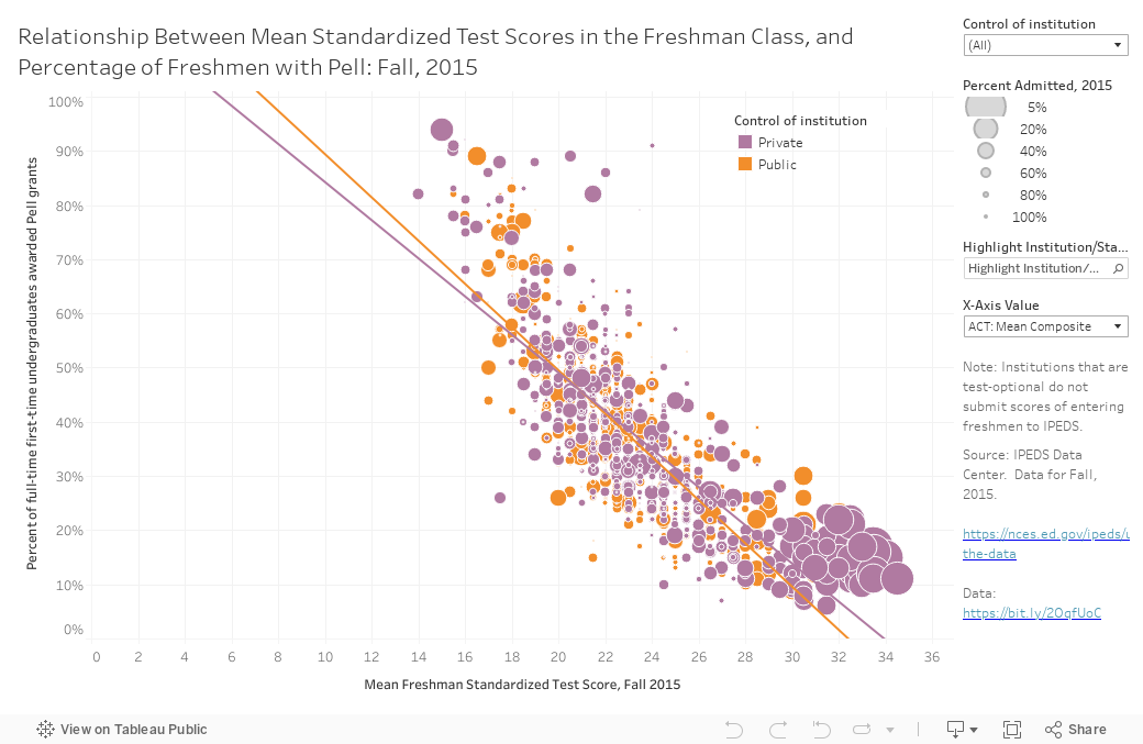
This is IPEDS data, from Fall of 2015 (the most recent complete set available). It shows the strong correlation between standardized test scores and income. And I think it shows something else, too.
On the x-axis, choose SAT or ACT scores (depending on your comfort) to see how higher scores translate into fewer lower-income students (as measured by eligibility for Pell Grants). The bubbles are color-coded by control, and sized by selectivity (that is, the percentage of freshman applications accepted.) Highly selective institutions are coded as larger bubbles, and less selective as smaller bubbles.
Note the cluster of private, highly selective institutions at the lower right: Most of these constitutions are among the nation's wealthiest, yet they enroll the lowest percentages of low-income students. And, at the same time, they deny admission to the greatest numbers of students. I presume they had many low-income students among those who were not offered admission.
Causality is complex, of course, and tests measure and vary with social capital, opportunity, and student investment as well as income and ethnicity. But this is one of those instances where a single picture tells the whole story, I think. What about you?
Comments
Post a Comment