OK. Maybe the headline is misleading. A bit.
I've written about this before: The interconnectedness of indicators for colleges success. This is more of the same with fresher data to see if anything has changed. Spoiler alert: Not much.
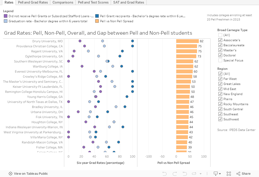
What's new this time is the IPEDS publication of graduation rates for students who receive Pell and those who don't, along with overall graduation rates. While the data are useful in aggregate to point out the trends, at the institutional level, they are not.
First, some points about the data: I've included here colleges with at least 20 Pell-eligible freshmen in 2015, just to eliminate a lot of noise. Colleges with small enrollments don't always have the IR staff to deliver the best data to IPEDS, and they make the reports a bit odd. And even without these institutions, you see some issues.
Second, colleges that do not require tests for admission are not allowed to report tests in IPEDS. Once you check "not required" that box with test scores gets grayed out, so attempting to report them is futile.
But, it's here. View one shows pretty much every four-year public and private not-for-profit college in the US, and includes four points: On the left as dots are six-year grad rates for all students (light blue), Pell students, (dark blue) and all students (purple). On the right is the gap between Pell grad rates and non-Pell students. Again, some of these numbers are clearly wrong, or skewed by small numbers in spite of the exclusion noted above.
The next four collectively tell the story of wealth and access:
I've written about this before: The interconnectedness of indicators for colleges success. This is more of the same with fresher data to see if anything has changed. Spoiler alert: Not much.
What's new this time is the IPEDS publication of graduation rates for students who receive Pell and those who don't, along with overall graduation rates. While the data are useful in aggregate to point out the trends, at the institutional level, they are not.
First, some points about the data: I've included here colleges with at least 20 Pell-eligible freshmen in 2015, just to eliminate a lot of noise. Colleges with small enrollments don't always have the IR staff to deliver the best data to IPEDS, and they make the reports a bit odd. And even without these institutions, you see some issues.
Second, colleges that do not require tests for admission are not allowed to report tests in IPEDS. Once you check "not required" that box with test scores gets grayed out, so attempting to report them is futile.
But, it's here. View one shows pretty much every four-year public and private not-for-profit college in the US, and includes four points: On the left as dots are six-year grad rates for all students (light blue), Pell students, (dark blue) and all students (purple). On the right is the gap between Pell grad rates and non-Pell students. Again, some of these numbers are clearly wrong, or skewed by small numbers in spite of the exclusion noted above.
The next four collectively tell the story of wealth and access:
- If you have more Pell students, your graduation rate is lower
- While most colleges do a pretty good job of keeping Pell and non-Pell grad rates close, there are some troubling outliers
- If you focus on increasing SAT scores in your freshman class, you'll pretty much assure yourself of enrolling fewer low-income students
- But if you have higher mean freshman test scores, you'll see higher grad rates
In other words, test scores are income; income is fewer barriers to graduation. And colleges are thus incentivized not to enroll more low-income students: It hurts important pseudo-measures of quality in the minds of the market: Mean test scores, and graduation rates.
If you're interested on a much deeper dive on this with slightly older data, click here. Otherwise feel free to play with the visualization below.
Comments
Post a Comment