It's official: Princeton has broken its streak of not considering transfer students for admission, and has admitted 13 applicants for the Fall, 2018 term of the 1,429 who applied, for an astonishing how-low-can-you-go admit rate of 0.9%. Of course, we'll have to wait until sometime in the future to see how many--if any--of them actually enroll.
I thought it might be interesting to take a look at transfers, so I did just that, using an IPEDS file I had on my desktop. There are four views here, and they're pretty straightforward:
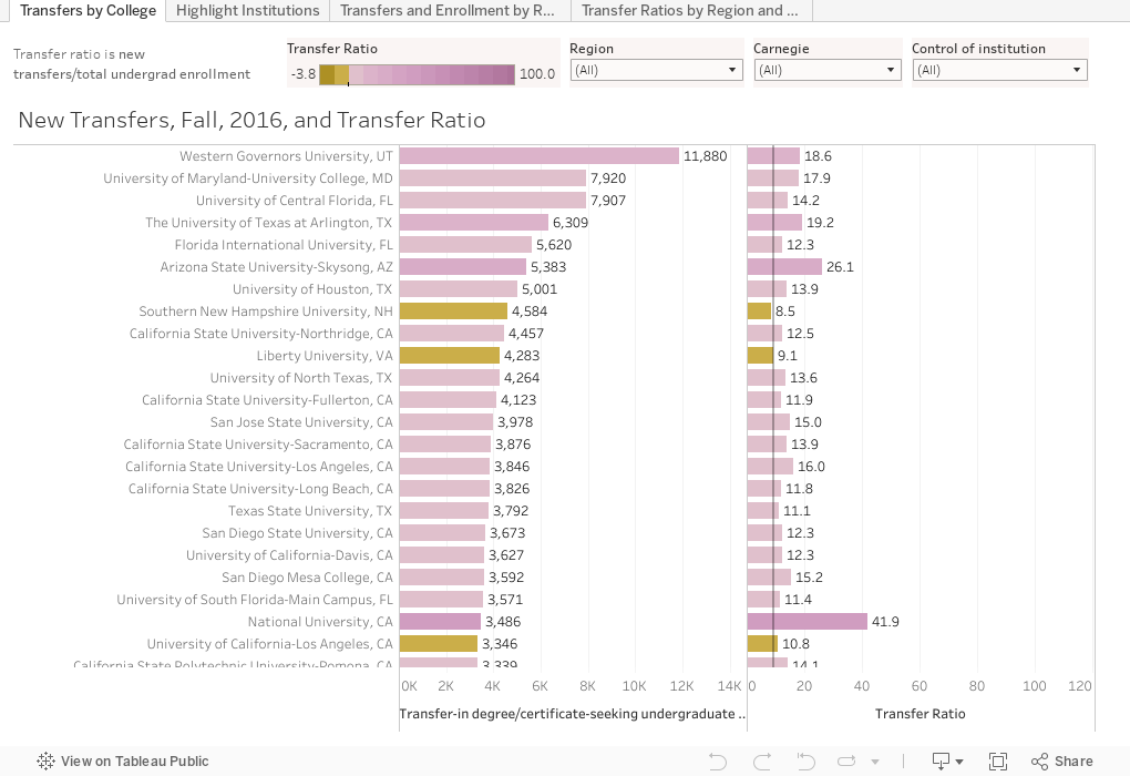
The first tab shows the number of transfers enrolled by institution in Fall, 2016 (left hand column) and the transfer ratio. The ratio simply indicates how many new transfer students for Fall, 2016 you'd meet if you were to go on that college campus in Fall, 2016 and choose 100 students at random. A higher number suggests a relatively more transfer friendly institution. You can choose any combination of region, control and broad Carnegie type using the filters at the top.
The second tab shows the same data arrayed on a scatter gram; type any part of a college name and then select it to see it highlighted on the chart. Hover over a point for details.
The third chart is static, and shows undergraduate enrollment in Fall, 2016 and the number of new transfer students in the same term. The bars are split by region and colored by Carnegie type.
And the last tab shows the weighted transfer ratios, split the same way.
As you'll see, thirteen students doesn't seem so significant against the 810,000 new transfers in Fall, 2016. But it's a start.
I thought it might be interesting to take a look at transfers, so I did just that, using an IPEDS file I had on my desktop. There are four views here, and they're pretty straightforward:
The first tab shows the number of transfers enrolled by institution in Fall, 2016 (left hand column) and the transfer ratio. The ratio simply indicates how many new transfer students for Fall, 2016 you'd meet if you were to go on that college campus in Fall, 2016 and choose 100 students at random. A higher number suggests a relatively more transfer friendly institution. You can choose any combination of region, control and broad Carnegie type using the filters at the top.
The second tab shows the same data arrayed on a scatter gram; type any part of a college name and then select it to see it highlighted on the chart. Hover over a point for details.
The third chart is static, and shows undergraduate enrollment in Fall, 2016 and the number of new transfer students in the same term. The bars are split by region and colored by Carnegie type.
And the last tab shows the weighted transfer ratios, split the same way.
As you'll see, thirteen students doesn't seem so significant against the 810,000 new transfers in Fall, 2016. But it's a start.
Comments
Post a Comment