The College Board publishes good and interesting data about college tuition, including a great table of tuition at state flagship universities. (I realized while writing this that I don't know how a university is designated a state flagship. Maybe someone knows.)
There is some interesting stuff here, but I'll leave it for you to decide what jumps out at you: If you live in North Dakota, you might wonder why South Dakota has such low tuition for non-residents. If you live just outside Virginia or Michigan, you might wonder why it costs so much to cross the border.
Anyway, using the tabs across the top, there are five views here:
Maps
Four maps, showing (clockwise from upper left) in-state tuition, out-of-state tuition, non-resident premium index (that is, how much extra a non-resident pays, normalized to that state's in-state tuition), and the non-resident premium in dollars. Hover over a state for details. You can change the year, and see the values in 2017 inflation-adjusted dollars, or nominal (non-adjusted) dollars.
States in Context
This arrays the states by tuition over time. Use the highlight functions (go ahead, type in the box; you won't break anything) to focus on a region or a specific state. You can view resident or non-resident tuition, adjusted or non-adjusted.
Single Institution
Just what it says. The view starts with The University of Michigan, but you can change it to any state flagship using the control at top right. Percentage increase is best viewed in 2017 adjusted dollars, of course.
Percentage Change
Shows change of in-state tuition by institution over time. The ending value is calculated as a percentage change between the first and last years selected, so use the controls to limit the years. Again, highlight functions put your institution in context
Non-resident Premium
This shows how much extra non-residents pay, and trends over time. Again, highlighter is your best friend.
Feel free to share this, of course, especially with people who are running for office in your state.
And, as always, let me know what you think.
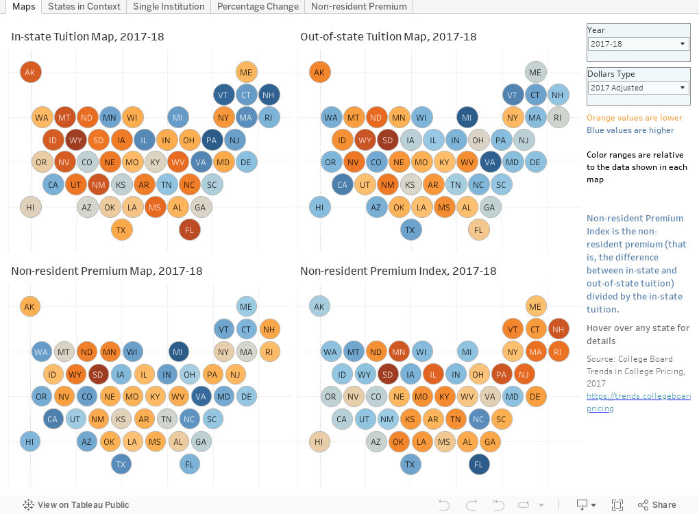
Comments
Post a Comment