There is a lot of talk about admission rates, especially at the most competitive colleges and universities, and even more talk, it seems, about how much of an advantage students get by applying early, via Early Decision (ED, which is binding) or Early Action (EA, which is restrictive, but non-binding).
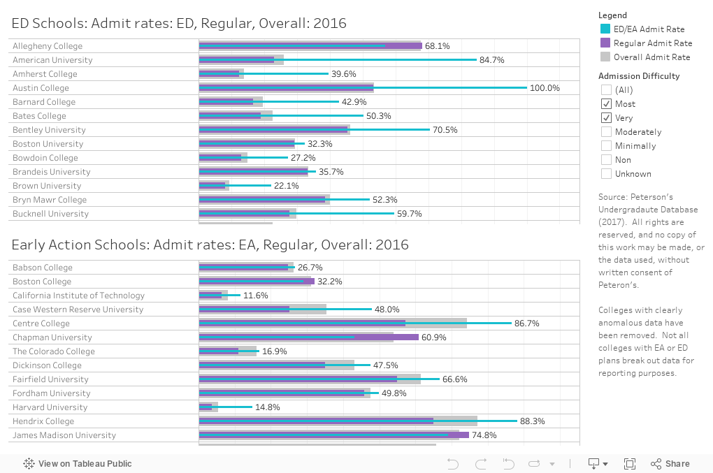
I license the Peterson's data set, and they break out admissions data by total, ED, and EA, and I did some calculations to create the visuals below.
Two important caveats: Some colleges clearly have people inputting the data who do not understand our terminology, who don't run data correctly, or who make a lot of typos (a -500% admission rate is probably desirable, but not possible, for instance). Second, not every university with an EA or ED option (or any combination of them, including the different ED flavors), breaks out their data.
Start with the overall admit rate. That's the one that gets published, and the one people think about. It's the fatter, light gray bar. Then, the purple bar is the regular admit rate, that is, the calculated estimate of the admit rate for non-early applications (this is all applications minus all early types). The light teal bar is the early admit rate: ED plans on the top chart, and EA plans on the bottom. Some colleges have both, of course, but most show up only once.
You can use the filter at right to include colleges by their self-described level of admissions difficulty.
Working on another view to show the number of admits scooped up early vs. regular. Stay tuned. Until then, what do you notice here? Leave a comment below.
Comments
Post a Comment