College enrollment is down. Or maybe it's up. Or maybe it's both.
When you read headlines, you don't get a lot of nuance. And in a country as big as ours, with such an incredible diversity of programs and widely divergent institutions, nuance is important. So this may help do the trick.
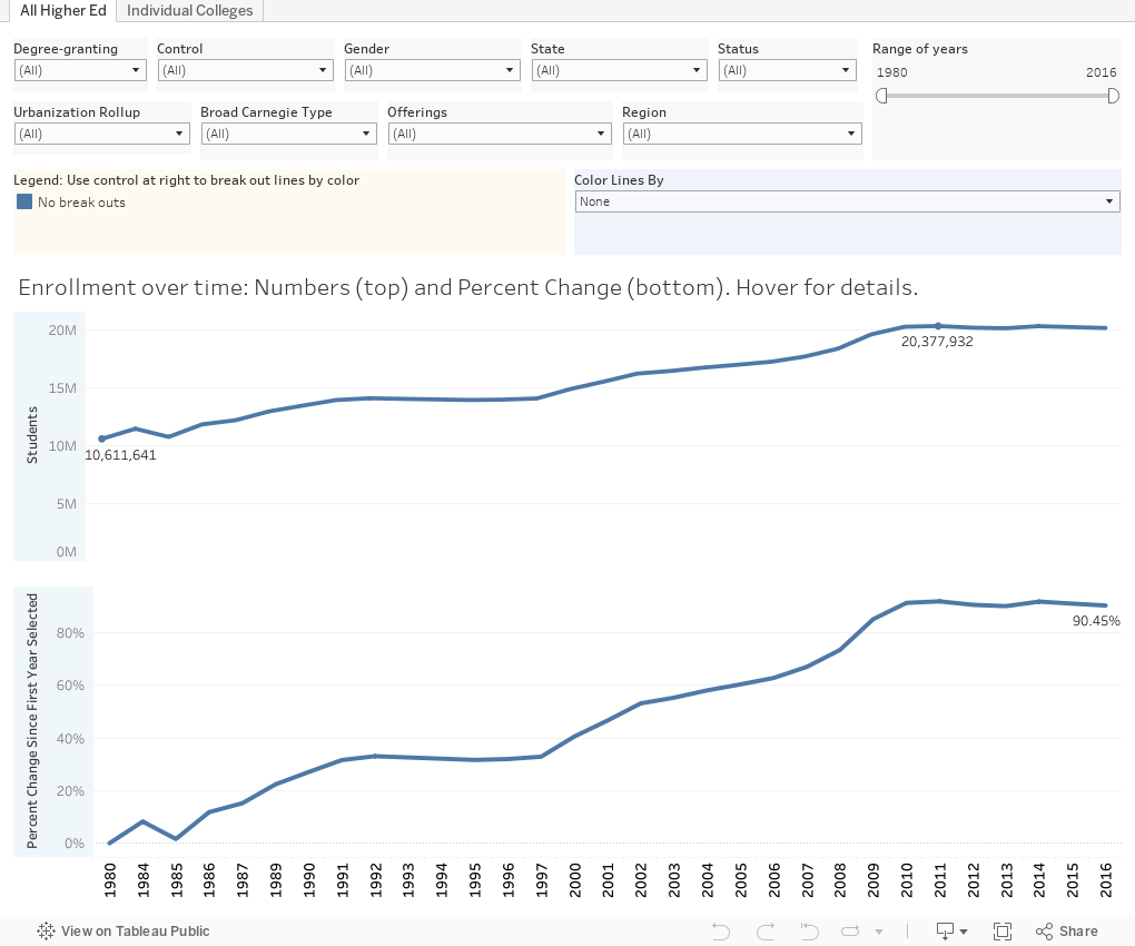
This is enrollment data from about 6,600 post-secondary institutions in the US, and goes back as far as 1980. It includes every institution, including those that grant degrees, and those that don't; four-year private, not-for-profits, for-profits, and publics; liberal arts colleges, research universities, and technical institutes. All here.
It's on two dashboards. The first shows all undergraduate and graduate enrollment at all these institutions, since 1980. (Note: The data skips from 1980 to 1984, and I took out two years of data--1998 and 1999--because they looked a little funky.)
On the first dashboard, there are several controls to filter the data. So for instance, if you want to look at just doctoral institutions, you can do that. Just colleges in New England? Yes. Only care about full-time enrollment? Just use the filter to select it. If graduate enrollment is your interest, it's easy to get rid of the undergraduate data. Just use the controls. The top chart shows raw numbers, and the bottom chart shows percent change over time. If you want a longer or shorter window, there's a control to limit the number of years. This is especially helpful to show percent change.
Then, you can break out what ever enrollment you've selected. Use the control titled "Color Lines By" and you can split the data shown into groups.
Try it. You won't break anything. You can always reset using the little reset button at the bottom.
The second dashboard (using tabs across the top) shows similar data, but you can choose an individual college. Once you've done so, you can limit the data shown, and you can also split it out according to your interest.
Have fun. I've found some interesting little ditties I'll be tweeting out, and I encourage you to do the same.
When you read headlines, you don't get a lot of nuance. And in a country as big as ours, with such an incredible diversity of programs and widely divergent institutions, nuance is important. So this may help do the trick.
This is enrollment data from about 6,600 post-secondary institutions in the US, and goes back as far as 1980. It includes every institution, including those that grant degrees, and those that don't; four-year private, not-for-profits, for-profits, and publics; liberal arts colleges, research universities, and technical institutes. All here.
It's on two dashboards. The first shows all undergraduate and graduate enrollment at all these institutions, since 1980. (Note: The data skips from 1980 to 1984, and I took out two years of data--1998 and 1999--because they looked a little funky.)
On the first dashboard, there are several controls to filter the data. So for instance, if you want to look at just doctoral institutions, you can do that. Just colleges in New England? Yes. Only care about full-time enrollment? Just use the filter to select it. If graduate enrollment is your interest, it's easy to get rid of the undergraduate data. Just use the controls. The top chart shows raw numbers, and the bottom chart shows percent change over time. If you want a longer or shorter window, there's a control to limit the number of years. This is especially helpful to show percent change.
Then, you can break out what ever enrollment you've selected. Use the control titled "Color Lines By" and you can split the data shown into groups.
Try it. You won't break anything. You can always reset using the little reset button at the bottom.
The second dashboard (using tabs across the top) shows similar data, but you can choose an individual college. Once you've done so, you can limit the data shown, and you can also split it out according to your interest.
Have fun. I've found some interesting little ditties I'll be tweeting out, and I encourage you to do the same.
Comments
Post a Comment