Fresh from IPEDS, just months after the wrap up of the 2017 admissions cycle, comes the 2016 admissions data.
I've done something a little different this year to focus your attention, using five views of data, navigable via the tabs across the top of the visualization:

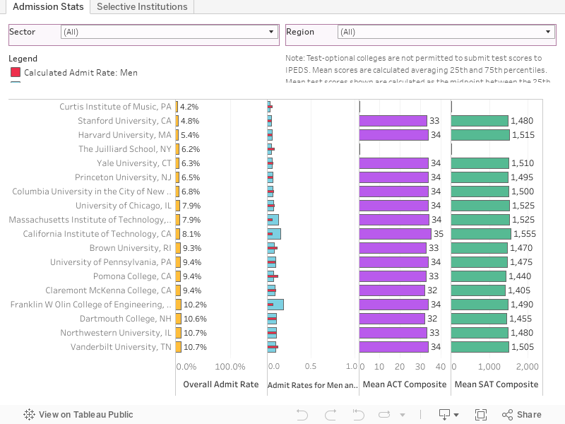
Admissions data (first tab) is pretty clear. Colleges display admit rates (overall, in red) and then admit rates by gender (men are in blue; women are in orange). If the blue bar extends beyond the orange, you can see that the admit rate for men is higher, and vice versa.
On the right are standardized test scores, showing calculated means. In other words, since no one publishes averages and everyone wants them, I took the mid-point of the 25th and 75th percentiles to approximate the 50th percentile. Note that IPEDS does not allow colleges that are test-optional to report test score information. Also note that I've taken out a lot of colleges with extremely limited or suspect data.
As always, you can play with the filters (if there are any) to limit the colleges displayed, and you can sort columns by hovering until you see this little icon, and then click on it.


I've done something a little different this year to focus your attention, using five views of data, navigable via the tabs across the top of the visualization:
Admissions data (first tab) is pretty clear. Colleges display admit rates (overall, in red) and then admit rates by gender (men are in blue; women are in orange). If the blue bar extends beyond the orange, you can see that the admit rate for men is higher, and vice versa.
On the right are standardized test scores, showing calculated means. In other words, since no one publishes averages and everyone wants them, I took the mid-point of the 25th and 75th percentiles to approximate the 50th percentile. Note that IPEDS does not allow colleges that are test-optional to report test score information. Also note that I've taken out a lot of colleges with extremely limited or suspect data.
As always, you can play with the filters (if there are any) to limit the colleges displayed, and you can sort columns by hovering until you see this little icon, and then click on it.
You can reset the view by clicking this little icon at lower right.
The four other views show a limited scope of colleges: Selective, wealthy, mostly men, and Land Grant institutions, and plotted them using some variables that should both answer and generate questions.
You be the judge.
Comments
Post a Comment