Higher education is struggling these days, and there are a lot of solutions from a lot of pundits, all of which tend to be macro in nature: Delivery, cost structures, optimization, curricular adaptations, and many other ideas abound.
On the micro level., however, the vast majority of the 1,700 or so private, four-year colleges and universities will point to "increasing our endowment" as one of the most crucial solutions to our internal institutional challenges.
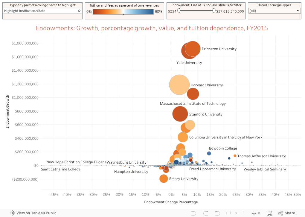
This is, in all probability, because the wealthiest institutions in the nation (in terms of endowment resources) are also the best known, and much of the brand of any institution is driven by wealth and reputation and prestige. And even in this decade and these trying times, some of these institutions have parlayed considerable investment income into one-year operating surpluses of over a billion dollars. No, that's not a typo; it's a problem every university president would love to have. (Reminder to self: Update this chart.)
I once had a finance professor suggest that every institution should multiply the amount of money spent on Advancement each year by 20, then consider these options:
Let's say your Advancement Office budget is $8 million per year. It would take an endowment increase of about $160 million to throw off that $8 million in cash each year forever (at 5%). Thus, shutting down the Advancement function completely would be the equivalent of raising $160 million in unrestricted endowment overnight. Unrestricted dollars are the hardest to raise, of course, because people don't tend to say, "Here's five million dollars; do with it whatever you want."
(It's also a good time to remind people that much endowment money is restricted; the $20 million gift from a big donor doesn't usually provide general operating relief but instead is used to fund some center or institute or faculty chair the donor thought was a good idea. So in some sense, total value of the endowment can be occasionally misleading. It's still generally better to be bigger, though.)
Due to head starts and compounding, the wealthiest institutions are so far ahead of the rest of us that even trying to catch up seems futile. Of course, that stops no one from relying on the old "tried and true." In reality, our only hope of catching up with them would be a catastrophic market crash with no rebound; even then, we'd all be poor. No solace there.
Take a look at the interactive visualization below. Each bubble is an institution. Hover over a bubble for details.
On the micro level., however, the vast majority of the 1,700 or so private, four-year colleges and universities will point to "increasing our endowment" as one of the most crucial solutions to our internal institutional challenges.
This is, in all probability, because the wealthiest institutions in the nation (in terms of endowment resources) are also the best known, and much of the brand of any institution is driven by wealth and reputation and prestige. And even in this decade and these trying times, some of these institutions have parlayed considerable investment income into one-year operating surpluses of over a billion dollars. No, that's not a typo; it's a problem every university president would love to have. (Reminder to self: Update this chart.)
I once had a finance professor suggest that every institution should multiply the amount of money spent on Advancement each year by 20, then consider these options:
Let's say your Advancement Office budget is $8 million per year. It would take an endowment increase of about $160 million to throw off that $8 million in cash each year forever (at 5%). Thus, shutting down the Advancement function completely would be the equivalent of raising $160 million in unrestricted endowment overnight. Unrestricted dollars are the hardest to raise, of course, because people don't tend to say, "Here's five million dollars; do with it whatever you want."
(It's also a good time to remind people that much endowment money is restricted; the $20 million gift from a big donor doesn't usually provide general operating relief but instead is used to fund some center or institute or faculty chair the donor thought was a good idea. So in some sense, total value of the endowment can be occasionally misleading. It's still generally better to be bigger, though.)
Due to head starts and compounding, the wealthiest institutions are so far ahead of the rest of us that even trying to catch up seems futile. Of course, that stops no one from relying on the old "tried and true." In reality, our only hope of catching up with them would be a catastrophic market crash with no rebound; even then, we'd all be poor. No solace there.
Take a look at the interactive visualization below. Each bubble is an institution. Hover over a bubble for details.
- The SIZE of the bubble indicates endowment value at the end of FY 15 (probably June 30, 2015)
- The COLOR of the bubble indicates tuition dependency (in IPEDS, "Percent of core revenues from tuition and fees.) Orange is low; blue is high.
- The relative position on the y-axis (up and down) indicates one-year endowment value change (note: This is just subtraction, so it is not endowment performance).
- The relative position on the x-axis (left and right) shows the one-year percentage change. I cut it at 50% each way for clarity as there were a few extreme outliers.
If you'd like, you can use the filters at the top right to limit the types of institutions shown, or the range of endowment values. Use the highlighter at the top left to highlight a specific institution. Just start typing any part of the name to do so.
How do you feel now?
Comments
Post a Comment