Note: If you haven't read my post about the 2016 election results and educational attainment, it might be of interest to read that first. Or later. Or not at all. Your choice.
This started simply enough: A couple of tables from the Digest of Education Statistics, (tables 302.65 and 302.70) showing the percentage of adults aged 18-24 who were attending a degree-granting college by state and ethnicity in 2005 and 2015. If you've read this blog enough, you know I have a love/hate relationship with the digest: Great data, but horrible formatting. The tables are made to be printed on a single 8" x 11" sheet and handed out. The crucial distinction between data and insight is lost.
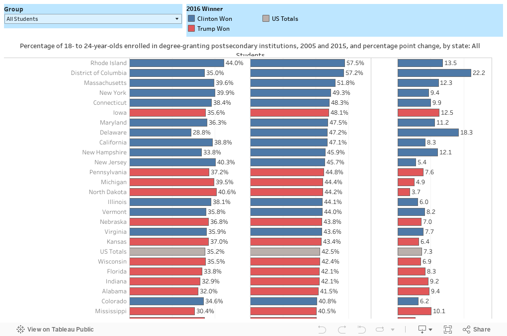
Regardless, I reformatted the sheets into something workable for Tableau, and started to look at them. I wasn't having much luck: Some of the states didn't have data on African-American students, for instance, in 2005. The variable for "Asian/Pacific Islander" was relatively new then, and only a few states had that data available. Beyond that, I was looking to add some color-coding into the visualization to help make a point, and it wasn't going well.
But I've been fascinated since the election by some of the tweets and writing of Chris Arnade and Sarah Kendzior, who are thinking about what the election results mean in "flyover land." And my blog post about the election results and attainment has stuck with me, mostly because of the reaction people had to it.
So I colored the states by the 2016 election results, and it got more interesting, as you can perhaps see below.
It's easy for us to look at things like this and chalk it up to "uneducated people voted for Trump." While that may technically be true, leaving it at that makes it too convenient for us in higher education to forget that educational attainment is only partially something you earn; it's also something you're born into. Some of the ten charts on this post might make that clearer.
This can also, of course, be a post about urban and rural, divides. The division in our country might be as much about opportunity as it is about attainment. If history tells us anything, it's that people start to rebel when they feel they don't have a chance via any other path.
So as we look at the current reality, the question, as always, remains: What are we doing to change the future?
This started simply enough: A couple of tables from the Digest of Education Statistics, (tables 302.65 and 302.70) showing the percentage of adults aged 18-24 who were attending a degree-granting college by state and ethnicity in 2005 and 2015. If you've read this blog enough, you know I have a love/hate relationship with the digest: Great data, but horrible formatting. The tables are made to be printed on a single 8" x 11" sheet and handed out. The crucial distinction between data and insight is lost.
Regardless, I reformatted the sheets into something workable for Tableau, and started to look at them. I wasn't having much luck: Some of the states didn't have data on African-American students, for instance, in 2005. The variable for "Asian/Pacific Islander" was relatively new then, and only a few states had that data available. Beyond that, I was looking to add some color-coding into the visualization to help make a point, and it wasn't going well.
But I've been fascinated since the election by some of the tweets and writing of Chris Arnade and Sarah Kendzior, who are thinking about what the election results mean in "flyover land." And my blog post about the election results and attainment has stuck with me, mostly because of the reaction people had to it.
So I colored the states by the 2016 election results, and it got more interesting, as you can perhaps see below.
It's easy for us to look at things like this and chalk it up to "uneducated people voted for Trump." While that may technically be true, leaving it at that makes it too convenient for us in higher education to forget that educational attainment is only partially something you earn; it's also something you're born into. Some of the ten charts on this post might make that clearer.
This can also, of course, be a post about urban and rural, divides. The division in our country might be as much about opportunity as it is about attainment. If history tells us anything, it's that people start to rebel when they feel they don't have a chance via any other path.
So as we look at the current reality, the question, as always, remains: What are we doing to change the future?
Comments
Post a Comment