"You should write something about discount rates."


I hear that a lot these days. Even though NACUBO does its annual discount study, people still want and crave more. There is no topic, it seems, as much on the minds of people in universities as discount rate.
But despite my desire to make you, the loyal readers of this blog, happy, there are a lot of reasons I haven't written about discount rates:
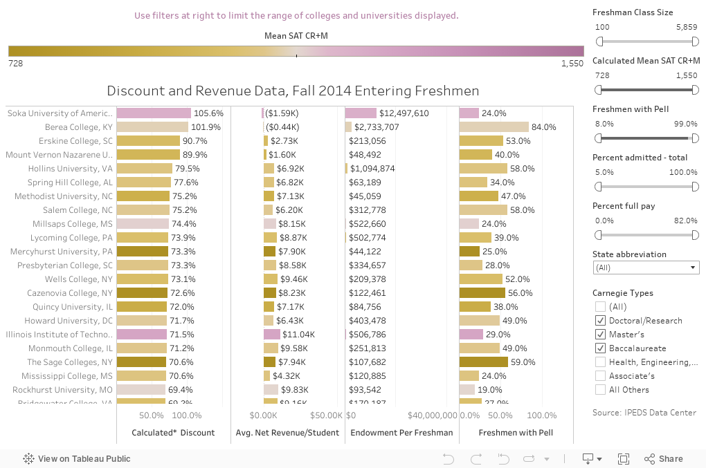
- First, data are old. It's a long story, but financial reporting (where you learn about financial aid) is reported about a year after the freshman class enrolls. So the ability to calculate discount is always behind the most current admissions data. The viz below is for 2014 freshmen for instance, and it's the most recent publicly available. It's hard to describe to people how much things have changed between 2014 and 2017. (And even harder to figure out why 2016 admissions data are not out yet.)
- Second, discount is not as important as accountants think it is. "WHAT?!?" say the accountants! I politely suggest that what you really care about if you're running an institution is net revenue per student, and total net revenue, the cash you use to run the university.
- Put it this way: If your tuition is $50,000 and you have a 40% discount rate, you net $30,000 cash per student. But you're generating less net revenue than your competitor who charges $55,000 in tuition with a 43% discount rate, who nets $31,350 per student. Still, people insist on comparing disparate institutions on this single accounting measure. Lower discount is not always better.
- In that same vein, average and total revenue are both important. If you took only full-pay students in the scenario above, you would average $50,000 with a zero percent discount. But your numbers of enrolling students would go way down, as would your total; you wouldn't have enough to cover your overhead. Inversely, you can generate more total revenue by discounting more and enrolling more, but your costs go up faster than revenue, which is of course not good.
- Third, most people and stories focus on freshman discount. If you're a small, tuition-driven, liberal-arts college, that might be meaningful, as freshman may make up 25% or 35% of your revenue. But it's less important at big, complex universities, where we have freshmen, transfer, law, medical, graduate, and other types of enrollment too. Overall discount is far more important, but usually less discussed. At some institutions, where educating undergraduates can almost be said to be a side business, the revenue from student tuition is tiny, dwarfed by things like research dollars and endowment return. Large discounts on tiny fractions don't add up to much.
- Fourth, net revenue is not the cost to the student. Pell and state grants come to the university as cash, and look the same as money from a student's pocket, even though they are very different to the student. You can't tell how much a college costs a student by looking at this data.
- Fifth, not all discount rates are the same, even at similar institutions with similar tuition rates. You can get to a 50% discount rate by having the class half full-pay and half-full need that you meet; you can also get there by having everyone at 50%. These are impossible examples, of course, but you get the picture.
- Finally, discount rate--an accounting measure--is something we used to look at only after the fact, where three decimal points are very satisfying. It's essentially impossible to manage to that rate in a fast-changing, dynamic environment unless you constrain other outcomes. As I've said before, when we send out aid awards, we're not planting saplings; we're casting seeds. You can predict with some precision what percentage of which seeds will take root and grow, but you can't control the wind, the rain, or the temperature, which are all critical to success.
As you look at this, there are a couple of things to consider in addition to the usual caveat about the accuracy of IPEDS.
I calculated discount by taking the Financial Aid Cohort of freshmen (first-time, full-time, degree-seeking) students and multiplying that number by the tuition, then using the total institutional aid. At most places, institutional aid is not funded, it's just a contra revenue. But at others, income from restricted endowment funds may actually fund the aid. Here's a long boring argument about whether this matters or not. For this purpose, I'm taking all aid as unfunded discount. Thus, discount = Institutional Aid/Gross Tuition Revenue.
Some numbers seem a little crazy. While a lot of institutions have freshman cohort numbers lower than total freshman enrollment (which makes sense) some have freshman total numbers lower than the aid cohort, which suggests someone in the IR office is counting wrong. Not my problem.
This does not include all 2,200 four-year, degree-granting private colleges and universities.
Discount only makes sense for private universities, for one thing, which takes us down to about 1,600. Several hundred of them don't accept freshmen, others have incomplete data, some are rabbinical institutes or schools of theology or massage therapy that aren't of great interest to many. Others have tiny freshman classes. Thus, this view starts with 675 institutions, and shows five things. The four columns, left-to-right show Calculated freshman discount, Average Net Revenue per Freshman, Endowment Per Freshman, and Percentage of Freshmen with Pell. The color shows mean SAT CR+M scores, approximated using the 25th and 75th percentiles; gold is low, and purple is high.
Use the filters on the right to limit the view. For instance, you might only want to look at colleges in your state, or with similar sized freshman classes, or test score averages. Or perhaps you only care about Doctoral institutions. Filter to your heart's content. If you want to sort the columns, just hover over the bottom of the column until you see the small icon appear, like this:

Click through the cycles to sort descending, ascending, or alphabetically. Click on undo, redo, and reset to, well, you get the picture.

Let me know what you think and what you see here. That is, if you've gotten this far and I haven't whomped the enthusiasm right out of you.
Comments
Post a Comment