I was doing some research for our own internal discussions, and decided to take it a few more steps to look at enrollment of undergraduate students by ethnicity at about 2,000 four-year, public and private institutions in the US. (And when you look at the data and wonder why, rest assured, I checked: Miami Dade does offer Bachelor's degrees via online programs.)
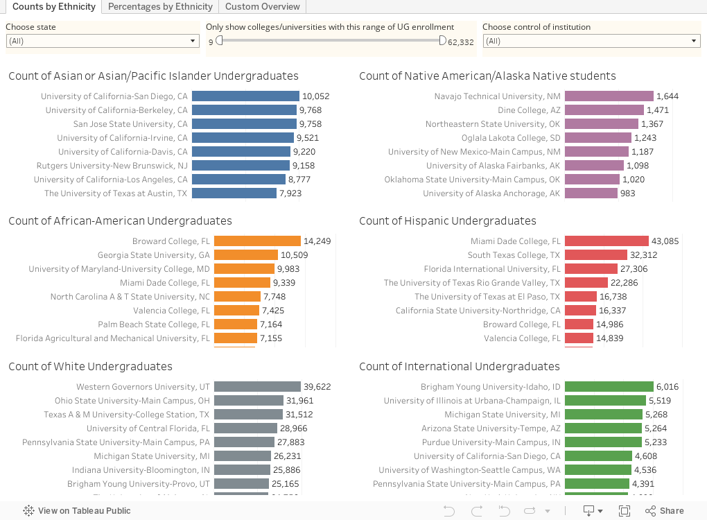
It's here, and the first two views are pretty easy to navigate: Each chart shows a separate ethnicity and lists each institution in descending order. The first view is by counts, and the second by percentages. Thus you can see the institution that enrolls either the most Hispanic students, for instance, or the institution with the greatest percentage of Hispanic students, depending on your preference.
If you'd like to focus on a single state, just public or private, or colleges of a certain size range, use the filters at the top. You can always reset the views using the control at the bottom.
The third view allows more customization. Each point represents an institution, arrayed on the x- and y-axis. But you can control what values the axes show: For instance, percentage White on the x-axis, and percentage Asian/Pacific Islander on the y-axis. The points are colored by control: Orange is for private institutions, purple for public. Again, you can limit by undergraduate enrollment or by state, if you'd like. But this view has the advantage of choosing a highlight institution: Use the highlight box to put a university of interest in context. Type part of the name, and select it, and it will show up all by itself.
I hope this is helpful for use with students who are interested in thinking about and comparing colleges and universities by enrollment profile. And if you're interested in seeing how an ecologist might look at enrollment diversity, check out this piece I wrote for Academic Impressions last fall.
Comments
Post a Comment