Much of what I post here is slightly modified from what I use at work, and this is no exception. Here at DePaul (like most universities) the biggest single slice of enrollment comes from our own state, and it's important to know what's going to be happening to the student markets in the future.
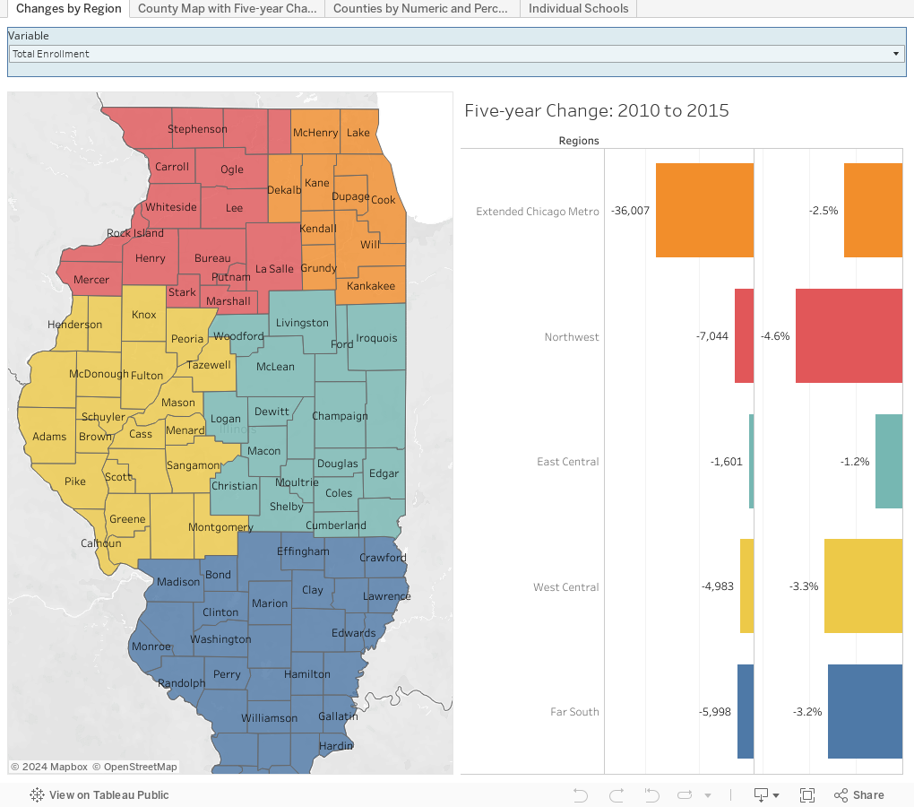
So I downloaded data from The Illinois State Board of Education showing enrollments for two years: 2010--2011 and 2015-2016 to see how things have changed over time, and to get a glimpse of the future. This is a more granular look than the WICHE data I visualized recently, but it's also not actual projections going forward, but rather just numbers; projections require a lot of time and mathematics skills, neither of which I have. I would have liked to gone deeper and farther with this, but the data are messy, and even things like School District IDs have changed over time.
There are four views using the tabs across the top: First by region, then county-by-county, and then a scattergram showing each county by both percent change and numeric change over time. On each, make a choice at the of the page to change the data displayed: You can look at total pre-K through 12 enrollment, if you like (the default view) of you can change to show grade-level enrollments, or by ethnicity or low-income status.
Finally, the last tab shows individual schools. You can type part of your school's name in the drop down box to start filtering, but be sure you find the county as well as the school. If you're going to be looking up "Lincoln," you've got a lot of work to do! Also, some schools have their name listed slightly differently in different years, and if your school is one of them, you won't get two years of data showing.
Please note: The data are not granular, so you can't combine variables (for instance, low-income students in 8th grade.) And, I've excluded small numbers from the analysis (students in juvenile detention centers, or public school students being education at other sites.)
But it's still interesting, I think, especially if you drill down a bit using the filter at the top.
What do you see? Leave a note in the comments.
Comments
Post a Comment