You can look at a lot of places on this blog to find the story of women and the increases in educational attainment over time, but perhaps none is so compelling as this one. It was very rare for women to have college degrees in the 1940's and 1950's, but even rarer to find doctors, lawyers, and dentists who were women.
As you'll see below, that all changed in the late 1960's and early 1970's. What happened? It's probably a lot of things, but you could probably do worse than to point to birth control as a major contributing factor.
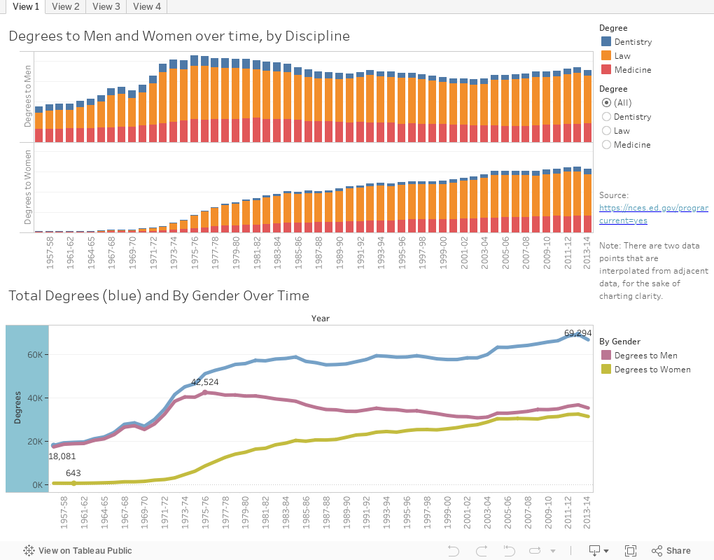
There are four views of the data from the Digest of Educational Statistics:
View 1 shows all degrees over time to men and women; the top via stacked bars, and the bottom using line charts. The top chart shows the dramatic increase in degrees to women; the bottom shows that in 1955-56, almost all degrees (blue line) were awarded to men (purple line.)
View 2 shows the same data, presented a different way. On the top chart, you see total degrees awarded, broken out by degree type. Use the filter to limit the view to men or women. On the bottom, degrees are awarded by percent of total: In the early 1960's, for instance, 99.62 percent of dental degrees were awarded to men. By this decade, the totals had virtually evened out.
View 3 shows percentage change since 1955-56 for all degrees: Filter to law, dentistry, or medicine if you wish. Any way you look at the charts, the data are astonishing. Especially interesting is dentistry, where there are actually fewer men graduating today than half a century ago.
And finally, View 4 shows institutions: There are now 70% more medical colleges, 60% more law schools, and 36% more dental schools than at the start of the analysis. This latter number is interesting, however; while law schools and medical schools were at record numbers in 2013-2014, dental programs peaked in 1983-84.
Once again, women, given a more equal shot at education, outpace men by a considerable margin.
What do you see here? Leave a comment below.
As you'll see below, that all changed in the late 1960's and early 1970's. What happened? It's probably a lot of things, but you could probably do worse than to point to birth control as a major contributing factor.
There are four views of the data from the Digest of Educational Statistics:
View 1 shows all degrees over time to men and women; the top via stacked bars, and the bottom using line charts. The top chart shows the dramatic increase in degrees to women; the bottom shows that in 1955-56, almost all degrees (blue line) were awarded to men (purple line.)
View 2 shows the same data, presented a different way. On the top chart, you see total degrees awarded, broken out by degree type. Use the filter to limit the view to men or women. On the bottom, degrees are awarded by percent of total: In the early 1960's, for instance, 99.62 percent of dental degrees were awarded to men. By this decade, the totals had virtually evened out.
View 3 shows percentage change since 1955-56 for all degrees: Filter to law, dentistry, or medicine if you wish. Any way you look at the charts, the data are astonishing. Especially interesting is dentistry, where there are actually fewer men graduating today than half a century ago.
And finally, View 4 shows institutions: There are now 70% more medical colleges, 60% more law schools, and 36% more dental schools than at the start of the analysis. This latter number is interesting, however; while law schools and medical schools were at record numbers in 2013-2014, dental programs peaked in 1983-84.
Once again, women, given a more equal shot at education, outpace men by a considerable margin.
What do you see here? Leave a comment below.
Comments
Post a Comment