One of the most popular posts on this blog has been this one, where I showed the baccalaureate college of the nation's 2011 doctoral recipients.
This is an update to that, using 2014 data from the NSF.
It's pretty simple: There are three views here.
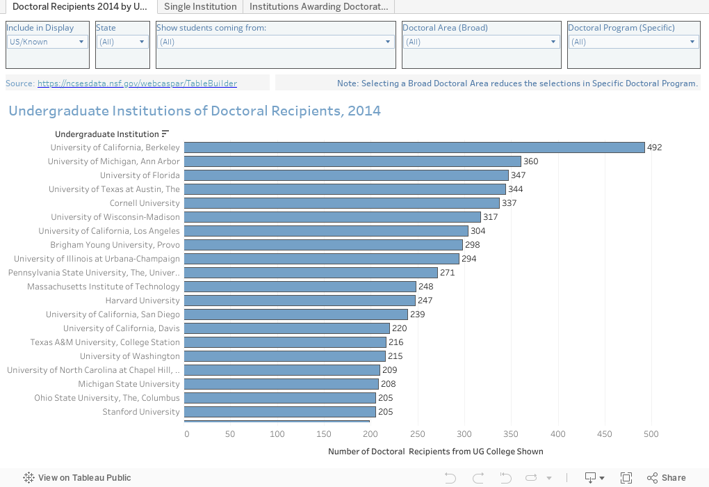
On the first view, you can see the undergraduate college of all doctoral recipients in 2014. The view starts with known US institutions only, but you can add in foreign or unknown institutions if you'd like. You can also look at a single state, the degrees awarded at the institution (for instance, if you have a student who really wants a liberal arts college, choose "Bachelor's-granting institutions"). Finally, choose the broad category of the doctorate, if you'd like, or even the specific program. Note that the filters cascade: If you choose "Life Sciences" under Broad Category, you won't be able to find "Economics" under Specific Program.
On the second view (using tabs across the top), you can look at a single institution and find out how many graduates received a doctorate in 2014, by broad area. Note that it doesn't matter if the person received the Bachelor's degree in 2010 or 1968: It's just everyone who earned a doctorate in 2014.
Finally, the last view shows institutions awarding doctorates, regardless of where the student originated. You can see foreign and unknown institutions, US institutions, or all institutions as the baccalaureate college.
I hope this is helpful as counselors work with students on their plans.
This is an update to that, using 2014 data from the NSF.
It's pretty simple: There are three views here.
On the first view, you can see the undergraduate college of all doctoral recipients in 2014. The view starts with known US institutions only, but you can add in foreign or unknown institutions if you'd like. You can also look at a single state, the degrees awarded at the institution (for instance, if you have a student who really wants a liberal arts college, choose "Bachelor's-granting institutions"). Finally, choose the broad category of the doctorate, if you'd like, or even the specific program. Note that the filters cascade: If you choose "Life Sciences" under Broad Category, you won't be able to find "Economics" under Specific Program.
On the second view (using tabs across the top), you can look at a single institution and find out how many graduates received a doctorate in 2014, by broad area. Note that it doesn't matter if the person received the Bachelor's degree in 2010 or 1968: It's just everyone who earned a doctorate in 2014.
Finally, the last view shows institutions awarding doctorates, regardless of where the student originated. You can see foreign and unknown institutions, US institutions, or all institutions as the baccalaureate college.
I hope this is helpful as counselors work with students on their plans.
Comments
Post a Comment