One of the things I hope to show people on this blog is that data is a lot more fun and interesting when you actually do something with it, rather than just present it in a spreadsheet. Here's a good example.
This week, over 6,000 people who work in or around college admissions will converge on Columbus, Ohio for the NACAC Conference. (Yes, Oktoberfest is also in Columbus this weekend, and based on my informal discussions, there may be some overlap.) NACAC puts its attendees in a table on its website for anyone to use.
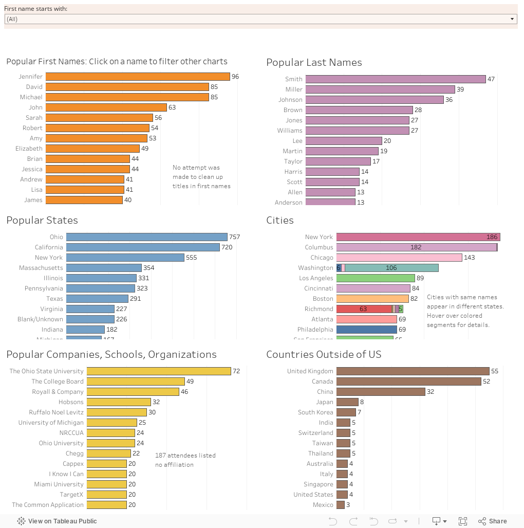
But it's just data: What does a simple spreadsheet have the power to tell us? Maybe more than you think. Yesterday, I put the information in a visualization (first page is set up for mobile but autosized) designed to help people find other attendees. As a side effort, I put up a chart of the most common first names of attendees, and it proved to be very popular. So last night I did a little more, and looked at most common first, and last names, as well as city, state, country, and organization. They're below, and I think they say a lot about our profession. What the information says is up to you to decide.
If you want to interact, click on a first name, and the other views update. See? Interactivity can be fun too.
A note about the data: I did only minimal cleaning on it; when 6,000 people enter data on a form, there are bound to be errors. Chicago, for instance, is not in Bosnia-Herzegovina. And I'm pretty sure Beijing is in China. I did not clean up names, so if you really think your first name is "Mr. Daniel" you miss out on a chance to be included with the other Daniels. And Daniel is Daniel, not Dan, so variations are not grouped together.
Have fun. And tell me what you think the data says.
This week, over 6,000 people who work in or around college admissions will converge on Columbus, Ohio for the NACAC Conference. (Yes, Oktoberfest is also in Columbus this weekend, and based on my informal discussions, there may be some overlap.) NACAC puts its attendees in a table on its website for anyone to use.
But it's just data: What does a simple spreadsheet have the power to tell us? Maybe more than you think. Yesterday, I put the information in a visualization (first page is set up for mobile but autosized) designed to help people find other attendees. As a side effort, I put up a chart of the most common first names of attendees, and it proved to be very popular. So last night I did a little more, and looked at most common first, and last names, as well as city, state, country, and organization. They're below, and I think they say a lot about our profession. What the information says is up to you to decide.
If you want to interact, click on a first name, and the other views update. See? Interactivity can be fun too.
A note about the data: I did only minimal cleaning on it; when 6,000 people enter data on a form, there are bound to be errors. Chicago, for instance, is not in Bosnia-Herzegovina. And I'm pretty sure Beijing is in China. I did not clean up names, so if you really think your first name is "Mr. Daniel" you miss out on a chance to be included with the other Daniels. And Daniel is Daniel, not Dan, so variations are not grouped together.
Have fun. And tell me what you think the data says.
Comments
Post a Comment