
All the fuss, updated

One of the very first posts I did on this blog was showing just how many "Uber Selective" colleges and universities there are (or aren't), and how many students they enrolled (or didn't.)

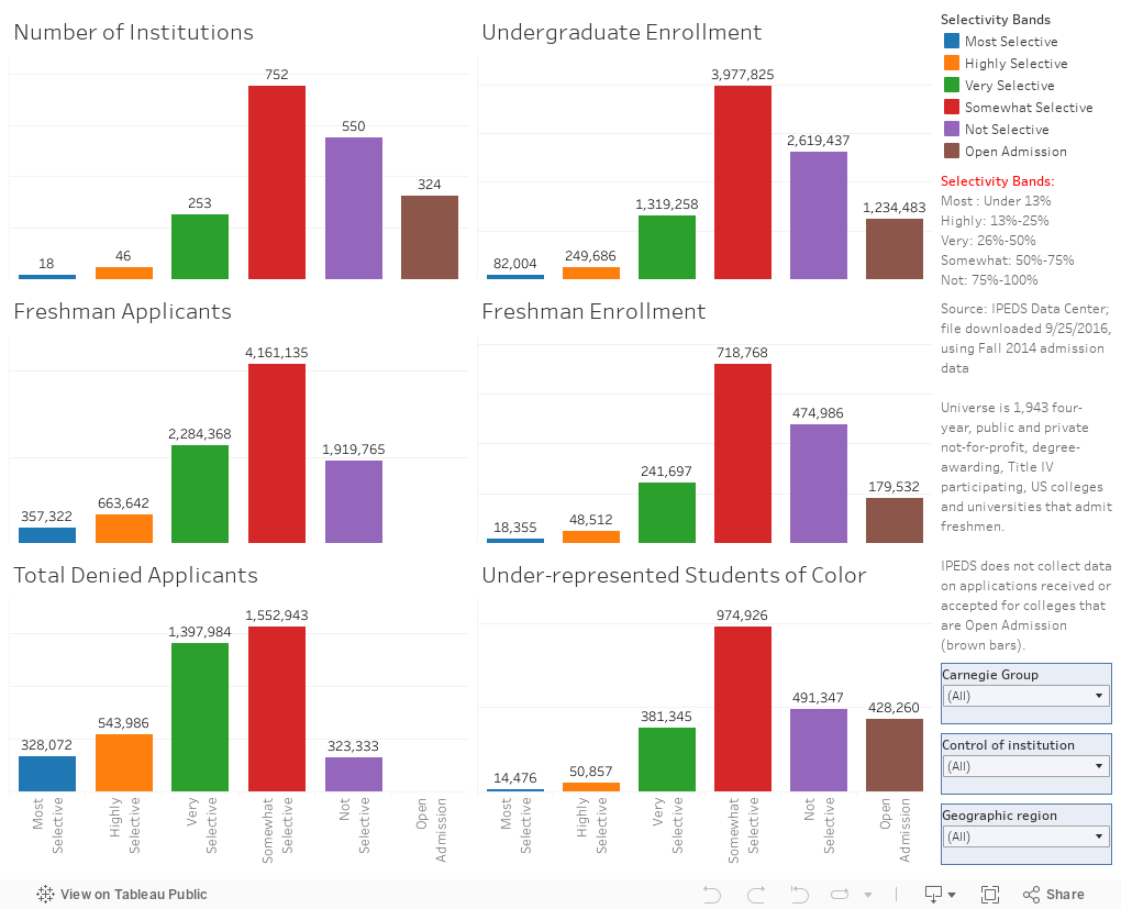
I used it last week at a presentation at NACAC, and several people asked me if I had an update on it, so as soon as I got home, I pulled down the data and started visualizing it.  It's below, and it should be self-explanatory: Of the 1,943 four-year institutions shown, only 18 admit less than 13% of freshman applicants.  These institutions (blue bars) enroll just 82,000 students (under 15,000 of whom are African-American, Hispanic, or Native American), and only about 18,000 freshmen.  Yet they get a relatively large share of the press and attention whenever the discussion turns to college admission.

This has limited interactivity: You can choose region, public or private, or Carnegie group.

And of most importance: This is but a sliver of American higher education; for instance, 9% of all college students enrolled in the US attend a community college in California; and another 4% at community colleges in Texas.  Keep that in mind as you look at this data.


Comments

Popular posts from this blog

First-year student (freshman) migration, 2022

A new approach to freshman migration, which is always a popular post on Higher Ed Data Stories. If you're a regular reader, you can go right to the visualization and start interacting with it.  And I can't stress enough: You need to use the controls and click away to get the most from these visualizations. If you're new, this post focuses on one of the most interesting data elements in IPEDS: The geographic origins of first-year (freshman) students over time.  My data set includes institutions in the 50 states and DC.  It includes four-year public and four-year, private not-for-profits that participate in Title IV programs; and it includes traditional institutions using the Carnegie classification (Doctoral, Masters, Baccalaureate, and Special Focus Schools in business, engineering, and art/design. Data from other institutions is noisy and often unreliable, or (in the case of colleges in Puerto Rico, American Samoa, and other territories, often shows close to 100% of enro...

Educational Attainment and the Presidential Elections

I've been fascinated for a while by the connection between political leanings and education: The correlation is so strong that I once suggested that perhaps Republicans were so anti-education because, in general, places with a higher percentage of bachelor's degree recipients were more likely to vote for Democrats. The 2024 presidential election puzzled a lot of us in higher education, and perhaps these charts will show you why: We work and probably hang around mostly people with college degrees (or higher).  Our perception is limited. With the 2024 election data just out , I thought I'd take a look at the last three elections and see if the pattern I noticed in 2016 and 2020 held.  Spoiler: It did, mostly. Before you dive into this, a couple of tips: Alaska's data is always reported in a funky way, so just ignore it here.  It's a small state (in population, that is) and it's very red.  It doesn't change the overall trends even if I could figure out how to c...

Education Levels in the US, by State and Attainment

Attainment has always been an interesting topic for me, every since I first got stunned into disbelief when I looked at the data over time.  Even looking at shorter periods can lead to some revelations that many don't make sense at first. Here is the latest data from NCES, published in the Digest of Education Statistics . Please note that this is for informational purposes only, and I've not even attempted to visualize the standard errors in this data, which vary from state-to-state.  There are four views year, all looking at educational attainment by state in 2012 and 2022.   The first shows data on a map: Choose the year, and choose the level of attainment.  Note that the top three categories can be confusing: BA means a Bachelor's degree only; Grad degree means at least a Master's (or higher, of course); and BA or more presumably combines those two.  Again, standard errors might mean the numbers don't always add up perfectly. The second shows the data o...