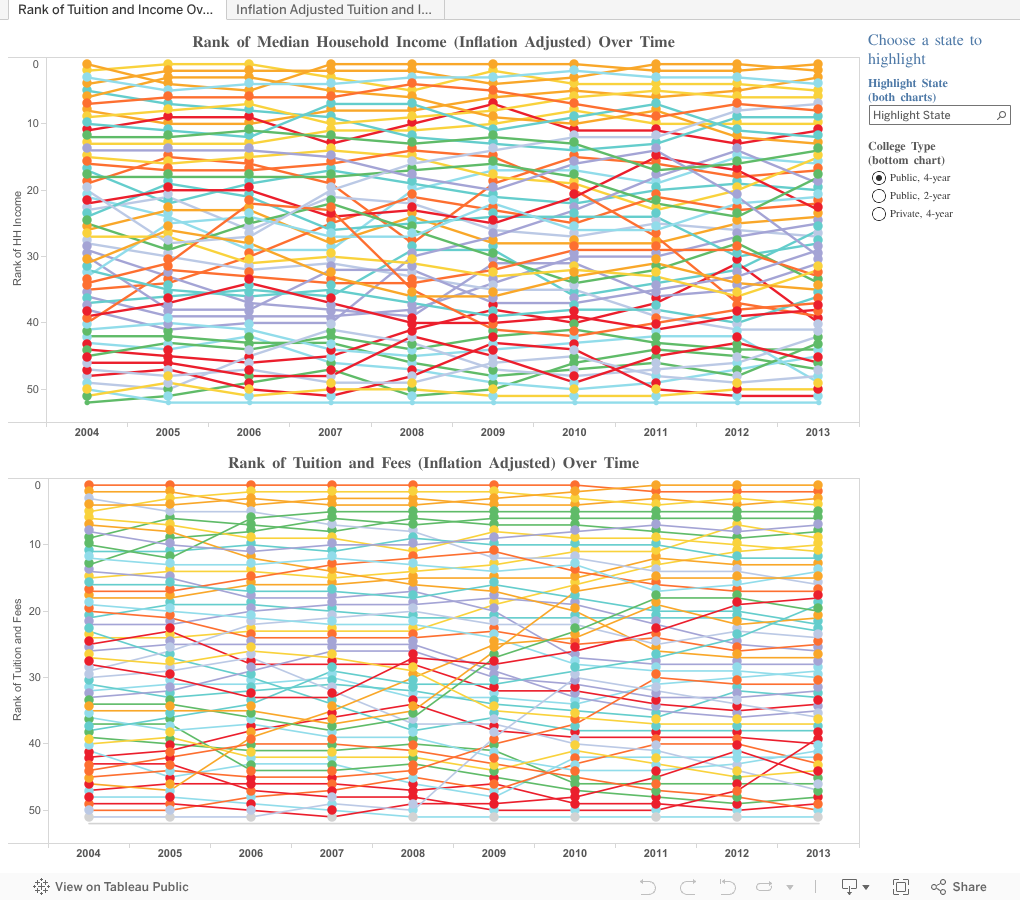
Whoa, you might say as you look at this. It's way too funky for me. That's OK; I'm going to show you a new feature in the data visualization tool, Tableau, that I use that will make this all make sense. Hang on.
I wondered: Do states with higher median income levels charge more for tuition? So I began to explore.
On each dashboard, median family income is displayed on the top chart, and college tuition on the bottom. The view starts with four-year publics, but you can change it using the filter. The first dashboard shows only the rank of the states, from 1 to 5, with 1 being the high value in each.
If you can't make sense of it, don't worry: Use the little box in the upper right hand corner to select any single state, and that state's data will be instantly highlighted on both the income and the tuition chart. You can see where a state stands on both measures.
The second dashboard (using the tabs across the top) shows the actual inflation-adjusted values (that is, $57,894 dollars in median family income, or $11,592 of tuition, both set to 2013), but the ranks are also displayed. Use the state highlighter the same way, and hover over the dot for details. Note on this income chart I've broken one of my cardinal rules by not starting the y-axis at zero, for the sake of clarity.
You can get a sort of affordability index by looking at income ranks in comparison to tuition ranks, and you can see trends in both over time by state.
What do you notice here?
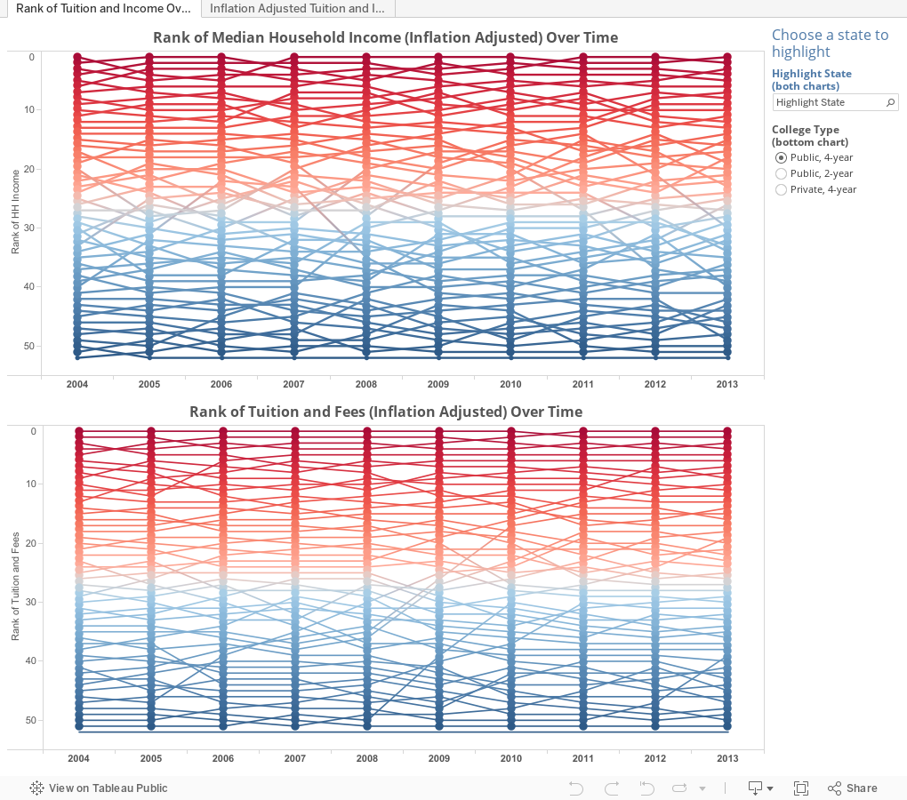
OK. So maybe that's too funky. Here's the same view, colored by red (high rank) to blue (low rank). If you like the original, it's below.
I wondered: Do states with higher median income levels charge more for tuition? So I began to explore.
On each dashboard, median family income is displayed on the top chart, and college tuition on the bottom. The view starts with four-year publics, but you can change it using the filter. The first dashboard shows only the rank of the states, from 1 to 5, with 1 being the high value in each.
If you can't make sense of it, don't worry: Use the little box in the upper right hand corner to select any single state, and that state's data will be instantly highlighted on both the income and the tuition chart. You can see where a state stands on both measures.
The second dashboard (using the tabs across the top) shows the actual inflation-adjusted values (that is, $57,894 dollars in median family income, or $11,592 of tuition, both set to 2013), but the ranks are also displayed. Use the state highlighter the same way, and hover over the dot for details. Note on this income chart I've broken one of my cardinal rules by not starting the y-axis at zero, for the sake of clarity.
You can get a sort of affordability index by looking at income ranks in comparison to tuition ranks, and you can see trends in both over time by state.
What do you notice here?
OK. So maybe that's too funky. Here's the same view, colored by red (high rank) to blue (low rank). If you like the original, it's below.
Comments
Post a Comment