Note: The visualizations are not optimized for mobile. A desktop is recommended for best viewing.
From the annual College Board Trends in College Pricing comes some interesting data, which I've combined into one database for visualization, focusing on public university tuition for residents and non-residents. This looks complex, but it's pretty simple.
The opening view shows six charts: 2015 tuition for residents; for non-residents; and the premium a non-resident pays (in sticker price) across the top. On bottom are three scatters: Resident tuition as a function of state funding per FTE student; five-year, inflation adjusted tuition for residents and not residents; and funding per $1000 of personal income and resident tuition. Of these, I think the middle is the most compelling: Note the states that have raised tuition faster for residents than for non-residents.
The chart starts with US Averages in red, against the states as gray. Use the control in the middle to highlight a single state on all six views. As always, hover over any point for details, and use the reset arrow at lower left if you get stuck.
Using the tabs across the top, you can navigate to the map view. Choose any value at top right to display on the map. That value is displayed on the state, and the tiles (representing the states) are color-coded. Red is high; blue is low. Click on any tile on the map, and a summary of that state appears at the bottom.
Would your state legislator find this valuable? If so, I'd encourage you to forward to her or him. Otherwise, leave a comment at the bottom, letting me know what you see.
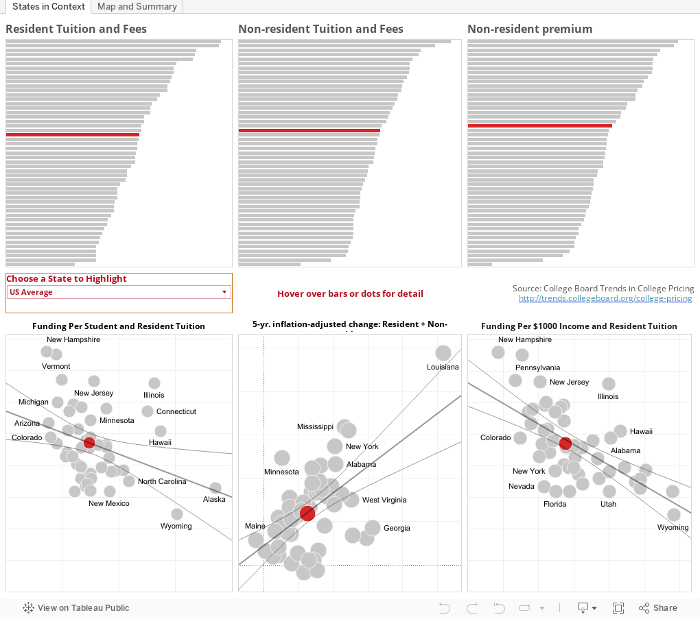
Comments
Post a Comment