Note: Visualizations are not mobile friendly. I recommend a laptop or desktop for viewing this site.
Someone asked me today about what I thought higher education's biggest challenge was, and I said college costs without thinking. And a few hours later, I still think that, with a twist: College costs for low-income students, especially at public institutions who presumably have a primary mission of educating students of all income levels in their state.
To be sure, costs are too high at private institutions, and many of the trends you'll see here are carried over and amplified in the private sector; but private colleges and universities may exist for different reasons, and that can be hard to capture in a visualization like this.
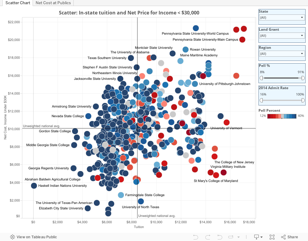
There are two views here, using the tabs across the top. The first is a scattergram, arraying almost all 660 US, four-year public colleges and universities that admit freshmen (a few are missing data). The x-axis shows in-state tuition in 2013, and the y-axis shows net price for freshman students who come from families with incomes of $30,000 or less, and who are paying the in-state tuition, most of whom are presumably in-state residents. The color shows the percentage of students enrolled who receive a federal Pell grant, a program for very-low income students.
Reference lines show the unweighted, institutional averages, which allows the creation of quadrants, roughly:
- The upper right, or high tuition, high net cost
- The lower right, or high tuition, low net cost
- The lower left, or low tuition and low net cost
- The upper left, or low tuition, high net cost
Color here is important: Red dots are those colleges with lower percentages of Pell students; blue dots show higher values, although I've capped the color range at 40%, about the national average, if you include all types of institutions. It's important because it shows how many students these institutions enroll, not just how well they do at reducing price (if they do.) In other words, it's a bit easier to do a lot to reduce cost for students if you don't do it for very many; it's harder on your budget if you enroll more.
You can limit the view to states, regions, Land Grant status, or by using the filters to show only institutions with certain admit rates or Pell percentages. As always, take a look at California. Well done, California.
The second view shows in-state tuition over time, accompanied by net price for three groups of students who receive aid. Students from:
- Families with income of less than $30,000 (gold)
- Families with income of $30,000 to $48,000 (orange)
- Families with income of over $110,000 (the highest band reported in IPEDS). This is in blue.
The bottom chart on the second tab simply turns these numbers into an Net Cost: Tuition ratio. A value of 1.5, for instance, means that the net price is 1.5 times tuition. Note the definition of net price:
Net cost shows all costs associated with cost of attendance, minus grant aid. For example, a university may have a tuition of $5,000, but a cost of attendance of $17,000 to include housing, meals, transportation, and personal expenses. If a student receives $10,000 in grant aid, that student's net price is $7,000, which is greater than tuition alone.
As always, hover for details, and use the reset button at lower left if you get stuck.
What do you see here? What else would you like to see?
Comments
Post a Comment