There has been a considerable amount of discussion in the admissions world about The Coalition for Access, Affordability, and Success. I remain skeptical about the motives behind this, as I did when I wrote this in the Washington Post. To be clear, however, I believe colleges have the right to create their own admissions platform and conduct the business side of higher education with great latitude. I am merely questioning how a fractured admissions process helps low income students find, apply, get admitted to, and enroll in college; and the use of the term "access" by colleges who have, in general, poor records of providing access to low-income students.
Many school counselors I've talked to are very concerned by what they perceive to be a dearth of information about how this all will work, and there are also lingering concerns about privacy, which have not yet been publicly answered (to the best of my knowledge), even though one component of the application platform--the Locker--is scheduled to open this month.
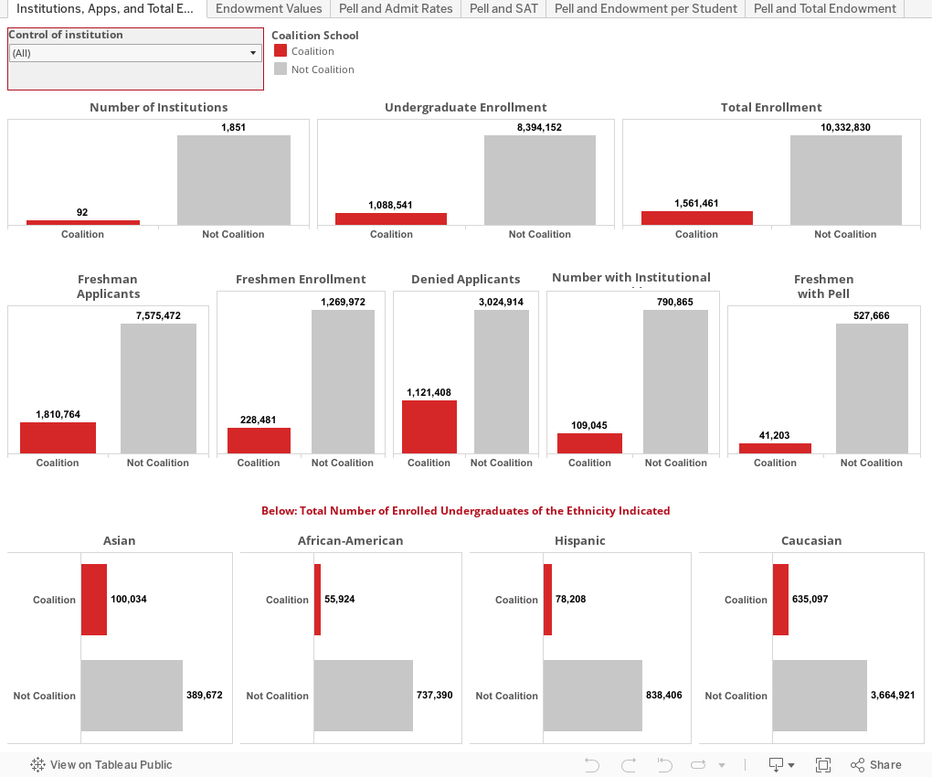
These colleges represent the very top of the pyramid among private institutions, and also include many large, state flagship public institutions, as well as a few statistical outliers. But to look deeper at the data, I downloaded a large IPEDS data set, and just scratched the surface. What should jump out at you is the impressive list of colleges, their collective wealth, and position on several of the scatter grams, below.
Use the tabs across the top. Every view has a filter to show public/private/all institutions. Coalition schools are in red to make them standout; everyone else is in gray. The universe is about 1,945 four-year, degree-granting, Title IV participating colleges and universities in theMidwest.US. (corrected 4/17 at 6:32 pm CST).
What do you see?
Many school counselors I've talked to are very concerned by what they perceive to be a dearth of information about how this all will work, and there are also lingering concerns about privacy, which have not yet been publicly answered (to the best of my knowledge), even though one component of the application platform--the Locker--is scheduled to open this month.
These colleges represent the very top of the pyramid among private institutions, and also include many large, state flagship public institutions, as well as a few statistical outliers. But to look deeper at the data, I downloaded a large IPEDS data set, and just scratched the surface. What should jump out at you is the impressive list of colleges, their collective wealth, and position on several of the scatter grams, below.
Use the tabs across the top. Every view has a filter to show public/private/all institutions. Coalition schools are in red to make them standout; everyone else is in gray. The universe is about 1,945 four-year, degree-granting, Title IV participating colleges and universities in the
What do you see?
Comments
Post a Comment