You hear a lot about enrollment of international students these days, and often, I think, when a subject gets a lot of play, it tends to be overhyped, often by people who don't really understand the data.
This would not be one of those times.
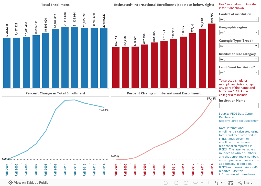
I used IPEDS trend analysis to look at enrollment of non-resident students (that is, students who are neither US citizens nor permanent residents) over time. For comparison's sake, I also looked at overall enrollment over that same time.
This data set includes all 7,276 post-secondary institutions in the US, both degree-granting and non-degree-granting, whether or not they participate in Title IV programs, so my usual advice about IPEDS data is amplified a bit here. Still, the trends are interesting.
The blue charts (on left) show total enrollment at these institutions: Bars show numbers, and the line shows percent change since Fall, 2004. The red charts (right) show estimated international enrollment. It's estimated because I had to calculate it using two variables, and the "percent of students who are non-resident" is expressed in a whole number, which is less precise than I'd like.
Of course, you're probably not interested in all the institutions in the US, so you can use the filters at right to look only at certain subsets, in any combination: Large doctoral universities in the west, for instance, or baccalaureate colleges in New England.
If you reset all those filters (reset button at lower left), you can look at any college or subset of colleges by typing the name in the box and make your selection(s). If you get in trouble, just reset.
What interesting trends do you see here?
This would not be one of those times.
I used IPEDS trend analysis to look at enrollment of non-resident students (that is, students who are neither US citizens nor permanent residents) over time. For comparison's sake, I also looked at overall enrollment over that same time.
This data set includes all 7,276 post-secondary institutions in the US, both degree-granting and non-degree-granting, whether or not they participate in Title IV programs, so my usual advice about IPEDS data is amplified a bit here. Still, the trends are interesting.
The blue charts (on left) show total enrollment at these institutions: Bars show numbers, and the line shows percent change since Fall, 2004. The red charts (right) show estimated international enrollment. It's estimated because I had to calculate it using two variables, and the "percent of students who are non-resident" is expressed in a whole number, which is less precise than I'd like.
Of course, you're probably not interested in all the institutions in the US, so you can use the filters at right to look only at certain subsets, in any combination: Large doctoral universities in the west, for instance, or baccalaureate colleges in New England.
If you reset all those filters (reset button at lower left), you can look at any college or subset of colleges by typing the name in the box and make your selection(s). If you get in trouble, just reset.
What interesting trends do you see here?
Comments
Post a Comment