The world is shrinking, if not literally, then metaphorically. Some colleges and universities embrace this in big ways, and this is the purpose of this visualization.
The Institute of International Education puts out good data on both international enrollment at US colleges and enrollment of US students in study abroad programs. I've combined that data into two views that show both.
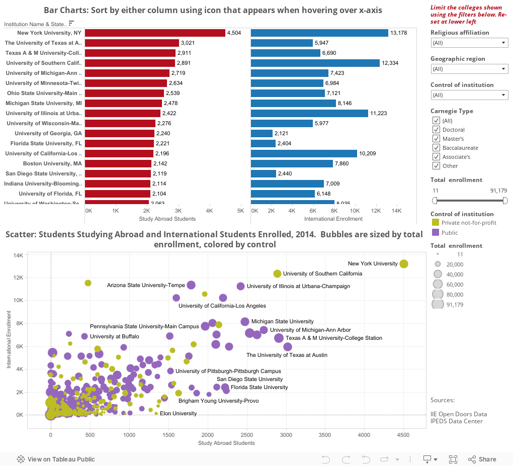
The top chart contains two sort-able and filterable bar charts. It starts out sorted from large to small on the left column, namely study abroad students in 2014-2015; if you'd rather sort by total international enrollment, hover over that x-axis until the small icon pops up and click that. Reset by using the button at lower left.
The bottom charts shows every college in the data set, with study abroad on the x-axis and international enrollment on the y-axis. Each dot is a college, color coded by control.
As always, if you want to look at a smaller set of colleges, use the filters on the right. They will control both charts at the same time.
Three things: First, the data are for all students, graduate and undergraduate. The IIE data are not broken out, so it's not possible to determine meaningful percentages, except of course for colleges that only enroll undergrads. Second, the data is only reported for colleges that enrolled 10 international students and/or sent 10 students abroad. Assuming the colleges reported the data.
So, on that point: I've checked this data where I seen anomalies; there are several obvious colleges where it's missing. A final caveat: High numbers can be caused by lots of things, including location, wealth of the student body, and curricular offerings, among others. There is (or should be) no value judgment attached to the numbers you find here.
The Institute of International Education puts out good data on both international enrollment at US colleges and enrollment of US students in study abroad programs. I've combined that data into two views that show both.
The top chart contains two sort-able and filterable bar charts. It starts out sorted from large to small on the left column, namely study abroad students in 2014-2015; if you'd rather sort by total international enrollment, hover over that x-axis until the small icon pops up and click that. Reset by using the button at lower left.
The bottom charts shows every college in the data set, with study abroad on the x-axis and international enrollment on the y-axis. Each dot is a college, color coded by control.
As always, if you want to look at a smaller set of colleges, use the filters on the right. They will control both charts at the same time.
Three things: First, the data are for all students, graduate and undergraduate. The IIE data are not broken out, so it's not possible to determine meaningful percentages, except of course for colleges that only enroll undergrads. Second, the data is only reported for colleges that enrolled 10 international students and/or sent 10 students abroad. Assuming the colleges reported the data.
So, on that point: I've checked this data where I seen anomalies; there are several obvious colleges where it's missing. A final caveat: High numbers can be caused by lots of things, including location, wealth of the student body, and curricular offerings, among others. There is (or should be) no value judgment attached to the numbers you find here.
Comments
Post a Comment