I normally focus on Higher Education data on this blog, and in fact, this visualization started out as a higher education post: I wanted to look at presidential election results from 2012 to see if education played a part in how people voted. But since I had a large census file anyway, with lots of interesting information like income, ethnic groups, and other data, I decided to take it one step farther. OK, may steps farther. And to me, almost everything is ultimately about education.
If you don't like to interact with these visualizations, stop right now. You'll have to play with this to see how it works.
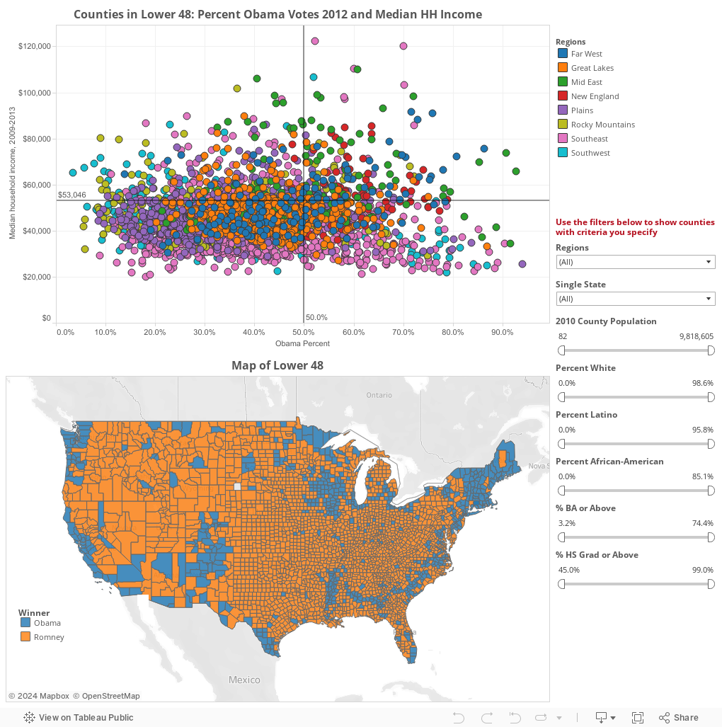
On the top view, you see every county as a dot, color-coded by region, and arranged on a grid. Hover over any dot for details, if you'd like. Counties voting more heavily for Obama are on the right; Romney counties are on the left. Wealthier counties are on top (higher median family income), and poorer are at the bottom. Note the reference line at $53,046, the national median.
If you want to look at a specific state or region, you can do that using the filters. But you can also look only at counties that meet certain demographic criteria, of your choice.
For instance, you could find counties that are at least 15% Hispanic and where at least 10% of the adults have a Bachelor's degree. Once you apply the filters, only the counties that meet those criteria are displayed. Use filters in an combination. (Of course, you can't find any county that's 51% White and 51% African-American; the filters aren't magic.)
The data also shows up on the map at bottom; it's pretty self-explanatory: Each county is colored blue (Obama won) or orange (Romney won.)
As always, the reset button is at bottom.
I find this very interesting, and I hope you do too. And I hope you vote in November; I need you for my next visualization!
If you don't like to interact with these visualizations, stop right now. You'll have to play with this to see how it works.
On the top view, you see every county as a dot, color-coded by region, and arranged on a grid. Hover over any dot for details, if you'd like. Counties voting more heavily for Obama are on the right; Romney counties are on the left. Wealthier counties are on top (higher median family income), and poorer are at the bottom. Note the reference line at $53,046, the national median.
If you want to look at a specific state or region, you can do that using the filters. But you can also look only at counties that meet certain demographic criteria, of your choice.
For instance, you could find counties that are at least 15% Hispanic and where at least 10% of the adults have a Bachelor's degree. Once you apply the filters, only the counties that meet those criteria are displayed. Use filters in an combination. (Of course, you can't find any county that's 51% White and 51% African-American; the filters aren't magic.)
The data also shows up on the map at bottom; it's pretty self-explanatory: Each county is colored blue (Obama won) or orange (Romney won.)
As always, the reset button is at bottom.
I find this very interesting, and I hope you do too. And I hope you vote in November; I need you for my next visualization!
Comments
Post a Comment