A recent article in the Washington Post piqued my interest: Why the University of Oregon turned to neighboring states for students, by colleague Roger Thompson.
Some of this is no surprise, of course. I've been looking at NCES and WICHE data for years, and even visualized the latter to show how demographics will change enrollment profiles at colleges across the country.
Lots of publics realize this, and lots have attempted to enroll larger numbers and percentages of students from outside their states. There's more to it than population, however: It's one of education's worst-kept secrets that students who travel farther to college come from families with higher incomes (or vice versa, of course), and in general, so do students who cross state lines for their education. Public universities have discovered that high out-of-state tuition makes them less desirable, and so have recently adopted a revenue maximization model, often offering large discounts to non-resident students. It's generally better to get 70% of $30,000 than 0% of $30,000, especially when resident students might only pay $12,500, assuming the enrollment boost is sufficient.
This is a natural reaction by the universities in light of massive state funding cutbacks.
To boot, wealthier students have higher test scores, on average, and at prestigious-conscious universities, this can be an added bonus.
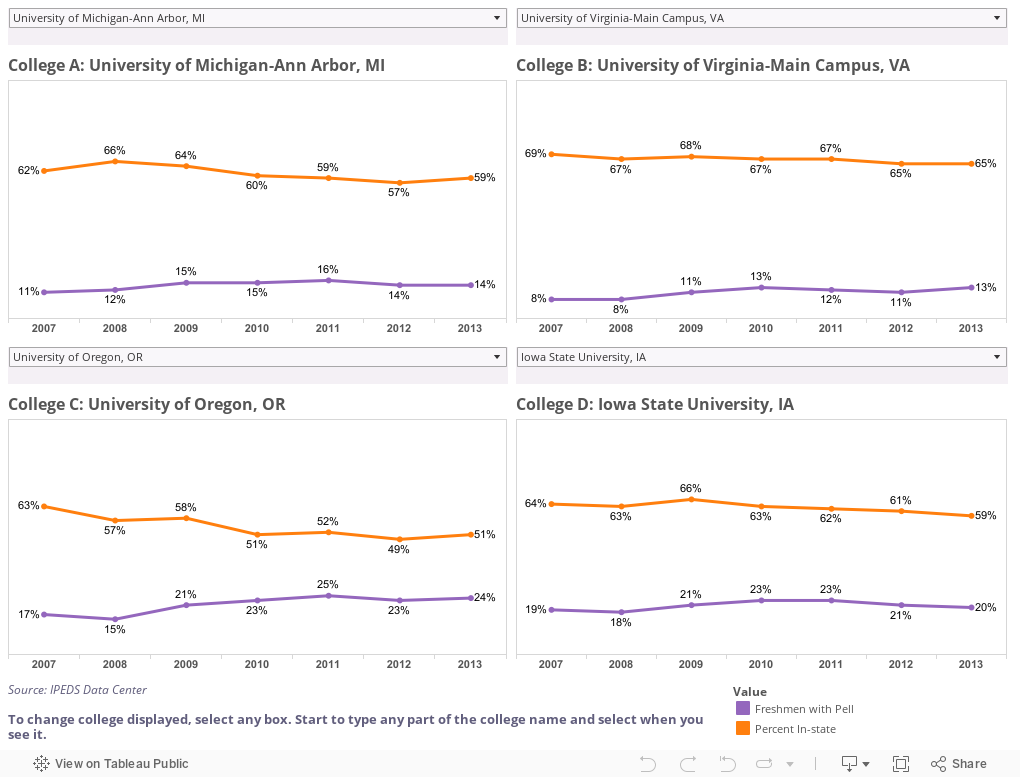
The danger, of course, is that this might exclude lower-income in-state students. So, I took a look at the two factors over time at about 550 public colleges and universities. The visualization below gives you the option to compare any four institutions by choosing the ones you want from the individual drop-down boxes: Orange lines show percent of freshmen from in-state; purple shows percent with Pell over time. In order to select a college, just click on the box and start typing any part of the name. If you want UC Santa Cruz, for instance, you'll get better luck with "Cruz" than "California."
I started with four at random. Make your own set.
What do you see? And are you surprised?
Note: Since I posted this, a colleague has pointed out that the IPEDS data are not sufficiently granular to separate in-state and out-of-state Pell students, which would have been the ideal way to look at this. And, in addition, I'll add that a university could a) increase the percentage of its state's HS graduates enrolling, b) increase the number of Pell students, and c) see the percentage of Pell students go down if the freshman class grew substantially.
Some of this is no surprise, of course. I've been looking at NCES and WICHE data for years, and even visualized the latter to show how demographics will change enrollment profiles at colleges across the country.
Lots of publics realize this, and lots have attempted to enroll larger numbers and percentages of students from outside their states. There's more to it than population, however: It's one of education's worst-kept secrets that students who travel farther to college come from families with higher incomes (or vice versa, of course), and in general, so do students who cross state lines for their education. Public universities have discovered that high out-of-state tuition makes them less desirable, and so have recently adopted a revenue maximization model, often offering large discounts to non-resident students. It's generally better to get 70% of $30,000 than 0% of $30,000, especially when resident students might only pay $12,500, assuming the enrollment boost is sufficient.
This is a natural reaction by the universities in light of massive state funding cutbacks.
To boot, wealthier students have higher test scores, on average, and at prestigious-conscious universities, this can be an added bonus.
The danger, of course, is that this might exclude lower-income in-state students. So, I took a look at the two factors over time at about 550 public colleges and universities. The visualization below gives you the option to compare any four institutions by choosing the ones you want from the individual drop-down boxes: Orange lines show percent of freshmen from in-state; purple shows percent with Pell over time. In order to select a college, just click on the box and start typing any part of the name. If you want UC Santa Cruz, for instance, you'll get better luck with "Cruz" than "California."
I started with four at random. Make your own set.
What do you see? And are you surprised?
Note: Since I posted this, a colleague has pointed out that the IPEDS data are not sufficiently granular to separate in-state and out-of-state Pell students, which would have been the ideal way to look at this. And, in addition, I'll add that a university could a) increase the percentage of its state's HS graduates enrolling, b) increase the number of Pell students, and c) see the percentage of Pell students go down if the freshman class grew substantially.
Comments
Post a Comment