
Graduation Rates, Rolled Up

I like the NCES Digest of Education Statistics, but some of the reports they present are almost unusable.  If you've ever tried to visualize a report like this, you know what I mean.  If anyone from NCES is reading this, please help and encourage the good people there to put data in a cleaned, unformatted report.

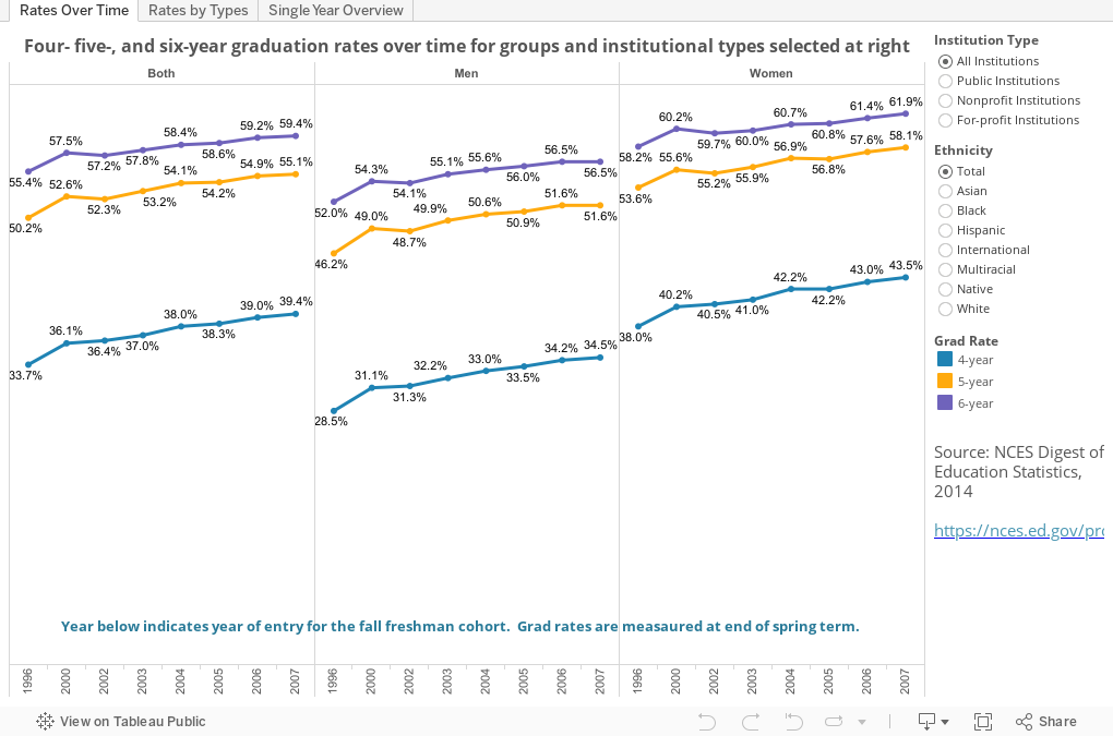
But, on to the data.  This is pretty simple, actually, and it bounces off previous visualizations I've done that show graduation rates are as much an input as an output.  The data are presented in three views: Over time, summarized for a single year, and by institutional type.  Click on the tabs to see them all, and use the filters on the right to select subsets.  You may want to look at women, or Hispanic students, for instance, and you can do so here.

There are some interesting patterns here.  It's clear that women, across the board, have higher graduation rates than men; and that colleges are not serving African American men very well.

What else do  you see? Anything surprising? Leave a comment below.

See this, too, for another way of looking at college graduation rates.


Comments

Popular posts from this blog

The Highly Rejective Colleges

If you're not following Akil Bello on Twitter, you should be.  His timeline is filled with great insights about standardized testing, and he takes great effort to point out racism (both subtle and not-so-subtle) in higher education, all while throwing in references to the Knicks and his daughter Enid, making the experience interesting, compelling, and sometimes, fun. Recently, he created the term " highly rejective colleges " as a more apt description for what are otherwise called "highly selective colleges."  As I've said before, a college that admits 15% of applicants really has a rejections office, not an admissions office.  The term appears to have taken off on Twitter, and I hope it will stick. So I took a look at the highly rejectives (really, that's all I'm going to call them from now on) and found some interesting patterns in the data. Take a look:  The 1,132 four-year, private colleges and universities with admissions data in IPEDS are incl

Freshman Migration, 1986 to 2020

(Note: I discovered that in IPEDS, Penn State Main Campus now reports with "The Pennsylvania State University" as one system.  So when you'd look at things over time, Penn State would have data until 2018, and then The Penn....etc would show up in 2020.  I found out Penn State main campus still reports its own data on the website, so I went there, and edited the IPEDS data by hand.  So if you noticed that error, it should be corrected now, but I'm not sure what I'll do in years going forward.) Freshman migration to and from the states is always a favorite visualization of mine, both because I find it a compelling and interesting topic, and because I had a few breakthroughs with calculated variables the first time I tried to do it. If you're a loyal reader, you know what this shows: The number of freshman and their movement between the states.  And if you're a loyal viewer and you use this for your work in your business, please consider supporting the costs

Doctoral recipients by bachelor's degree-granting institution, 2016-2020

Each time I publish this visualization I get a lot of traffic on the site, and I can see why. It shows all doctoral recipients (in 2016-2020) broken out by where they received their bachelor's degrees.  So, for instance, the top level view shows that UC Berkeley is the alma mater of more doctoral recipients than any other institution, followed by The University of Michigan and Cornell University. That would be interesting, but of course, these are large institutions, and it's natural to think lots of graduates will lead to lots of doctoral degrees.  No surprise there. So the visualization allows you to look at the types of colleges you or your students might want: Select a state, select public or private, select by Carnegie type if you wish.  You can also look at HBCUs if you'd like.  Most important, you can filter by doctoral degree, so if you want to see which institution sends the most students to doctorates in chemistry, you can do so. To head off the questions I get ev