This is the second part of my visualization of graduation rates from NCES. Part I is right below this one, or if you want, you can click here to open it in a new window.
People in higher ed, and especially in government, talk a lot about graduation rates, and the presumption is this: That graduation rates are something we credit or blame on the colleges; that is, something a particular college does determines whether or not its graduation rate is high. If Princeton stopped caring, presumably, its graduation rate would collapse.
Well, maybe. Probably not, though.
We can see that a single factor, such as percentage of students in the freshman class with Pell, or the mean SAT score, can predict with some precision the graduation rate of a college or university. If you don't believe me, see for yourself.
There is some variation in rates of colleges with similar profiles, of course, and people believe--correctly, or incorrectly, I'm not sure--that this is the important difference, or the value added by the particular college. Maybe, but given the percentage of variance explained by single variables, I'm willing to guess other pre-college characteristics explain a lot of that unexplained variance. Even as dull an instrument as US News and World Report realized years ago that having more Pell students lowered your graduation rate, all other things being equal.
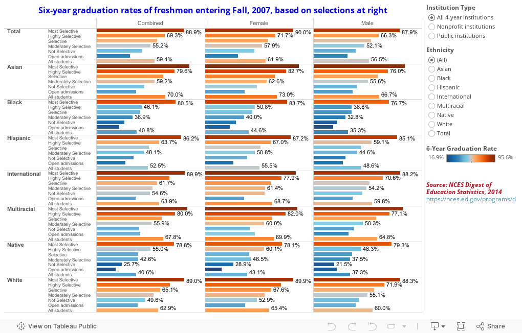
Which leads us to this: The entering freshman class of 2007, and their six-year graduation rate, broken out by gender, ethnicity, and the selectivity of the college. You can see the pattern: The more selective the school, the higher the graduation rate.
Consider this. You are headmaster at a college where they only thing they teach is dunking a basketball. At the end of the course of study, students are given a test: 100 attempts to dunk the basketball. And your school has a dunk percentage of 74.3%, the highest in the nation, and far better than any other Dunking College in the US. All the people in Tallsville, where you're located, are very proud of you, as you educate mostly local kids from Tallsville, named for the Tall family.
The next year, you get ten times as many applicants. And, being a college that wants to turn out the best dunkers (it's in your strategic plan, of course), you are suddenly able to admit only the tallest applicants, with the biggest vertical jumps and the largest hands. Using the same instructional tools you've always used, your dunking percentage skyrockets to 98.2%. And next year, guess what happens to applications? And guess whom you select from that pool?
The nation's oldest and wealthiest colleges mostly had a head start of several hundred years on the rest of us. And in times when college was almost exclusively the bastion of wealthy, white men from the upper crust of society, they have long histories of turning out men who end up, not surprisingly, wealthy and white.
Their reputation ensures that their position in the market will be strong for as far as the eye can see, and will allow them to select only students who, albeit not always white, wealthy men anymore, are destined to graduate from college. If you're a little less selective, you have a little less luxury of choice. And so it goes.
There is, of course, nothing wrong with that. But choosing a college because of its graduation rate is backwards: The college will select you based on your propensity to graduate. Ponder that.
Do you agree? Or not? Either way, I'd love to hear from you.
People in higher ed, and especially in government, talk a lot about graduation rates, and the presumption is this: That graduation rates are something we credit or blame on the colleges; that is, something a particular college does determines whether or not its graduation rate is high. If Princeton stopped caring, presumably, its graduation rate would collapse.
Well, maybe. Probably not, though.
We can see that a single factor, such as percentage of students in the freshman class with Pell, or the mean SAT score, can predict with some precision the graduation rate of a college or university. If you don't believe me, see for yourself.
There is some variation in rates of colleges with similar profiles, of course, and people believe--correctly, or incorrectly, I'm not sure--that this is the important difference, or the value added by the particular college. Maybe, but given the percentage of variance explained by single variables, I'm willing to guess other pre-college characteristics explain a lot of that unexplained variance. Even as dull an instrument as US News and World Report realized years ago that having more Pell students lowered your graduation rate, all other things being equal.
Which leads us to this: The entering freshman class of 2007, and their six-year graduation rate, broken out by gender, ethnicity, and the selectivity of the college. You can see the pattern: The more selective the school, the higher the graduation rate.
Consider this. You are headmaster at a college where they only thing they teach is dunking a basketball. At the end of the course of study, students are given a test: 100 attempts to dunk the basketball. And your school has a dunk percentage of 74.3%, the highest in the nation, and far better than any other Dunking College in the US. All the people in Tallsville, where you're located, are very proud of you, as you educate mostly local kids from Tallsville, named for the Tall family.
The next year, you get ten times as many applicants. And, being a college that wants to turn out the best dunkers (it's in your strategic plan, of course), you are suddenly able to admit only the tallest applicants, with the biggest vertical jumps and the largest hands. Using the same instructional tools you've always used, your dunking percentage skyrockets to 98.2%. And next year, guess what happens to applications? And guess whom you select from that pool?
The nation's oldest and wealthiest colleges mostly had a head start of several hundred years on the rest of us. And in times when college was almost exclusively the bastion of wealthy, white men from the upper crust of society, they have long histories of turning out men who end up, not surprisingly, wealthy and white.
Their reputation ensures that their position in the market will be strong for as far as the eye can see, and will allow them to select only students who, albeit not always white, wealthy men anymore, are destined to graduate from college. If you're a little less selective, you have a little less luxury of choice. And so it goes.
There is, of course, nothing wrong with that. But choosing a college because of its graduation rate is backwards: The college will select you based on your propensity to graduate. Ponder that.
Do you agree? Or not? Either way, I'd love to hear from you.
Comments
Post a Comment