This is three years of data from the NCES Digest of Education Statistics, breaking out all bachelor's degrees awarded by ethnicity, gender, and discipline. For the sake of clarity, I rolled many of the disciplines together, and on at least one view, rolled up ethnicities into groups as well.
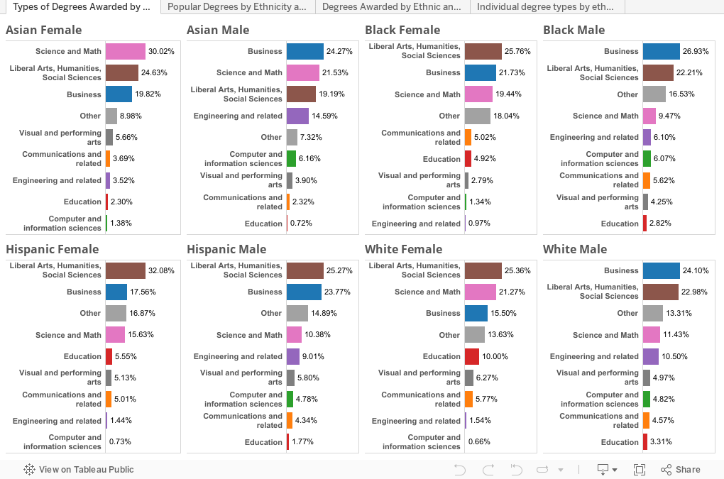
The first view simply takes a look at ethnicity and gender: What do Asian women, or Hispanic men study in college? Eight views on one dashboard, showing some interesting stuff: 30% of Asian women study Science and Math, compared to just 9.5% of African American men. Business always dominates with men, except Hispanic men. Interesting.
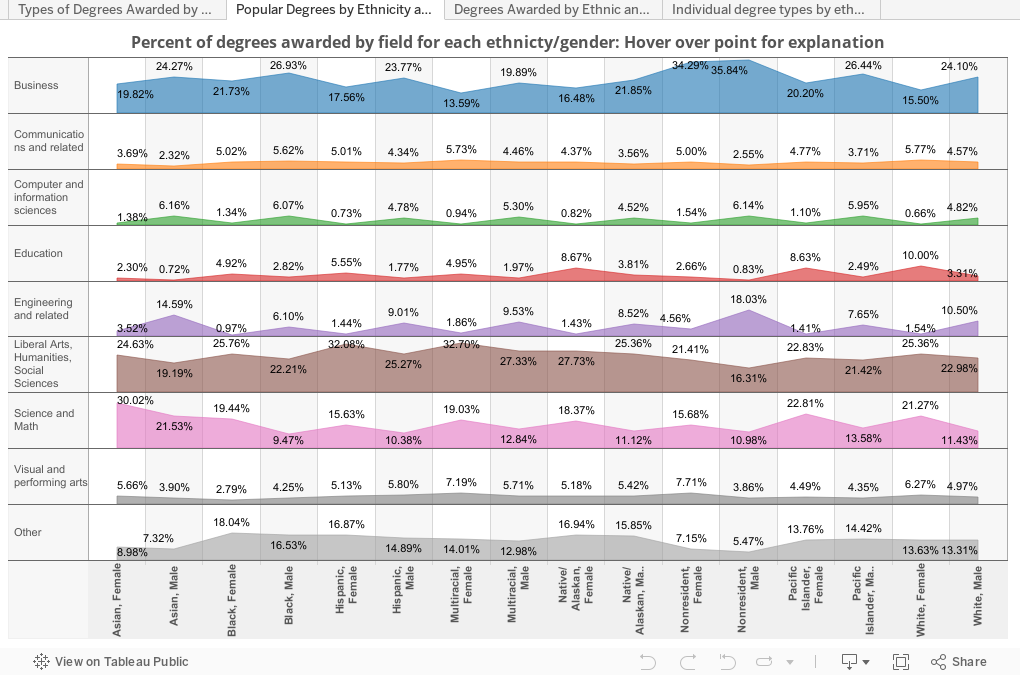
Behold the power of DataViz. This view is the exact same day, just shown a different way to allow you to get a comparative view. This shows all ethnic groups in the data set, however, and the data in columns adds up to 100%. So, for instance, in the very top left, of all degrees awarded to Asian women, 19.82% were in business. The figure is 34.3% for nonresident (international) men.
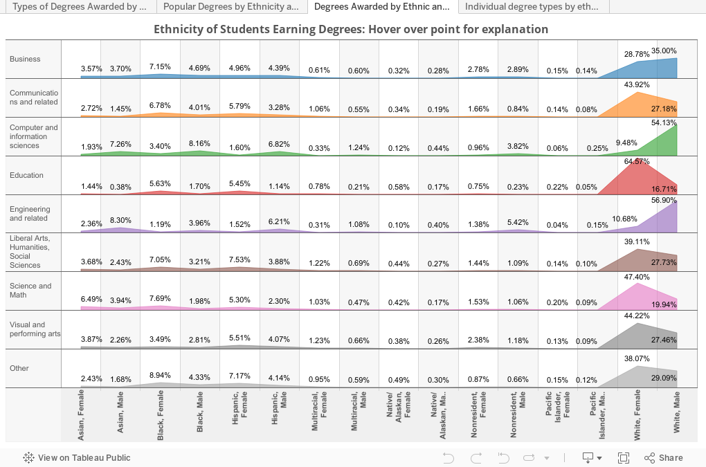
The third view turns it all around. Here you can see all the degrees awarded in a specific discipline in those three years, and see how they were distributed. For instance, of all the degrees awarded in Education, 65% went to Caucasian women; of all the engineering degrees, 8.3% went to Asian males.
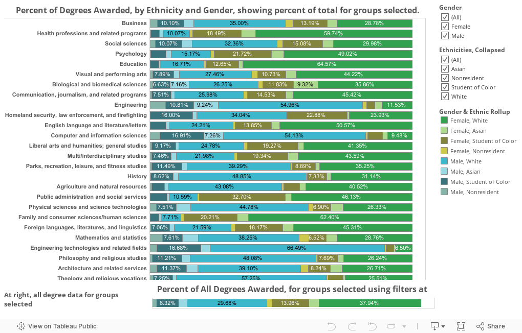
The fourth view is a little more complex, and allows you to create your own view. For each discipline shown, the colored bars add up to 100% for the groups selected. At first, it's a little noisy: Both men and women, and all ethnicities. But this is where you can get interactive. Look at just Hispanic students, for instance, by de-selecting every thing else; or see just men, if that's what you want. The bars will always recalculate, and the very bottom bar rolls up all degrees into one bar, for comparison.
What do you see that jumps out at you? Let me know in the comments at the bottom.
The first view simply takes a look at ethnicity and gender: What do Asian women, or Hispanic men study in college? Eight views on one dashboard, showing some interesting stuff: 30% of Asian women study Science and Math, compared to just 9.5% of African American men. Business always dominates with men, except Hispanic men. Interesting.
Behold the power of DataViz. This view is the exact same day, just shown a different way to allow you to get a comparative view. This shows all ethnic groups in the data set, however, and the data in columns adds up to 100%. So, for instance, in the very top left, of all degrees awarded to Asian women, 19.82% were in business. The figure is 34.3% for nonresident (international) men.
The third view turns it all around. Here you can see all the degrees awarded in a specific discipline in those three years, and see how they were distributed. For instance, of all the degrees awarded in Education, 65% went to Caucasian women; of all the engineering degrees, 8.3% went to Asian males.
The fourth view is a little more complex, and allows you to create your own view. For each discipline shown, the colored bars add up to 100% for the groups selected. At first, it's a little noisy: Both men and women, and all ethnicities. But this is where you can get interactive. Look at just Hispanic students, for instance, by de-selecting every thing else; or see just men, if that's what you want. The bars will always recalculate, and the very bottom bar rolls up all degrees into one bar, for comparison.
What do you see that jumps out at you? Let me know in the comments at the bottom.
Comments
Post a Comment