I've had a long-standing rule when publishing to this blog: I don't take requests. This is for two reasons: First, I do this for fun, and I publish what's interesting to me, hoping you'll find it compelling as well. Second, the tools available now allow you to answer your own questions fairly easily. If you like my visualizations but want to ask some more questions, you can download free versions of Tableau Public and explore to your heart's content.
But yesterday, when I published this piece on freshman migration, a topic that generated a lot of interest this time and the first time I did it, I admitted this was the most fun I had exploring data. And I also admitted that I had dozens of views lined up, but, in the interest of keeping things simple, kept just two.
Since it's gone live, I've had about 20 people ask me "Could you look at this data this way?" questions. That's exciting, because I'm always hoping what I publish generates as many questions as it answers.
So, for once, I'm taking requests. And, even some suggestions. specifically from Ian Pytlarz and Carolyn Rockafellow of a Google+ Group for Higher Ed users of Tableau. Thanks to them.
Six views here, all in one workbook, and accessible via tabs across the top:
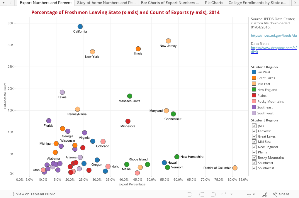
- State exports: Numbers and percentages in a scatter
- State "stay homes: Numbers and percentages in a scatter
- Bar charts of exports, showing number and percentages. You can sort by either column
- Pie charts of all 50 states and DC: (Another rule I broke, as pie charts are not very good for such things, but some people like them, and if you don't you can skip them and get the information elsewhere)
- Individual college enrollments by in-state/out-of-state, or in-region/out-of-region
- Enrollments in colleges within a state in aggregate, showing percentage from in-state and out-of-state
But that's it! I may do some more internal analysis for our own use here at DePaul, but if you want more, you can make yourself data independent (and I'd love to see what you do with this!)
Comments
Post a Comment