This is always a popular post: Statistics on the entering class of 2014 at about 1900 colleges and universities across the country. It's based on IPEDS data, which I downloaded from the IPEDS data center and conditioned. The source file is here, if you'd like to do something with it yourself.
This year, NCES only reports test score ranges for those colleges and universities that require tests for all applicants; in some regard, this makes sense, but it's unfortunate. At my institution, for instance, about 94% of enrolling students submit tests, and this data might be helpful to students who do plan to apply with tests. I plan to let NCES know this was not a good idea, and you can, too, if you'd like. For now you'll know why these colleges don't show up. You'll have to check with the colleges themselves.
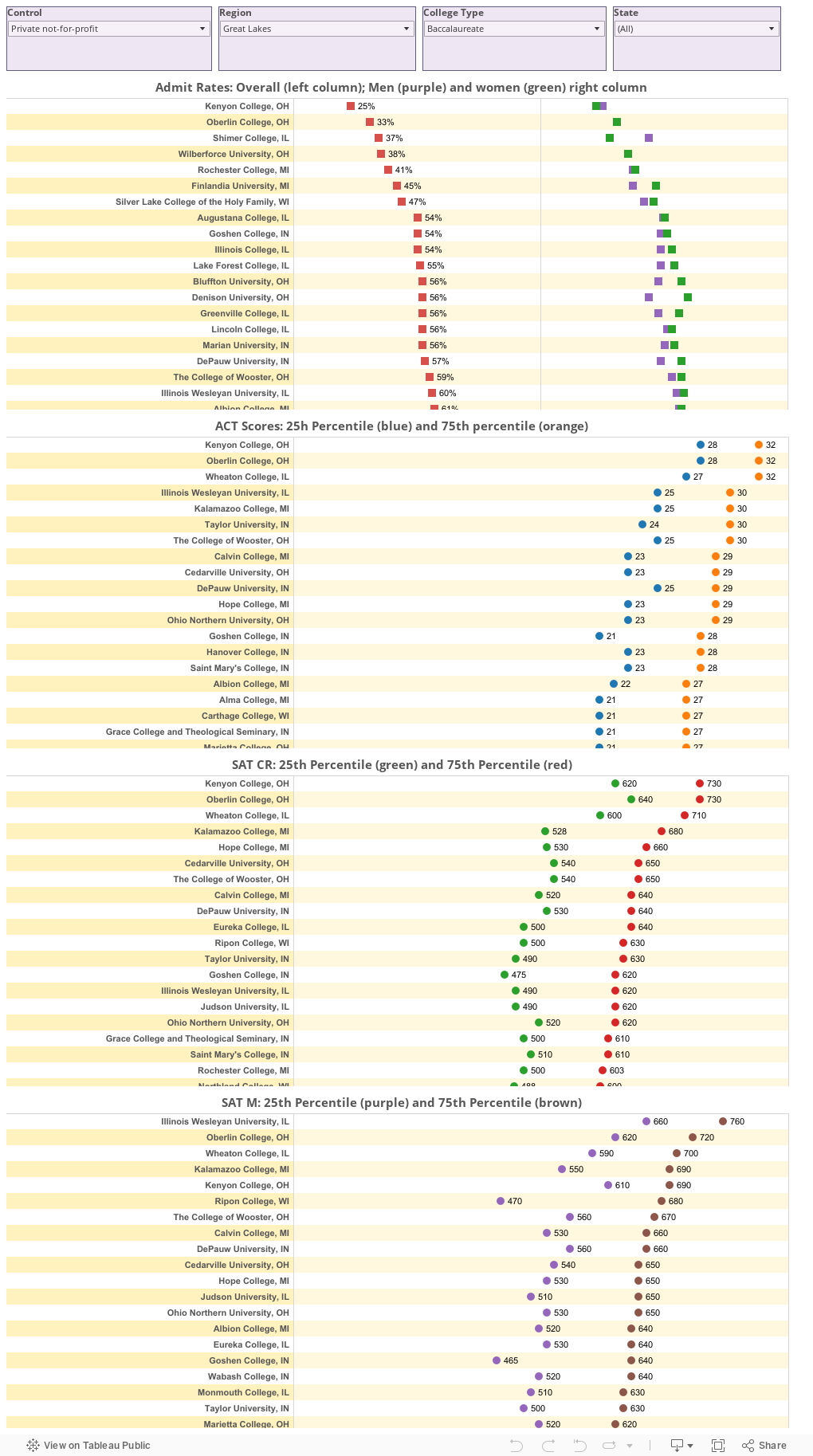
This view starts with private, Liberal Arts Colleges in the Great Lakes region, but you can make the list be whatever you want using the filters across the top. Be aware that if you select "New England," for instance, you can't then select "Florida" until you re-set the region filter.
The views from the top down are:
This year, NCES only reports test score ranges for those colleges and universities that require tests for all applicants; in some regard, this makes sense, but it's unfortunate. At my institution, for instance, about 94% of enrolling students submit tests, and this data might be helpful to students who do plan to apply with tests. I plan to let NCES know this was not a good idea, and you can, too, if you'd like. For now you'll know why these colleges don't show up. You'll have to check with the colleges themselves.
This view starts with private, Liberal Arts Colleges in the Great Lakes region, but you can make the list be whatever you want using the filters across the top. Be aware that if you select "New England," for instance, you can't then select "Florida" until you re-set the region filter.
The views from the top down are:
- Admit rates, with the overall rate on the left, and men and women on the right
- ACT Scores, at the 25th and 75th percentile
- SAT CR Scores, at the 25th and 75th percentile
- SAT M Scores, at the 25th and 75th percentile
You'll have to scroll down to see them all four boxes, and within each box, use the scroll bar.
Comments
Post a Comment