Ever since I started in admissions, people have been talking about demographics changes and challenges, and the chant continues. The future, we're told, will look very different than the present.
Our trade paper, the Chronicle of Higher Education, ran an article about how this might affect higher education. It included lots of interesting charts and graphs, but didn't allow me to look at the data in the ways I wanted to. So I downloaded it and started looking at it using Tableau.
This is as much a testament to self-service BI as it is to the trends in the data. I've often spoken about the 80/80 rule of business intelligence: 80% of what an analyst gives you, you don't need; 80% of what you want isn't in the report. I spent a long time playing with and slicing this data to see if I could find a way to present it that makes sense, and that gives people what they want. And every time I answered a question, I generated several more ("what if" can waste a lot of time.")
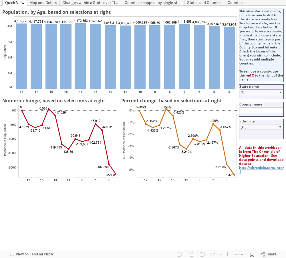
In the end, after several different views, I settled on the first one, below. It's very simple, yet it gives you the flexibility find out most of what you need.
On the chance that you want or need something else, though, I kept the other views I had been experimenting with.
View 2: Maps and Details allows you to see the data mapped; once you filter to a region, you can see how states compare.
View 3: Changes with a State over Time looks at the same data four ways: Numbers, percent change, percent of total, and numeric change by ethnicity.
View 4: Counties Mapped allows you to select a state and see where concentrations of ethnicities live; choose a state, choose the ethnic group and age of the population, and see the results.
View 5: States and Counties shows ethnic percentages for every county, listed by state.
View 6: Counties shows all counties regardless of state. Did you know there are 40 counties in the US where every 18-year old is white? Or that one county in South Dakota is 98% Native American?
Some notes about the data are on the CHE website. Be sure to read them so you know what this shows and doesn't show.
Again, remember to interact. You can't break anything.
And if the frame is not displaying the visualization correctly, you can go right to the original on the Tableau Public website.
Our trade paper, the Chronicle of Higher Education, ran an article about how this might affect higher education. It included lots of interesting charts and graphs, but didn't allow me to look at the data in the ways I wanted to. So I downloaded it and started looking at it using Tableau.
This is as much a testament to self-service BI as it is to the trends in the data. I've often spoken about the 80/80 rule of business intelligence: 80% of what an analyst gives you, you don't need; 80% of what you want isn't in the report. I spent a long time playing with and slicing this data to see if I could find a way to present it that makes sense, and that gives people what they want. And every time I answered a question, I generated several more ("what if" can waste a lot of time.")
In the end, after several different views, I settled on the first one, below. It's very simple, yet it gives you the flexibility find out most of what you need.
On the chance that you want or need something else, though, I kept the other views I had been experimenting with.
View 2: Maps and Details allows you to see the data mapped; once you filter to a region, you can see how states compare.
View 3: Changes with a State over Time looks at the same data four ways: Numbers, percent change, percent of total, and numeric change by ethnicity.
View 4: Counties Mapped allows you to select a state and see where concentrations of ethnicities live; choose a state, choose the ethnic group and age of the population, and see the results.
View 5: States and Counties shows ethnic percentages for every county, listed by state.
View 6: Counties shows all counties regardless of state. Did you know there are 40 counties in the US where every 18-year old is white? Or that one county in South Dakota is 98% Native American?
Some notes about the data are on the CHE website. Be sure to read them so you know what this shows and doesn't show.
Again, remember to interact. You can't break anything.
And if the frame is not displaying the visualization correctly, you can go right to the original on the Tableau Public website.
Comments
Post a Comment